About
Randy Krum
President of InfoNewt.
Data Visualization and Infographic Design

Infographic Design

Infographics Design | Presentations
Consulting | Data Visualizations

DFW DataViz Meetup

Join the DFW Data Visualization and Infographics Meetup Group if you're in the Dallas/Fort Worth area!

Search the Cool Infographics site

Custom Search

Subscriptions:


Feedburner

The Cool Infographics® Gallery:

How to add the
Cool Infographics button to your:

Cool Infographics iOS icon

- iPhone
- iPad
- iPod Touch


Read on Flipboard for iPad and iPhone

Featured in the Tech & Science category

Flipboard icon

Twitter Feed
From the Bookstore

Caffeine Poster

The Caffeine Poster infographic

Entries in flights (3)

Friday
May052017

Six Maps that Show America’s Infrastructure

Tim Meko, a graphic reported at the Washington Post, designs some fantastic data visualizations. Six Maps that Show the Anatomy of America’s Vast Infrastructure is a great visual exploration of what makes America run. Check out the original article for more explanation of each map and more visual details.

Found on FlowingData

Thursday
Dec012016

Thanksgiving Flight Patterns

Thanksgiving Flight Patterns is a cool animated, interactive data visualization from the NY Times TheUpshot that looks at where people traveled to for the Thanksgiving holiday last week. On the interactive version on the NY Times site, you can hover over any included city to see only those connections. There was a huge surge of people headed to Florida!

Thanksgiving is known as a time to return home to family, with the holiday calling to mind images of grandmother’s house. But for many Americans, it’s also now a chance to go on vacation.

This week, Florida will see a surge in the number of people arriving by plane. Las Vegas is another popular destination. Much more than is commonly realized, Thanksgiving is a time to seek out sun (and gambling), in addition to (or possibly instead of) catching up with loved ones.

These conclusions emerge from The Upshot’s analysis of search data from Google Flights. In all, more than 3.6 million Americans — or slightly more than 1 percent of the country’s population — are expected to take a flight for Thanksgiving.

I really like the design choice to change the colors at both ends of each line. It really helps to see the traffic departing a city in comparison to the traffic arriving. 

I think the animation of the dots moving along the flight paths in the interactive version was unnecessary.

Wednesday
Jul132016

Global Connectivity Ranking

Global Connectivity Ranking interactive infographic world London

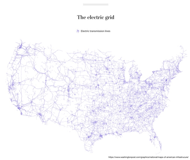
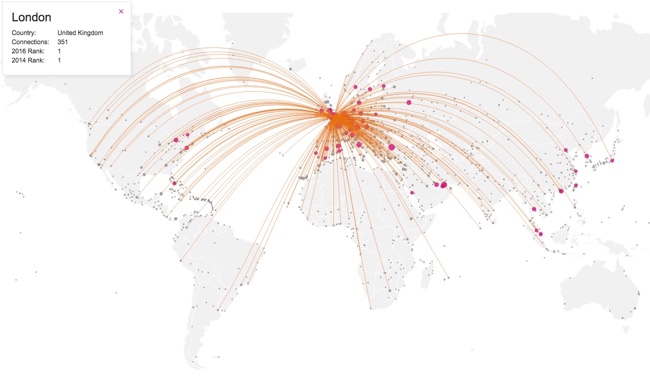
The Global Connectivity Ranking from Rome2rio includes a beautiful interactive data visualization showing how connected we are on a global scale. Above you can see the direct flight connections from London, the most connected city on Earth.

Just how connected are our cities?  How do we measure such connections?  How do these connections change over time?

To answer these questions, my research team at KPMG collaborated with Rome2rio to produce the Global Connectivity Ranking. We ranked all 1,212 cities on the planet which operate international airports.

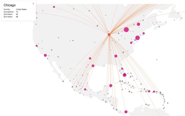
The Rome2rio Global Connectivity Ranking reflects the number of international cities that a city is connected to through direct flights. It measures connections from city to city - not airport to airport. For example, the connection count for London reflects how many cities outside the UK that can be reached from any of London's 6 international airports. Rankings were computed using Rome2rio's global transit data from April 2014 and January 2016.

Choose any city on the list to animate to direct flight connections. The size of the bubbles over each city also represent the total number of connections from that city.

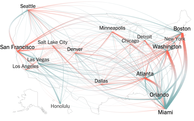
The default is the world view, but can also choose to focus on a single continent. Here you can see the connection from Chicago when zoomed in to only North America.

Global Connectivity Ranking interactive infographic North America Chicago