About
Randy Krum
President of InfoNewt.
Data Visualization and Infographic Design

Infographic Design

Infographics Design | Presentations
Consulting | Data Visualizations

DFW DataViz Meetup

Join the DFW Data Visualization and Infographics Meetup Group if you're in the Dallas/Fort Worth area!

Search the Cool Infographics site

Custom Search

Subscriptions:


Feedburner

The Cool Infographics® Gallery:

How to add the
Cool Infographics button to your:

Cool Infographics iOS icon

- iPhone
- iPad
- iPod Touch


Read on Flipboard for iPad and iPhone

Featured in the Tech & Science category

Flipboard icon

Twitter Feed
From the Bookstore

Caffeine Poster

The Caffeine Poster infographic

Entries in DataViz (17)

Tuesday
Feb202018

Aflac Brunch Commercial #BadDataViz Error

Pancakes ≠ Eggs!

This commercial really bugs me! When you visualize information, you need to get the data visualization right! Don't tell people that Aflac is like the pancakes, and then highlight the eggs in the data visualization!

This comes from the shortened version I've seen through the CBS app of this longer commercial, which doesn't make this error. The long commercial is fine.

Whoever shortened this commercial, just didn't care enough to get it right!

Thursday
Jul132017

Presenting Data Effectively by Stephanie Evergreen!

Presenting Data Effectively Stephanie Evergreen 2nd Edition Interview and Giveaway

The updated 2nd Edition of Presenting Data Effectively by Dr. Stephanie Evergreen was just released! This is a fabulous resource, and the new edition includes full color images and screenshots as well as new content!

During JULY 2017, I am giving away one signed copy of Presenting Data Effectively! Register on the Giveaways Page by July 31st to be entered.

Now in striking full color, Presenting Data Effectively, Second Edition by Stephanie D. H. Evergreen shows readers how to make the research results presented in reports, slideshows, dashboards, posters, and data visualizations more interesting, engaging, and impactful. The book guides students, researchers, evaluators, and non-profit workers—anyone reporting data to an outside audience—through design choices in four primary areas: graphics, text, color, and arrangement. The Second Edition features an improved layout with larger screenshots, a review of the recent literature on data visualization, and input from a panel of graphic design experts.

Stephanie was very helpful and answered a bunch of questions I sent her about visualizing data and the updated book:

Who is the book intended for?

Stephanie Evergreen: Anyone who has to convey some information to other people should read this book, whether it is in a report, a slideshow, a dashboard, etc.


It’s been 4 years since the 1st edition. What has changed the most?

Stephanie Evergreen: Color! We are finally catching up with the modern world and printing in full color. And speaking of catching up, I’ve included a lot of new content about how we have to change how we report to adapt to a mobile reading culture.


What does it mean to present data effectively?

Stephanie Evergreen: At the very core, that means people understand what we are trying to say. Which means we will have to adjust how we talk about our work so it aligns with how humans come to understand things. So with a little bit of the research behind how brains work, we end up with many significant implications for how we report.


What makes presenting data effectively so challenging?

Stephanie Evergreen: The hardest part is uprooting the ways we have been taught to present, usually from academia. You know what I mean. Lots of bullet points. Dense slides. Too much detail. We think we have to come off this way because it will show we are studious, thorough, and very smart. But reality is that it will only confuse our audiences. And if we are confusing our audiences, we aren’t doing our job. It actually takes in-depth knowledge about a topic to be able to convey it to others with clarity.


What should readers expect to learn and apply to their own presentations?

Stephanie Evergreen: Readers will learn extremely practical guidelines to apply AND the buttons to push to make it happen, right inside the software we all already own.


Is there an ideal balance of text and visuals on a presentation slide?

Stephanie Evergreen: Slides are intended to be a visual support for our talk. So the ideal balance is enough text to frame your key point and a visual that provides the evidence or context for that key point.


How do you help people that are told to only use the company’s colors, fonts and presentation templates?

Stephanie Evergreen: Use them very well. And look for the places where the style guide *doesn’t* dictate your choices – such a font size – and do your magic in those gaps.


What are your thoughts on animated slide transitions and/or clicking to reveal different pieces of information on a slide.

Stephanie Evergreen: Please no transitions. The last thing you want is people thinking “oooh look at how her slide swept away like an ocean tide” because while they are thinking that, they’ve missed everything you were saying. Animating is a different story. Animation can be helpful to break down complex stuff and make it easier to digest. Just don’t be obnoxious (Swivel In, I’m talking about you).


How difficult is it to choose the right chart style?

Stephanie Evergreen: We have a lot of choices, so it can be difficult to even know where to begin. But if you start with your point – the thing you are actually trying to say with this data – you’re headed in the right direction. And coming up with your point, as in really doing the thinking and the analysis, is the hard part.


Is complexity the enemy of good data visualization design?

Stephanie Evergreen: Heck no! Clutter is the enemy of good data visualization design. Complex stuff can be clear and easy if we strip out all the junk.


How do you make it look so easy?

Stephanie Evergreen: I’m funny.


Is there a website to go along with the book?

Stephanie Evergreen: My website rocks. http://stephanieevergreen.com/ My blog is full of tons of resources and I put out new posts every other week that show you exactly how to do what I do. Books are awesome but they take 6 months to print and in that time, I’ve already had a dozen new ideas and the blog is where you’ll find them.


Are you speaking at any upcoming presentations or webinars?

Stephanie Evergreen: I’m on the road, criss-crossing the globe, working with truly awesome folks, giving keynotes and workshops about 35% of my life (typing on a plane right now). Check out my events here: http://stephanieevergreen.com/upcoming-events/ and come say hi or bring me in yourself.


Where’s the best place to follow you online?

Stephanie Evergreen: Dataviz nerds hang out on Twitter, so catch me there https://twitter.com/evergreendata . You can also follow my travel adventures on Instagram at: https://www.instagram.com/severgreen/

Friday
Jun232017

The Big Book of Dashboards!

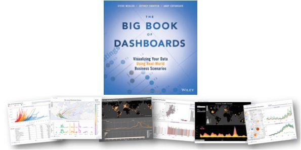
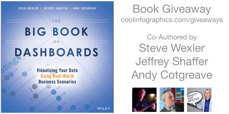
The Big Book of Dashboards is a fantastic new book release in 2017 co-authored by Steve Wexler, Jeffrey Shaffer, and Andy Cotgreave. Published by Wiley, the book is available in print and ebook. You can check it out here on Amazon!

The book starts with good data visualization design practices and then dives into 28 case studies of real dashboard designs in practice. The case studies are design tool agnostic, covering good dashboard designs from a variety of design tools. It doesn't matter what software you use, you will find inspiration and great examples in this book!

I met the co-authors at this year's Tapestry Conference, and interviewed them about the book below.

This month (June 2017) I'm giving away one copy to a lucky winner!  Register on the Giveaways Page by June 30th to be entered.


Who is the book intended for?

Steve Wexler: Anyone tasked with building or overseeing the development of business dashboards.


The three of you are in distant locations from each other. What was your process to collaborate on writing the book?

Steve Wexler: It wasn’t just the three of us!  While we were the authors, the book has 17 contributors and we would have web-sharing sessions with all of them so we could understand the rationale behind the dashboards.  There were also many cases where we would ask them to either defend their decisions or make some refinements.

In any case, we web-conferenced and relied very heavily on Slack to handle asynchronous collaboration.  The slack channels are massive (you should see all the discussions on the definition of the dashboard).

Andy Cotgreave: We also used Join Me for teleconferencing and Dropbox for file sharing. Looking back, it’s incredible how technology facilitates close collaboration across the world. 


How do you define what is a dashboard?

Steve Wexler: A dashboard is a visual display of data used to monitor conditions and / or facilitate understanding. Yes, it’s a broad definition.

Jeff Shaffer: There were long discussions on this one. We really considered Stephen Few’s definition, but picked apart terms like “single screen” and “monitored at a glance”. For example, does printing a dashboard and taking it into a meeting disqualify it from being called a “dashboard”? We think it’s still a dashboard and while it may not be used to monitor something in that instance, it does facilitate understanding. Another example is a “dashboard” that is presented on a tablet or phone where scrolling off a single screen is necessary. Technology, and screen size, is constantly changing, so while our definition is broad, I find it more accurate.


Why should dashboards be elegant or visually appealing?

Steve Wexler: I guess for the same reason that your want a computer, phone, appliance, etc., to be elegant or visually appealing.  For certain, the dashboard must first be functional (i.e., inform, enlighten, and engage) but the “engage” part is more likely if the experience with the dashboard is pleasant.

Andy Cotgreave: You need people to engage with a dashboard. Don Norman defines success according to three levels of processing: Visceral, Behavioural and Reflective. Each needs to succeed. The first response is Visceral - it’s an instant emotional reaction to whether you like something. It takes little effort to ensure the colours, fonts, layout of a dashboard is appealing, but it’s vital to get that visceral response right. The “functional” part comes next, in the behavioural level.


Do dashboards have a size limit? How large can they go?

Steve Wexler: They should be bigger than a bread box and smaller than the Empire State Building. Goodness, it depends on so many things -- the audience, the platform (desktop vs. tablet vs. mobile) and so on.

Looking at the 28 scenarios in the book, with the exception of the Financial Times Economy at a Glance dashboard, none of the desktop-based dashboard have any scrolling (many of the mobile-dashboard do provide for scrolling).  

As for the number of distinct charts on a dashboard the examples run from as few as one to around a dozen.

Interestingly, two of the examples that have a dozen or so charts are from Dundas, but because they are elegant and visually appealing you don’t feel overwhelmed by them.

Andy Cotgreave: Traditionally I’d have said they should fit on a single screen. But as mobile takes over, I think that is changing. The Financial Time Economies at a Glance dashboard is very very tall and designed for scrolling. It works extremely well on mobile. A starting rule of thumb would be to try to keep everything on one page.


How do you address the challenge of choosing the right type of chart for a given data set?

Steve Wexler: That is the raison d'être for the book! Given a particular predicament / scenario, and given the data you have, what is the chart or combination of charts that shine the most, brightest light on the subject?  That’s what we’re trying to do.

And very often that chart or combination of charts may not be what you expect.  Andy wrote a terrific chapter on visualizing time and shows there are so many cases where you don’t want to use a line chart.

Jeff Shaffer: It all starts what you are trying to show with the data. Presenting time is a great example. We have an entire chapter devoted to the different ways to show time, i.e. data over time. Typically a line chart would be a great way to show trend over time, but there are many other ways to visualize time.


What are the key mistakes people make in their dashboards?

Steve Wexler: Too much clutter and not enough clarity.  Plus we’ll often see people putting too much emphasis on decoration and not enough on information.

Jeff Shaffer: The misuse of color. People using color incorrectly or in an overwhelming way. We talk in depth about this in the opening chapter and throughout the book in many of the examples.


What advice would you give young professionals just getting started with visualizing data?

Steve Wexler: Seek feedback when building dashboards.  You need to meet with your audience, often, to make sure what you’re building actually helps the intended audience. 


What’s available for readers on the bigbookofdashboards.com site?

Steve Wexler: There are links to articles, podcasts, and workshops.  We’re also posted downloadable versions of many of the dashboards featured on the book.


Where can people follow all of you online?

Jeff Shaffer -- @highvizability, www.dataplusscience.com
Andy Cotgreave -- @acotgreave, gravyanecdote.com
Steve Wexler, @vizbizwiz, www.datarevelations.com


Are there any events coming up related to the book?

 Steve and Jeff are offering a workshop in Atlanta on June 14  and will be offering more workshops throughout the year (See http://bigbookofdashboards.com/workshops.html)

Andy, Jeff, and Steve will be offering a free webinar on how to build world-class business dashboards on June 21.  (See https://www.tableau.com/learn/webinars/big-book-of-dashboards)

We will all be at the Tableau Conference in Las Vegas, presenting sessions, and signing books!


Tuesday
Apr182017

Big Data Bootcamp in Dallas May 5-7

I'll be giving my talk "What is Good DataViz Design?" at the Big Data Bootcamp in Dallas, May 5-7, 2017 at the Irving Convention Center. There will be other fantastic speakers as well, including Barrret Clark, author of the Data Visualization Toolkit, which is this month's giveaway!

For anyone interested in attending the entire event, get $200 OFF your registration cost by using the discount code DFWDATAVIZ and this LINK. The discount is good for registrations until April 27th.

Thursday
Oct272016

9 Great DataViz & Infographics Tools with Education Discounts

Data visualization and data literacy are necessary life skills, and you should start developing them now! Whether you need to make a diagram for a Science project, a presentation for your History class, or a chart to solve that Math problem, you should start learning how to use data visualization tools while you’re in school. These tools are being used in classrooms from elementary school up through colleges and universities. While many online design tools offer free trials, these tools offer exclusive educational prices for students, teachers and educators to give them the means to more easily visualize information at a great price.

Here I share some of today’s most popular online data visualization and infographic tools, all offering educational prices. Because these are all online tools, they are all cross-platform, making them great for any computer a student may have; Windows, Mac or Linux. Follow the links to find the current education pricing deals!

I love that all of these online tools are helping to improve data literacy for students and educators all over the world! Which are you favorites? Any more online tools with education pricing plans for students and teachers that I missed?


Visme

Visme is an online tool used to visually present your ideas in the form of infographics, presentations, reports, and much more. Visme has a built-in charting tool gives you the power to easily transform your data into visual content and with their easy-to-use editor. Hundreds of fonts, millions of free images, and thousands of quality icons for use in your designs. Share your designs online with a direct link, post on social media, embed on a website, or download for offline use.

Contact for educational pricing: http://support.visme.co/


Infogram Education Pricing

Infogr.am

With Infogr.am, you have the power to make your data look its best. Users can easily create interactive charts and graphics that require zero coding. And to make sure your data is always up-to-date, you have the option to connect your chart to live sources like Google Sheets a Dropbox file, or a JSON feed. Educators can create a team account for an entire class.

Contact for educational pricing: https://infogr.am/education


Piktochart Education Pricing

Piktochart

Take your visual communication to the next level with Piktochart, an easy-to-use infographic maker. Create your charts by importing your data from a Microsoft Excel file or a Google spreadsheet. With a library of hundreds of professionally-designed templates, creating infographics, reports, posters, and presentations has never been easier. Educational pricing for individuals or whole classrooms.

Individual and classroom prices: https://piktochart.com/pricing/education/


Creately Education Pricing

Creately

With Creately, you can easily make beautiful diagrams in no time. Flow charts, mind maps, organization charts, Venn diagrams, Gantt charts, network diagrams and more. Thousands of ready-made subject-specific templates and over 40 types of diagrams with specialized shape sets are available to make sure your diagram looks its best. And real-time online collaboration allows you to work with fellow students.

Contact for educational pricing: http://creately.com/diagram-products#education


Venngage Education Pricing

Venngage

Venngage allows users to create infographics in just three easy steps: choose a template, add charts and visuals, and customize your design. In just minutes you can create a visual story in the form of posters, social media posts, and infographics. Post your final designs on social media, embed on websites, or download as an image or PDF file.

Register for a classroom Education account, includes 35 users: https://venngage.com/education-pricing/


Prezi Education Pricing

Prezi

Prezi is the tool for creating engaging and memorable presentations with the charting tool, editable images, and embedded videos. Give your presentations online or offline, using the library of templates as your starting point. Prezi presentations are built on an open canvas and spatial movement transitions that are unique and easy-to-use.  

Choose an educational pricing package: https://prezi.com/pricing/edu/


Lucidchart Education Pricing

Lucidchart

Lucidchart is an online diagramming tool for everyone. You  can create flow charts, Venn diagrams, mobile app mockups, network diagrams and more using the extensive shape libraries, or perform a Google image search right in the editor. You can even add a YouTube video to your diagram!

FREE accounts for students and teachers: https://www.lucidchart.com/pages/usecase/education


Easelly Education Pricing

Easel.ly

With over thousands of infographic templates to chose from, Easel.ly makes creating and sharing your visual ideas easy. The drag-and-drop interface helped Easel.ly win the Best Websites for Teaching and Learning Award from the American Association of School Librarians (AASL) in 2013. Create your infographic, and then publish online or download a high-resolution file for offline use. Check out their free ebook: How to Use Easel.ly in your Classroom (https://www.easel.ly/blog/infographicsforeducation)

Contact for educational pricing: https://www.easel.ly/contactus


Plotly Education Pricing

Plot.ly

Plot.ly is a higher-level, advanced data visualization platform that helps data science, engineering, and analytics students create create informative graphics using an open source visualization library and an online chart creation tool. With Plotly, users can easily import data, create charts, and share their findings by embedding them on a website, exporting them, or creating presentations and dashboards. Create technical visuals using tools and APIs for D3.js, Python, R, MATLAB, Excel and more.

Student pricing for Professional features: http://marketing.plot.ly/education.html


Article was reposted by The Huffington Post

Monday
Oct102016

5 Great TED Talks about DataViz

DataViz is a broad term that has been trending for years, so what exactly is DataViz, and why does it matter? DataViz (or data visualization) is simply the visual representation of data or information. For example, charts, maps, diagrams, infographics, icons and illustrations are all forms of data visualization. It is commonly understood that humans are visual creatures. We understand visual information faster than reading text, and we are more likely to remember visual information later when it can impact a decision or behavior. As the amount of data we generate continues to increase, we need more efficient ways to understand and communicate insights from the data, and this is where DataViz is very effective.

The world is changing, and the world of DataViz is changing. In this ever evolving world, one thing is constant, TED’s ability to understand the pulse of what’s next. This is no more apparent than when TED talk influencers focus on the world of dataviz. From DataViz guru David McCandles talk on The Beauty of Visualization to medical doctor and statistician Hans Rosling talk on The Best Stats You’ve Ever Seen, you can experience the depth and breadth in the world of DataViz.


David McCandless - The Beauty of Visualization

“Design is about solving problems and providing elegant solutions, and information design is about solving information problems.”

McCandless' repertoire of visualized data has ranged from politics and climate to pop music trends. But it’s not the actual graphics that present McCandless’ true brilliance. Rather, it’s his ability to discover new ways to combine data in a fresh and interesting way. In his TED Talk, he discusses his process of turning complex data into simple yet engaging graphics.

TED Talk: http://www.ted.com/talks/david_mccandless_the_beauty_of_data_visualization


Chris Jordan -  Turning Powerful Stats into Art

“That's what I'm trying to do with my work, is to take these numbers… and to translate them into a more universal visual language, that can be felt. Because my belief is, if we can feel these issues… then they'll matter to us more than they do now.”

Artist and photographer Chris Jordan has a passion for American consumption. He strives for unique visualizations of some of Western culture’s most unimaginable statistics, solidifying the phrase, “a picture is worth a thousand words.” In his speech, Jordan invites the audience into the inspiration and process behind some of his best work- including his powerful visualization of America’s annual incarceration rate.

TED Talk: https://www.ted.com/talks/chris_jordan_pictures_some_shocking_stats


Aaron Koblin - Visualizing Ourselves… With Crowd-Sourced Data

“Our lives are being driven by data, and the presentation of that data is an opportunity for us to make some amazing interfaces that tell great stories.”

From Johnny Cash’s final music video to animating the paths of every North American airline flight, Aaron Koblin’s work is all about fun. As more and more social data becomes available, Koblin discusses how he feels it’s his obligation to tell stories through visualizations. Standing by his belief that data makes us more human, Koblin shares how interface can be used as a powerful narrative device.

TED Talk: https://www.ted.com/talks/aaron_koblin 


Hans Rosling - The Best Stats You’ve Ever Seen

“We want to see how the world is changing. Why are we not using the data we have? Because the data is hidden down in the databases. And the public is there, and the Internet is there, but we have still not used it effectively.”

It’s guaranteed that you've never seen data presented like Hans Rosling presents it. His genius stems from his ability to transform development statistics into animations that make the information clear, intuitive, and playful. In this legendary TED Talk (the first of many TED Talks he has given), Rosling discusses the idea that making information more accessible has the potential to change the quality of the information itself.

TED Talk: https://www.ted.com/talks/hans_rosling_shows_the_best_stats_you_ve_ever_seen   


Jer Thorp - Make Data More Human

“I believe that this world of data is going to be transformative for society… By bringing the human element into this story, I think we can take it to tremendous places.”

Deeply inspired by science, Jer Thorp creates beautiful data visualizations to put abstract data into a human context. At TEDxVancouver, he shares some of his finest work, and delves deeper into why his art focuses on bringing big sets of data to life.

TED Talk: https://www.ted.com/talks/jer_thorp_make_data_more_human

Friday
Sep162016

Mapping the Disciplines of User Experience Design

Mapping the Disciplines of User Experience Design infographic

Mapping the Disciplines of User Experience Design is an uber-complex Venn Diagram. The original concept by Dan Saffer at KickerStudio was given a clean DataViz overhaul by Thomas Gläser who was with envis precisely at the time.

An infographic approach to visualize all players of the interactive field

. It shows the different areas and how they connect and overlap.

The diagram is based on the work of Dan Saffer

It's a couple years old, but all of the files were published on Github under Creative Commons 3.0 Attribution-ShareAlike so anyone can Adpapt or Improve the design going froward.

You can see the original concept from Dan Shaffer here:

Found on FastCoDesign

Monday
Aug082016

23 Reasons to Get Excited About Data (Free eBook)

23 Reasons to Get Excited About Data IBM eBook

The team at IBM Watson Analytics has released a free, new eBook 23 Reasons to Get Excited About Data that explores the latest trends, practical applications and predictions about big data. I'm honored to have been included in the book as an expert on data visualization, along with all of the other IBM Watson Analytics applications!

These days, everyone’s tossing around the term “big data.” The term is nothing new – businesses have been collecting and analyzing data since the 1950s, before the two words were ever even uttered. Take a look back in time and you’re likely to see someone laboriously poring over a sheaf of spreadsheets, manually going through row after row to identify trends and gain insights.

More people are doing more things – personally and professionally – with data, and best practices will continue to develop. Self-serve, more democratized data analytics will Get Bigger, Get Faster and Get Cloudier!

I participated in an IBM video series about big data and visualization that you can see HERE. Data visualization is such an important conponent for humans to the analyze data, discover insights and communicate our findings to others! I'm very passionate about helping people understand how important data visualization truly is! Here are a couple of the thoughts I contributed to the ebook:

Humans are visual creatures. We can process visual information extremely fast, and are 6.5 times more likely to remember visual information than text. These are incredibly important facts when you are trying to communicate data to others. Use data visualizations to help your audience understand your information, and remember it later when it could influence their decisions or behavior. - Randy Krum

Data visualization is a language of context. You dramatically improve comprehension of your data when you design a visualization that puts your data into context for the audience. This can be a series of data points over time, or comparing your data to reference data to give the audience the perspective of how your data fits into a bigger picture. Storytelling with data is more than designing a chart, it’s the art of communicating specific insights from your data. - Randy Krum

Are you doing everything you could with your data? The future of data, along with predictive analytics and data visualization, is very exciting! Grab the free ebook now!

23 Reasons to Get Excited About Data IBM eBook Randy Krum Quote

Tuesday
May172016

Even Major News Outlets Get DataViz Wrong


Data visualization can be the most powerful, inspiring, and effective tool of a storyteller—as long as it’s accurate. However, a visualization can go horribly wrong if the designer uses the design tool incorrectly or gets the math wrong.

All too often, the underlying data is correct, but the visualization doesn’t accurately represent the corresponding values. Most of the time, it’s safe to chalk up the false visualization to an honest mistake by the designer, because it’s actually easier than you think.

Take a bubble chart, for example. A great visualization method, but it’s a common source of flawed dataviz. The reason is that design software only allows scaling or width and height adjustments to size shapes. So designers, upon reviewing the data, will sometimes mistakenly scale a circle's diameter instead of the circle’s area. This, in turn, produces radically incorrect sizes. The approach has logic to it (to some degree), but it’s inherently wrong. What should instead be done takes a bit of geometry and a spreadsheet.

“Just think about it: if you tell a software tool to scale something 200 percent, it will make it twice as tall and twice as wide. Therefore, you aren’t doubling the size of your original circle. You’re making it four time larger.”

- The Truthful Art, Alberto Cairo (@albertocairo)

For a real-world example of this problem, take a look at CNN’s recent “ISIS goes global: 90 attacks in 21 countries have killed nearly 1,400 people,” an insightful article, serious topic, credible source with inaccurate data visualizations. Unsurprisingly, it’s a bubble chart at fault. Assuming the data gathered by CNN is accurate, the maps included in the article don’t match the data and are way off.

CNN ISIS Goes Global Incident Map Bad DataViz

Take a close look and the size key. The circle size for five incidents is clearly shown as five times the diameter of the circle for only one incident, which creates a circle for “5 incidents” that is actually 25 TIMES LARGER, not five times larger. This drastically over emphasizes the locations on the map for the Middle East! I’ve designed the correct sizes so you can see what the bubble sizes should be.

CNN ISIS Circles DataViz Key Corrected

“It’s key for data visualization designers to understand that we visually compare the sizes of objects based on the their area (not their height). Numerical values are one-dimensional, but objects on a page or screen are two-dimensional. This is where designers need to remember to use the math learned from high-school geometry class. If you didn’t do well in geometry, it’s time to take another look.”

- Cool Infographics, Randy Krum (@rtkrum)

Bubble charts are in no way the only kind of dataviz that lends itself to mishaps. In print, broadcast, and online, you’ll see a variety of charts incorrectly showing the data — pie charts not adding up to 100%, logo sizes that don’t match the data, lines of icons with a different quantity than the data, etc.

Inaccurate dataviz certainly doesn’t always happen by accident either. Creating deceptive visual context is an unethical tactic employed by researchers, companies and publications alike, typically to promote a persuasive argument. Differences can be blown out of proportion or hidden by changing the axis scale or ignoring relevant data.

Once you start looking at data visualizations as a critical thinking reader, you’ll start notice many charts that don’t match the data. Always look to make sure the designer accurately represented the information before you take any data visualization at face value.

Thursday
Apr282016

All 30,699 career shots by Kobe Bryant


The LA Times created a fantastic interactive data visualization of every shot taken by Kobe Bryant during his career. All 30,699 of them!

Kobe Bryant's 30,699th and final field goal came from 19 feet with 31 seconds left against the Utah Jazz. During his 20 years with the Lakers, he fired up more than 30,000 shots, including the regular season and playoffs.

Take a tour of key shots over his 20-year career, or explore the makes and misses over his long career on your own.

The data is sourced from stats.nba.com, and the visualization was build with leaflet and cartodb. The reader can hover over any specific dot to see the details of each shot. It's not obvious, but you can adjust the court image on the right to view the shots from the other end of the court. Color-coded for made and missed shots, you can also Tour the Data to see the most significant shots from his career, like his final shot:

Similar visualization style to the BallR visualization I posted about a few weeks ago.

For the serious fan, it's also available for purchase as a poster version for $59.95, which include more stats and visualizations from his career.

Found on FlowingData!