About
Randy Krum
President of InfoNewt.
Data Visualization and Infographic Design

Infographic Design

Infographics Design | Presentations
Consulting | Data Visualizations

DFW DataViz Meetup

Join the DFW Data Visualization and Infographics Meetup Group if you're in the Dallas/Fort Worth area!

Search the Cool Infographics site

Custom Search

Subscriptions:


Feedburner

The Cool Infographics® Gallery:

How to add the
Cool Infographics button to your:

Cool Infographics iOS icon

- iPhone
- iPad
- iPod Touch


Read on Flipboard for iPad and iPhone

Featured in the Tech & Science category

Flipboard icon

Twitter Feed
From the Bookstore

Caffeine Poster

The Caffeine Poster infographic

Entries in politics (59)

Tuesday
Sep042018

Extremely Detailed 2016 Election Map

The New York Times has published An Extremely Detailed Map of the 2016 Election, and it's fascinating to explore! 

Their full article, Political Bubbles and Hidden Diversity: Highlights From a Very Detailed Map of the 2016 Election, examines some of the more interesting patterns, insights and inconsistencies.

The election results most readers are familiar with are county maps like the ones we produce at The Times on election night. But votes are cast at a much finer unit of geography — in precincts, which may contain thousands of voters but in some cases contain only a handful. Our previous election maps contained results for about 3,100 counties; here we show results for more than 168,000 voting precincts.

The interactivity is really well done, made possible through the integration with MapBox, and you can zoom in to view the data down to the smallest voting precincts. Pop-up information will tell you the exact number of votes at the precinct level.

Here's an animated journey (accelerated) around the country to 14 major cities:

Friday
Jul202018

The UK's Brexit Options in the EuroZone Visualized

The team at Information Is Beautiful have visualized the different options available to the UK in EuroZones: The Brexit Landscape, and have been making updates as the situation evolves.

Brexit? The Eurozone? The European Economic Area? The European Free-Trade Area? The European Customs Union? Whaaat?

A graphic that hopefully clarifies the complex structure of the European Union and the UK’s various routes and options for Brexit.

UPDATE: 15th July 2018: The saga continues. The UK announces its ideas for a “common rulebook” and “facilitated customs arrangement”, effectively a ‘soft’ Brexit.
Hard Brexit ministers resign.

UPDATE 3rd July 2017: It’s getting complicated! Added 2 more Brexit routes. See the first version.
UPDATE 1st AUG 2017: Detailed UK opposition party Labour’s positions. Refined ‘Free Trade Brexit’ & typical negotiation times (from here). Clarified a key difference between EEA (good & services) & Customs Unions (just goods). Read a useful, clarifying article
UPDATE 28th AUG 2017: UK opposition party, Labour, has now consolidated under a “soft Brexit” position.


Wednesday
Aug092017

Landslide for the "Did Not Vote" Candidate in the 2016 Election!

From BrilliantMaps, this is the Did Not Vote Election Map, showing the magnitude if all voting-eligible adults that did not actively vote in the 2016 Presidential election. A Presidential candidate needs 270 Electoral College votes to win. The "Did Not Vote" candidate would have have gathered 41% of the total votes from the voting eligible population, and 471 votes from the Electoral College! A Landslide!

The map above shows what the 2016 US Presidential Election results would have been if votes not cast for Hillary, Trump or one of the third party candidates had gone to fictional candidate “Did Not Vote.”

 As a percentage of eligible voters, Clinton received 28.43% (65,845,063) of all votes compared to Trump’s 27.20% (62,980,160) and Did Not Vote’s 44.37%(102,731,399).

Total voter turnout was estimated to be 55.3% of the voting age population and 59.0% of the voting eligible population.

Map created using 270 To Win, based on reddit user Taillesskangaru’s posts here and updated here.

Disclaimer: The map above was accurate as of January 17th, 2017. Totals below were true at the time of writing but may no longer currently be accurate as additional votes and recounts are conducted.

Thanks to Mike Wirth for sharing on Facebook!

Friday
Oct142016

A House Divided: The Rise of Political Partisanship

The Rise of Partisanship in the House of Representatives is a video infographic showing network maps and animating their change over time. Business Insider published this great data visualization video earlier this year.


This 60-second animation shows how divided Congress has become over the last 60 years

It's news to no one that Congress has had a hard time passing legislation in recent years. Some have even asserted that partisanship in Washington has reached historic levels. But how do we put the current divide in perspective? A group of researchers recently tried to quantify and visualize House partisanship in a paper published in PLoS ONE.

Produced by Alex Kuzoian. Original visualization by Mauro Martino.

To understand what is being displayed:

  • Each dot represents a member of the U.S. House of Representatives
  • Connection lines represent when two members voted the same way
  • Connection line thickness represents how often they voted together during each 2-year period
  • Dot size based on the total number of connections
  • Color represents political party

A poster version of this design is also available on Mauro Martino's site:

Thanks to Sue Miller for sharing on Facebook!

Thursday
Aug252016

Examining the Real Cost of Donald Trump's Wall

Building Donald Trump's Wall infographic

Real Money has done the math and shared their findings in the infographic Examining the Real Cost of Donald Trump's Wall, designed by DesignBySoap. It appears that the actual cost of the wall would end up being 2-3 times more expensive than the publicly released estimate. Luckily, even many of his supporters do not believe he will build the wall. You can see the details of Trump's plan, as well as some statistics on how Americans feel about it in the infographic above.

Thanks to John for sending in the infographic!

Thursday
Jun202013

How to Create a Winning Email Marketing Campaign

How to Create a Winning Marketing Campaign infographic

Originally intended for the election year, VerticalResponse has created an infographic on How to Create a Winning Email Marketing Campaign

With over three billion email accounts open worldwide, numbers are showing that email marketing is a viable strategy to target and captivate potential customers. That number is expected to grow to a whopping 4.3 billion by 2016.

How do you make your email stand out from an inbox that receives an average of 112 emails per day? If stats citing click-through rates for 2011 are accurate, only 22 of those emails are opened, leaving the other 90 emails to become unopened, or worse, marked as spam (a four-letter word that strikes fear into the hearts of email marketers).

With election day coming up, we wanted to celebrate the occasion with a patriotic infographic on email marketing. From choosing the right “from” name to integrating your email with social networks, if email marketing has your vote, check out the infographic for five steps towards a winning email marketing campaign.

This is a good way to use an infographic as a visual explanation instead of a bullet list in text for a blog post.  It’s easier to share and includes the images to make it easier to understand.

They had some great data about the growing number of email accounts, but they didn’t include that in the infographic.  Any text description on the infographic landing page is usually lost when people share the infographic, so all of that information should be included in the infographics itself.

Thanks to Leigh for sending in the link!

Friday
Oct262012

A Visual History of the US House poster and interview

The Visual History of the United States House of Representatives infographic poster


Timeplots has launched a new infographic poster, The Visual History of the United States House of Representatives.  Available for purchase from the Timeplots site for $34.95.

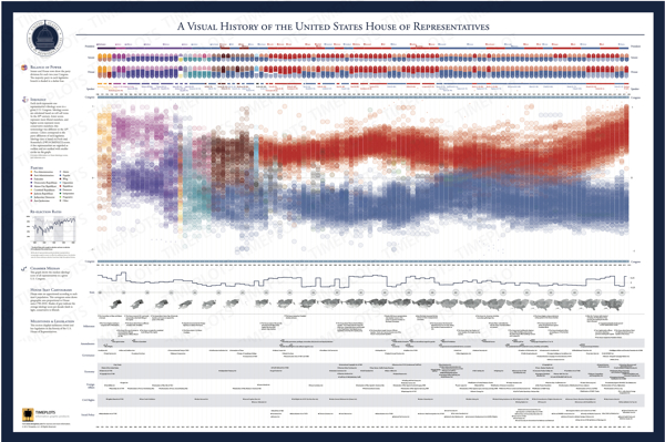
This large-scale (48″x32”) print is like nothing else available on the history of the U.S. House of Representatives. It depicts the progression in political ideology of every House seat from 1789 to 2010.

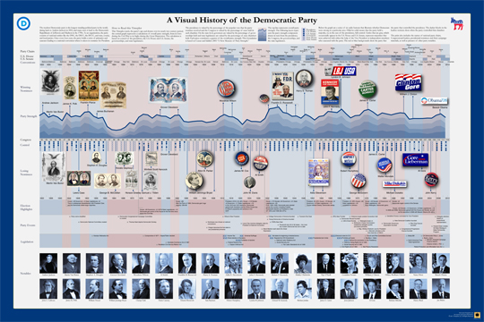
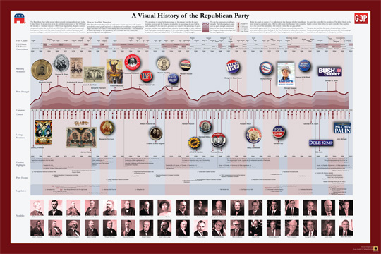
Other highlights include a timeline of over 100 major legislative enactments and significant developments in U.S. legislative history, and visual summaries of party control and ideological distribution of the House and Senate in each Congress. A Visual History of the U.S. House of Representatives is packed with information and is not intended to be absorbed at a glance, but rather visited and revisited over time. 

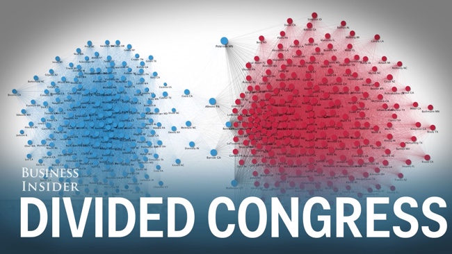
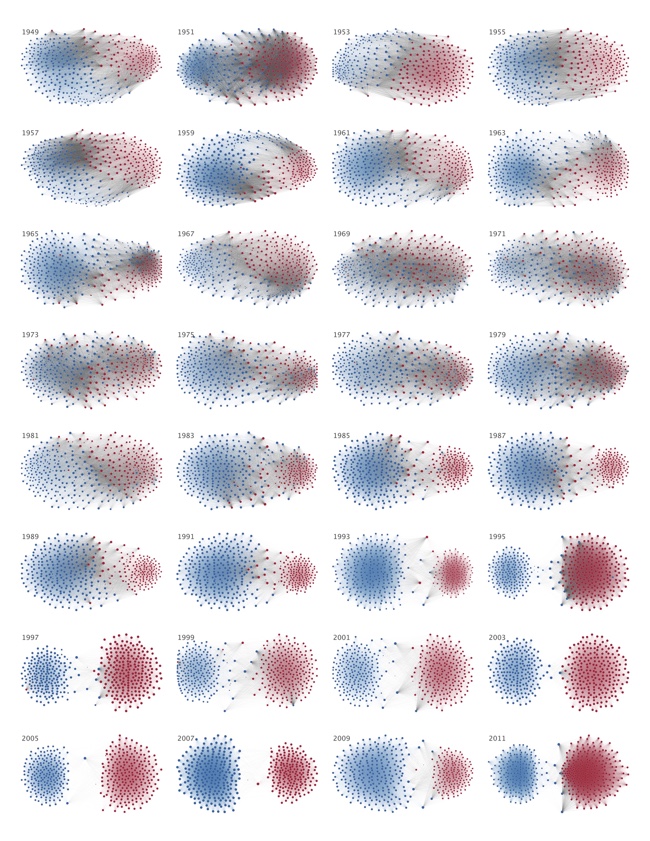
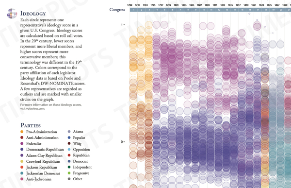
The infographic design visualizes the entire history from 1789-2013.  The main, central visualization is the unique highlight of this design.  Each representative is shown by a colored circle that matches their party affiliation, and placed along a vertical scale based on their ideology.  The circles are filled partially transparent, so you get the cumulative color effect when the circles overlap.  This creates a darker color when many representatives within any particular two-year Congress share a similar ideology, and you can see clear areas of concentration.  Fantastic new visualization method, and creates a beautiful image.

The Visual History of the United States House of Representatives infographic poster ideology

The poster also visualizes the balance of power for each two-year Congress by party, and compares it to the Senate and the President from the same time period.  Major milestones, amendments, governance issues, economy, foreign affairs, civil rights and social policy achievements are also plotted within the time periods they took place.

Nathaniel Pearlman, Founder and President of Timeplots, agreed to answer a few behind-the-scenes questions about designing the poster.

Cool Infographics: What software applications were used to help analyze the data and create the design?

Nathaniel Pearlman: So far we have programmed our information graphic prints in the R language and done the final design pass in Illustrator. I’m interested in hearing about other platforms to use for complex data and layout — especially other software applications that would allow us to create interactive and print versions from the same code base.

Cool Infographics: What’s the most interesting thing you learned from the data?

Nathaniel Pearlman: As with some of our other posters, I like the big picture: for me, the visual history of the U.S. house print shows the sweep of U.S. history — a marked contrast with the more journalistic, and immediate, take on the political and economic state of the nation that we are used to seeing in the news. You can clearly see the ebb and flow over time of ideological overlap between the parties – and how they are at such loggerheads now.

Cool Infographics: What was the hardest part behind designing the House poster?

Nathaniel Pearlman: For the House poster, it took us a while to come up with a compelling central graphic. We were looking for something visually arresting from a distance, but that captured the key patterns in the data.  I think we found that.  

Cool Infographics: What should we expect in the future from Timeplots?

Nathaniel Pearlman:  We have recently launched Graphicacy, a design group that helps other tell their own stories with print or interactive information graphics, especially involving large or complex data sets. For Timeplots, we are currently working on a history of U.S. State boundaries and a visual history of baseball. I am excited about both of them. I would also love to hear from your audience what they would like to see, and we are always looking for collaborators, if someone would like to work with us on a project that they care about. We’re open to new ideas!

Cool Infographics: Who is your primary audience for the posters?  Schools, businesses, political offices, individuals, etc.?

Nathaniel Pearlman: Our primary audience is those with true interest in the subject matter.  Our work is explanatory or educational art for smart people – and just about everyone has areas of intense interest, whether it is sports, entertainment, food, politics or finance.  Timeplots has done a lot with American politics so far, but we intend to move now into other areas as well.


Thursday
Oct112012

Obamacare: The Price of Socialized Medicine

Obamacare: The Price of Socialized Medicine infographic

The big news in the public health field in the U.S. is Obamacare. In response to its passing, Master of Public Health.org created The Price of Socialized Medicine: Obamacare’s Unconstitutionality by the Numbers infographic to give insight into how it will affect everyone.

The Supreme Court yesterday upheld the constitutionality of the Patient Protection and Affordable Care Act of 2010, in a landmark 5-4 decision. Unfortunately, they got it wrong. The PPACA, known colloquially as Obamacare, should have been struck down by the high court, as it is both unconstitutional and very costly:

  • Individual Mandate: Obamacare requires that all Americans carry health insurance or face an annual penalty. The federal government is effectively compelling individual citizens to enter a market, which is a clear violation of the Commerce Clause of the Constitution. The Supreme Court ruled that this was constitutionally valid as within Congress’ taxing power.
  • Medicaid Expansion: As the original Act is written, the PPACA would require states to expand Medicaid support or risk having their entire Medicaid federal funding cut off. This infringes on states’ rights. Fortunately, the Supreme Court did rule against these sanctions.

In response to the ruling, we have produced an infographic titled, “The Cost of Socialized Medicine: Obamacare’s Unconstitutionality by the Numbers”, which illustrates the folly of the PPACA as well as some of the costs that will be borne as a result.

Obviously, this design is promoting a specific opinion, but we’re here to discuss the infographic design itself.

  • The design outlines a really good step-by-step story top-to-bottom, and summarizes the data behind their point of view clearly
  • Good mix of illustrations and data visualization within each section.
  • In general, there’s WAY too much text in the design.  They want to be thorough in their explanations, but this much text will turn away many readers from reading the infographic at all.  Also, most of the text is too small to read on their landing page.  Less text would have been more effective, and allowed for a larger font.
  • The timeline looks like events along the heartbeat axis, but they aren’t spaced out appropriately to match their dates.
  • I like the icon representation of the justices.  Just enough detail to be recognizable.
  • Clear, easy to understand map of the costs to each state in the country map
  • The sizes of the circles in the Cost of Obamacare section are close, but not quite accurately representing the dollar figures shown.  Some are larger than they should be, and a couple are smaller.  Almost like the sizes were eye-balled instead of calculated mathematically.  Odd.
  • The states that have filed lawsuits would be easier to understand if the colored states were still placed within the map of the U.S.
  • Good list of sources
  • Need a copyright statement and the URL to the original infographic landing page for readers that find the infographic posted on the Internet to be able to find the original.

Thanks to Jimmy for sending in the link!

Monday
Sep122011

Client Infographic: Sudan, Bombing Everything That Moves


Sometimes, you get the opportunity to work on a project with a very serious topic and global relevance.  Recently, InfoNewt (my company) worked with Prof. Eric Reeves and designer Mike Wirth to design the infographic Bombing Everything That Moves (hosted on Eric’s site SudanBombing.org). 

For well over a decade the Government of Sudan—the National Islamic Front/National Congress Party (NIF/NCP) regime in Khartoum—has engaged in a sustained campaign of deliberate aerial military attacks on civilian and humanitarian targets in both South and North Sudan. These attacks have been only fitfully condemned by the international community, and no effective action has been taken to halt them.

Obviously, the topic is very political.  Prof. Reeves has published an extensive report and makes his Excel data file available to everyone on his site, so I’ll keep my comments focused on the unique challenges we faced when designing the infographic.

The data for this visualization is much different that the readily available Internet stats we see every day.  There is no database to query or reseach data file to purchase.  The exhaustive work Prof. Reeves has done to manually consolidate these confirmed bombing attack reports from U.N. observers, humanitarian aid personnel, radio reports and news reports is a massive, ongoing effort.

Even though the number of attacks in the report was known, most reports had unknown numbers for casualties and the number of bombs used in the attack.  Because of that, the bar chart-style visualization that is the center of the design only shows the number of attacks (a solid number we could work with) and separately shows the average numbers of bombs and casualties from the reports that had that information available.

Data transparency is always important.  As an infographic, the data sources have to be very transparent becuase you want your audience talking about the implications of your information, not challenging your credibility.

Eric Reeves is Professor of English Language and Literature at Smith College in Northampton, Massachusetts. He has spent the past twelve years working full-time as a Sudan researcher and analyst, publishing extensively both in the US and internationally. He has testified several times before the Congress, has lectured widely in academic settings, and has served as a consultant to a number of human rights and humanitarian organizations operating in Sudan.

Due to the nature of this infographic, please keep any comments on the infographic design itself.  Any inflamatory or political comments will be removed based on my judgement.

Wednesday
Feb162011

The Visual History of the Political Parties (infographic posters)


Timeplots.com has just released two new posters visualizing the history of the two major American political parties.  Zoomable images of both A Visual History of the Democratic Party and A Visual History of the Republican Party are available so you can see all of the detail online.  

Timeplots is also offering a discount to readers of Cool Infographics!  Enter the Coupon Code “CIG020311” to receive 10% off until 3/31/11!


Just like the other great posters from Timeplots.com, these are highly-detailed posters, loaded with a huge amount of data.  At its heart, they are timelines that show the overall party strength from 1832 (Democrats) or 1856 (Republicans) to the present.  Along the timeline additional information is included like the names of the national party chairs, Congressional leaders, city where the party convention was held, who were the winning and losing party nominees for President (along with campaign material), election highlights, party events, major legislation, as well as pictures of other party notables.

You get the point that there is a lot of history in there!

It places each party event in historical context, visualizing a remarkable range of party events, legislation, election results, and leadership to succinctly tell the story of the party. Narratives are displayed within the larger context of party strength by aggregating and annotating data on presidential elections, Congress, Governorships and State Legislatures. The Timeplot provides a new lens into American political history; it is not intended to be absorbed at a glance, but rather to be visited and revisited over time.

Posters are 36” x 24” and normal price without the discount is $29.95.

Posters should start shipping by 2/28.  Also, check the Timeplots.com site for student discounts on any of their posters.