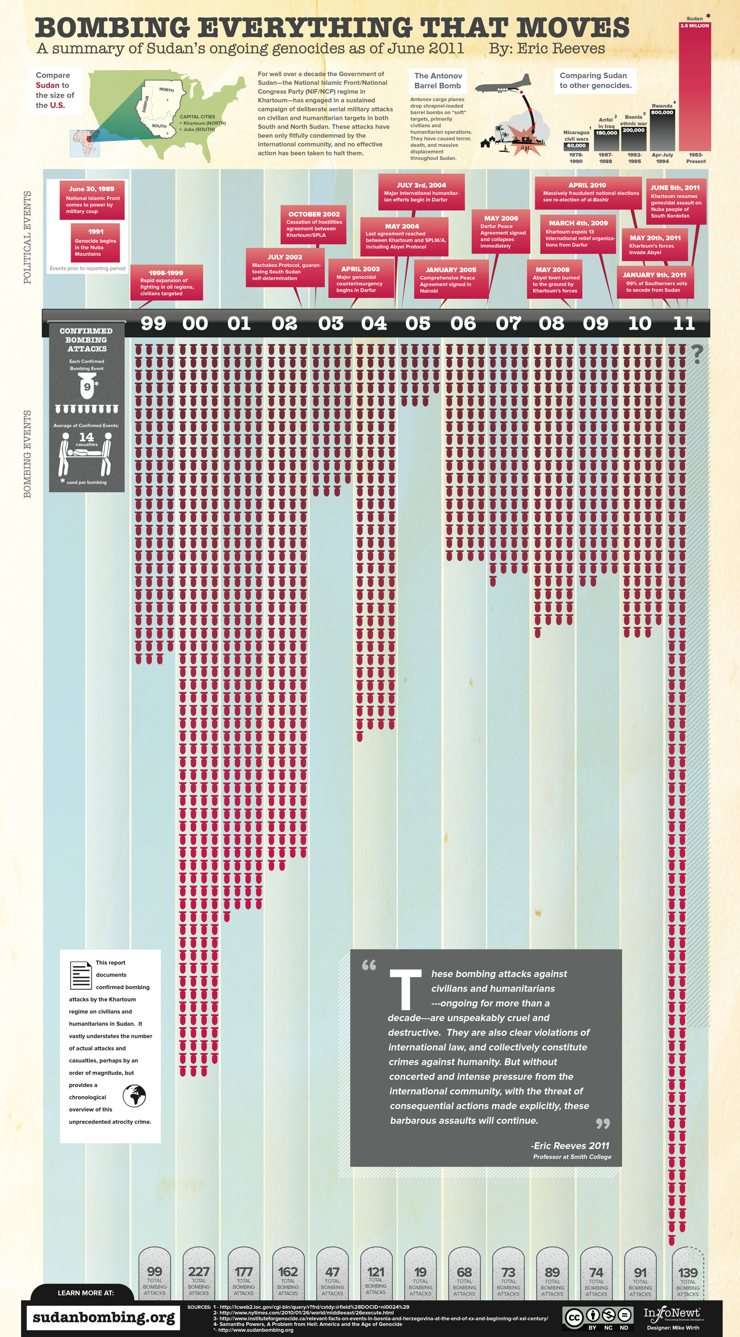
Client Infographic: Sudan, Bombing Everything That Moves
Sometimes, you get the opportunity to work on a project with a very serious topic and global relevance. Recently, InfoNewt (my company) worked with Prof. Eric Reeves and designer Mike Wirth to design the infographic Bombing Everything That Moves (hosted on Eric’s site SudanBombing.org).
For well over a decade the Government of Sudan—the National Islamic Front/National Congress Party (NIF/NCP) regime in Khartoum—has engaged in a sustained campaign of deliberate aerial military attacks on civilian and humanitarian targets in both South and North Sudan. These attacks have been only fitfully condemned by the international community, and no effective action has been taken to halt them.
Obviously, the topic is very political. Prof. Reeves has published an extensive report and makes his Excel data file available to everyone on his site, so I’ll keep my comments focused on the unique challenges we faced when designing the infographic.
The data for this visualization is much different that the readily available Internet stats we see every day. There is no database to query or reseach data file to purchase. The exhaustive work Prof. Reeves has done to manually consolidate these confirmed bombing attack reports from U.N. observers, humanitarian aid personnel, radio reports and news reports is a massive, ongoing effort.
Even though the number of attacks in the report was known, most reports had unknown numbers for casualties and the number of bombs used in the attack. Because of that, the bar chart-style visualization that is the center of the design only shows the number of attacks (a solid number we could work with) and separately shows the average numbers of bombs and casualties from the reports that had that information available.
Data transparency is always important. As an infographic, the data sources have to be very transparent becuase you want your audience talking about the implications of your information, not challenging your credibility.
Eric Reeves is Professor of English Language and Literature at Smith College in Northampton, Massachusetts. He has spent the past twelve years working full-time as a Sudan researcher and analyst, publishing extensively both in the US and internationally. He has testified several times before the Congress, has lectured widely in academic settings, and has served as a consultant to a number of human rights and humanitarian organizations operating in Sudan.
Due to the nature of this infographic, please keep any comments on the infographic design itself. Any inflamatory or political comments will be removed based on my judgement.


 Randy
Randy

Reader Comments (2)
I'd suggest keeping it at 4 columns and representing a possible increase differently (perhaps rows of bombings that fade out?).
Other than that it's a very informative infographic.
Displaying the 6-months of data from 2011 as only two columns of bomb icons was a conscious choice that we made during the design process. We were looking for ways to make it obvious that we only had data for the first half of the year, and that's why the second half only shows a question mark. It also shows, how frequent the bombing events have been compared to other years if the trend continues.
The reason we didn't show it as four bombs wide was that would imply a full year of data (especially if you view the infographic after 2011), and we knew that many readers wouldn't take the time to read any text that stated only partial year data. We also wanted to stay away from any projections or predictions, so no grayed-out bomb icons showing what the rest of the year "might be."
Any ideas on how it could have been designed differently?