About
Randy Krum
President of InfoNewt.
Data Visualization and Infographic Design

Infographic Design

Infographics Design | Presentations
Consulting | Data Visualizations

DFW DataViz Meetup

Join the DFW Data Visualization and Infographics Meetup Group if you're in the Dallas/Fort Worth area!

Search the Cool Infographics site

Custom Search

Subscriptions:


Feedburner

The Cool Infographics® Gallery:

How to add the
Cool Infographics button to your:

Cool Infographics iOS icon

- iPhone
- iPad
- iPod Touch


Read on Flipboard for iPad and iPhone

Featured in the Tech & Science category

Flipboard icon

Twitter Feed
From the Bookstore

Caffeine Poster

The Caffeine Poster infographic

Entries in apple (56)

Friday
Apr212017

534 Apple Products On One Giant Poster

534 Apple Products on One Giant Poster are included in The Insanely Great History of Apple 3.0 poster from Pop Chart Lab. It is the new and improved list of all Apple products ever made! You can buy a 28"x 42" print of the infographic here.

Newly refreshed with recent Apple products including the 9.7" iPad Pro and the iPhone SE, the world's most comprehensive mapping of Apple products is back just in time for Apple's 40th Anniversary--and is now printed on demand on beautiful exhibition canvas! This classic gallery of proprietary gadgets displays every computer, handheld, peripheral, software, and operating system released by Apple from 1976 onward. Over 500 items in all, chronicling how Apple has invented—and reinvented—insanely great products.

What's more, this canvas print comes bundled with laser-engraved System 6 Window Bar Rails for a throwback-OS mounting solution.

Found on Fast Company Design!

Thursday
Aug112016

Predicting iPhone Release Date With DataViz

Predicting iPhone Release Date With DataViz

With no inside knowledge, I predict the new Apple iPhone announcement on September 7th, with an actual release on the Friday of the following week, on September 16th.

How do I know this? I fully expect Apple to stay true to their pattern for releasing iPhones every September. They have consistently had an announcement on a Tuesday or Wednesday early in September, followed by the actual release on the following Friday. (I think 2015 was an anomaly with an extra week before shipments)

We humans are still the best visual pattern recognition machines on the planet. Visual patterns are also one of the best ways to communicate an insight or a finding from within the data. In this visual, I've visualized just the important dates that show a clear pattern, and simplified the design to just the relevant information. You don't need the whole calendar or all of Apple's products to communicate this one insight about iPhones.

Check out all of my visualization of all of Apple's Release Patterns!

Monday
Aug012016

The Battery Life of iPhones

iPhone Usability vs Battery Durability infographic

When your iPhone says 100% battery, what does it really mean? The Battery Life Of iPhones infographic from the iPhone Doctor gives the hours of battery life for each model of iPhone based on how you are using it.

The iPhone packs quite a punch in terms of design, features, functionality and overall sexiness. It’s not much of a stretch to call it practically indispensable for modern life. There is just one inconvenience of the iPhone that leaves many in the lurch all too often – reduced battery life.

Running out of battery just when you need to use your smartphone is a constant source of frustration and annoyance and quite possibly the bane of the modern world. A simple Google search for “how to increase iPhone battery life” brings up nearly 10 million hits. That’s a lot of concerned individuals.

Take a look to see what really drains your iPhone’s charge and find out what you can do to extend its battery life.

A little out of date since it's missing the latest 6S and 6S+, but I really like the visual simplicity of the design.

Thanks to Tony for sending in the link!

Thursday
Dec032015

Why Do People Uninstall Apps?

Why Do People Uninstall Apps? infogrphic

Why Do People Uninstall Apps? Well according to ITR, a company that specialises in translation and localization services for software applications, the most overwhelming reason for uninstalling apps is that they take up too much space! The infographic covers; how long we keep apps for, why apps are being uninstalled, the 8 most common design mistakes, and the difference between the Apple store and Google Play.

There are currently 1,000 apps being created and added to the app stores every day. With the continuous creation of apps, how long does a user actually keep an app for and what are their reasons for uninstalling?

Found on MarketingProfs

Thursday
Oct152015

iOS Version Release Date History

iOS Version Release Date History

iOS Version Release Date History is a data visualization that shows how long each version of iOS has gone through beta versions. I really like this visualization by Will Hains and posted on his site Thinky Bits.

The design is still a work-in-progress, and it still requires me to go in and edit it every time a new beta is released, but it’s much less work than it used to be. And now, with the magic of Google’s Charts API, it’s interactive as well. The chart is 100% generated by Javascript in the browser, producing slick SVG images on-the-fly.

The stacked bar style clearly shows how long each version spend in the development process, and specifically shows how fast iOS 9.1 is being pushed through the system.

You can also see how long each version was the official current version in the wild, and the general trend to update iOS more frequently in Will's 2nd chart.

iOS Final Version Release Date History

Thursday
Aug132015

Android Fragmentation Visualized

Android Fragmentation Visualized

This one data visualization can demonstrate why mobile responsive web design is important: Android Fragmentation Visualized. OpenSource published a number of data visualizations, both static and interactive, that show the tremendous market fragmentation in the market of Android phones and devices. This treemap shows market share by device.

Fragmentation is both a strength and weakness of the Android ecosystem, a headache for developers that also provides the basis for Android’s global reach. Android devices come in all shapes and sizes, with vastly different performance levels and screen sizes. Furthermore, there are many different versions of Android that are concurrently active at any one time, adding another level of fragmentation. What this means is that developing apps that work across the whole range of Android devices can be extremely challenging and time-consuming.

Despite the problems, fragmentation also has a great number of benefits – for both developers and users. The availability of cheap Android phones (rarely running the most recent version) means that they have a much greater global reach than iOS, so app developers have a wider audience to build for. Android is successfully filling the gap left behind by the decline of Nokia’s Symbian – and in this report we look at the different shape of fragmentation in countries from different economic positions, as a way of showing that fragmentation benefits Android much more than it hurts it. Android is now the dominant mobile operating system and this is because of fragmentation, not in spite of it.

Here you can see the same treemap reorganized into brand clusters, still sized by market share:

Android Fragmentation Visualized

The hundreds of different Android screen sizes can be seen in this visualization:

In contrast, Apple currently only has FIVE devices and screen sizes for phone and tablets, but uses the same screen resolution on a couple of them:

Found on Business Insider

Thursday
Mar122015

Apple Product Flops Timeline #Fail

Apple Fail infographic

Not all ideas are good ones. Apple has had it’s own fair share of ideas gone wrong. The Apple #Fail infographic from 7 Day Shop is a compiled list of Apple’s not so successful inventions.

Behind All Successes Are a Series of Failures

When starting your own business, you should be ready for some failures along the way – but the most successful firms learn from their mistakes. As author C.S Lewis once said: “Failures are finger posts on the road to achievement.”

Take Apple. The Cupertino-based tech giant may be known for the runaway success of the iPhone and Ipad. But as our Infographic shows, Steve Jobs suffered a number of epic fails over the years.

Some misses like the Apple III and the Macintosh Portable, almost put them out of business!

Never Giving Up

But they didn’t give up – even when their machines were tipped for success, but failed to appeal to the tech market. Take the PowerPC processor for example. It could be used as a games console and a word processor, but consumers weren’t bothered.

The same can be said for Apple’s U2 iPod and the U2 album giveaway “Songs of Innocence”. Both failed, but perhaps because of the music churned about by the Irish rock band more than the marketing idea.

And FireWire’s inability to displace the USB, encouraged Apple to develop the Lightning Cable, which is now the standard iPhone charger cable. Even some good ideas did catch on. What about the Power Mac G4 Cube? A shiny monitor in an acrylic glass enclosure with upgradeable video – surely, that had to work! The idea was magic in a box, or as Apple might say, it was genie-us. Consumers didn’t think so. It failed.

Thanks to Kunie for sending in the link!

Wednesday
Sep172014

The Evolution of iOS from iOS 1 - iOS 8

The Evolution of iOS from iOS 1 - iOS 8 infographic

On iOS 8 launch day, The Evolution of iOS from iOS 1- iOS 8 infographic is a timeline of the iOS systems from 7 Day Shop. The infographic shows the evolution of the home screen, app icons, and the most noteworthy features.

This week saw the launch of the highly anticipated iPhone 6, iPhone 6 Plus and iWatch. Apple also announced that iOS 8, the operating system that will run both of the new iPhones will be made available for download on September 9th, 2014.

In light of the evolutionary change of the iOS, we decided to dig a little deeper to the first ‘iPhone OS’ right through to it’s latest iteration iOS 8. It’s development both in the hardware and software front over just only 6 years is beyond remarkable.

We have charted the evolution of the home screen, app icons and the most noteworthy features of each iOS.

It’s a tall design with a lot of information, but the visuals help out tremendously.  There’s way too much text in this design, and they chose to make the font size too small to fit it all in.  For the new features added with each major upgrade I would remove the text descriptions, and just keep the titles.  Keep the design simple.

This is a good example of an informative infographic capitalizing on a hot trending topic. There’s no hard sales pitch or even a call-to-action. This makes people more willing to share the infographic, and 7DayShop.com just put their logo in the footer to claim credit and build their overall awareness and credibility. They should have included the URL link to the original infographic on their site to help readers find it. Especially on a design this big, because most blog and social shares will post a smaller thumbnail version.

Are the new features compelling you to upgrade to iOS 8? Did you order the new iPhone 6? Let me know in the comments!

Thanks to Kunie for sending in the link!

Wednesday
Mar052014

Hungry Tech Giants

Hungry Tech Giants Interactive Infographic

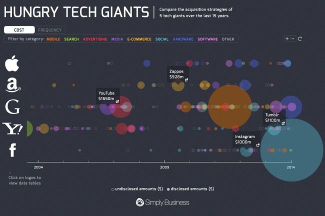
Hungry Tech Giants is a cool infographic from Simply Business that is both zoomable and interactive!  To put them into context, the design visualizes 15 years of tech company acquisitions by Apple, Google, Yahoo, Amazon, And Facebook.

2013 was a busy year for tech acquisitions.

With competition in the tech space heating up, Apple, Amazon, Google, Yahoo, and Facebook collectively executed 65 acquisitions in 2013 alone.

Yahoo was the biggest acquirer of 2013, buying a total of 25 companies following the hiring of its new CEO, Marissa Meyer.

Although Meyer is best known for her acquisition of Tumblr, the majority of her deals have bought engineering talent in an effort to build Yahoo as a serious challenger to Google.

Apple also had their biggest ever year for acquisitions in 2013, with ten purchases in total.

To see all of the acquisitions in detail, please visit our interactive microsite.

Each acquisition is appropriately placed on the timeline, and shown as a circle sized to match the total acquisition price.  Solid circles shown known prices, and open circles are not sized because the acquisition amount was never released publicly.  The circles are also color-coded to represent the different categories.

The interactivity allows you to select which categories to show, and when you hover over any particular acquisition, the acquired company name is shown with a link to the press release or news story announcing the acquisition.

The zooming controls allow you to adjust the date range shown, which helps identify many of the overlapping circles.  Clicking on the company logos on the left also brings up the data table which shows all of the known values, dates and includes the links to the press releases.  A very good way to establish credibility and make your data sources transparent.

The overall design is meant to be very detailed and allow the audience to dig in and explore the data.  At the macro level, the infographic clearly puts Facebook’s $19B acquisition of WhatsApp into context as the largest tech acquisition of all time!

Found on TechCrunch and Cult of Mac!

Friday
Nov152013

Two Years Without Steve Jobs: Has Apple Crumbled?

Two Years Without Steve Jobs: Has Apple Crumbled? infographic

Has Apple Crumbled? is an infographic from WhoIsHostingThis.com that takes a close look at the business and financial results of the last couple of years under Tim Cook’s leadership.

With the passing of Steve Jobs in 2011, many tech industry experts were quick to predict that his company, Apple, Inc., would soon falter without its charismatic founder at the helm. Yet in the years since Jobs’ successor, Tim Cook, has taken the wheel, Apple has not only continued on, but flourished.

The design starts off well, but gets lazy towards the bottom with a number of statistics shown in text only, and not visualized.  Readers will perceive these values as less important and visually skim right over them.  With a mix of visualized data and text only data, the text only values are perceived as secondary information and often ignored.

I really like the character illustrations. They are minimal, but still easily recognizable.  The same goes for the product icons.  Minimal but easily recognizable.

The footer does a good job with sources and the company logo, but should have also included the URL link back to the original infographic landing page so readers can find the full-size original version.

Found on MacTrast.com