About
Randy Krum
President of InfoNewt.
Data Visualization and Infographic Design

Infographic Design

Infographics Design | Presentations
Consulting | Data Visualizations

DFW DataViz Meetup

Join the DFW Data Visualization and Infographics Meetup Group if you're in the Dallas/Fort Worth area!

Search the Cool Infographics site

Custom Search

Subscriptions:


Feedburner

The Cool Infographics® Gallery:

How to add the
Cool Infographics button to your:

Cool Infographics iOS icon

- iPhone
- iPad
- iPod Touch


Read on Flipboard for iPad and iPhone

Featured in the Tech & Science category

Flipboard icon

Twitter Feed
From the Bookstore

Caffeine Poster

The Caffeine Poster infographic

Entries in apple (56)

Monday
Feb152010

My Digital Life 2.0: A Consumer Gadget Map

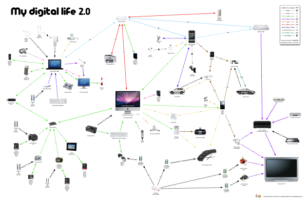
Presenting My Digital Life 2.0!  I’ve significantly updated the My Digital Life infographic I designed last year.  In addition to including many more gadgets and accessories in the graphic, I changed the connection lines to indicate either a constant or occasional connection.  The line arrows also indicate the direction of information flow (sometimes one-way, sometimes both ways).  You can see the high-resolution images on Flickr by clicking on the images.
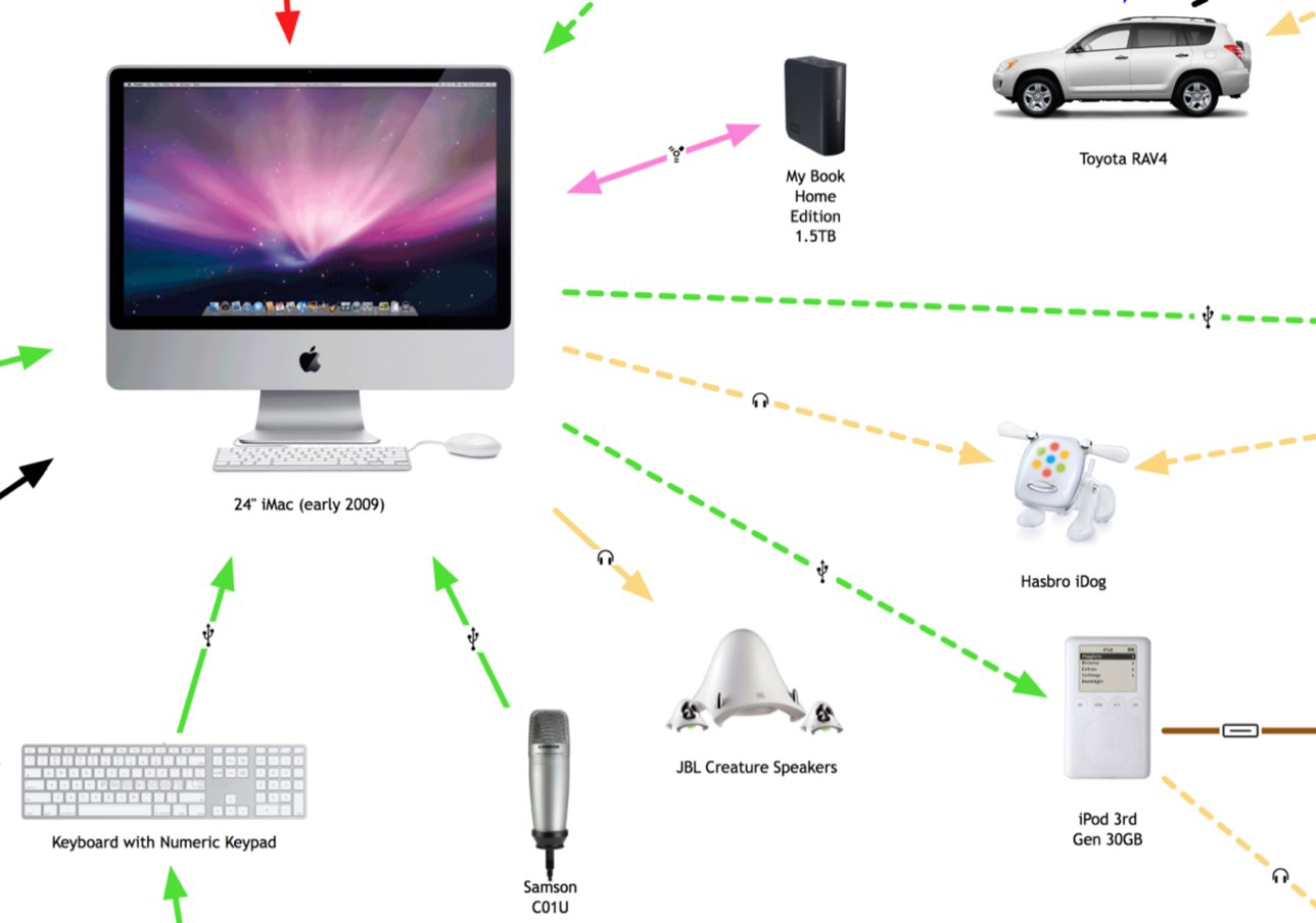


The infographic highlights many of the decisions a consumer has to make with each new gadget they buy.

  • What kind of batteries should I use?
  • How much and what kind of memory will I need?
  • How do I connect to my existing gadgets and computers?
  • How will it work in my car?
  • Do I have an available connection?
  • Where can I add a new gadget (like a new hard drive)?

For the purpose of Product Development and Marketing, this is a fantastic way to map out the experiences a consumer faces and how new products will fit into their life.  For example, if you were at a company designing a new consumer electronic gadget how would your product fit into your target consumer’s life?  What decisions would they have to make about your product?  Is it easy for them to understand if your new product will work with their existing setup?

Even if you’re only a headphone manufacturer, it’s incredibly important to understand the whole consumer experience.


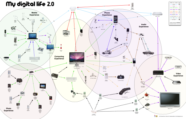
You’ll notice that the map began to form natural groupings that I call experience zones.  Here’s a modified version that highlights six specific areas of experience: video, audio, phone, photos, computing and mobile.  From an average consumer perspective, I know I’m missing two potential additional areas: Gaming and Reading.  I don’t own a gaming console (Xbox or Wii) and I don’t own an e-reader (Amazon Kindle or Sony Reader).

Since I’m a technology geek, I already understand how all of these connections work…in my head.  I’m the one who set them up and I use them every day.  However, imagine your parents or grandparents trying to understand all of these connections, and that doesn’t include the software communication between many of these gadgets.
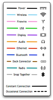
I’ve added a few new types of connections, and included the different line types in the legend.  I also took a few liberties with the connection types.  “Snap Together” indicates any type of physical connection, like the Ear Jams snapping onto my Apple Earbuds and also the iPhone snapping into the car mount.  I left the camera memory cards as USB connections without getting into any more detail of the inner connections in the cameras.  The legend is not truly necessary because in true Tufte form, I included the connection icons in each of the connection lines, but I decided to leave the legend in to identify any icons that people aren’t familiar with.

The biggest challenge in designing the infographic, was arranging everything so that none of the lines crossed.  To make this happen, I ultimately had to skip a couple connections.  I have used the Etymotics earbuds with the MacBook occasionally, but that connection line would have been horribly ugly, crossing the entire graphic.

Saturday
Dec122009

My Digital Life - personal infographic


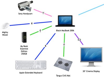
My Digital Life, is an quick infographic by me!  A mindmap or network map of the digital products in my life, and how they all interconnect. Each connection is color-coded by the connection type (USB, wireless, ethernet, etc.) including its respective standard icon.  High-res version is on Flickr.

This started as a simple sketch to help me determine how to add a new external hard drive I got on Black Friday, but it quickly became much more fun to see how far out I could push the network.  I already know of some more that I want to add, so someday there may be a 2.0 version.  Apparently, I could use an IT manager at home.


I did ignore some differences within the connection types to keep this fairly simple.  I don't distinguish between USB 1.1 and USB 2.0 connections.  I use "Display" as a connection type, but its a DVI connection for the MacBook, a HDMI connection from the AppleTV and a composite connection from the DVD player.  I also show only one "Wireless" connection, but I know that the iPhone only uses 802.11g and the laptop uses 802.11n.

I did this using OmniGraffle, with a little help from Pixelmator and Keynote to clean up the images.

Wednesday
Aug122009

Mac OS X Snow Leopard Upgrade Chart


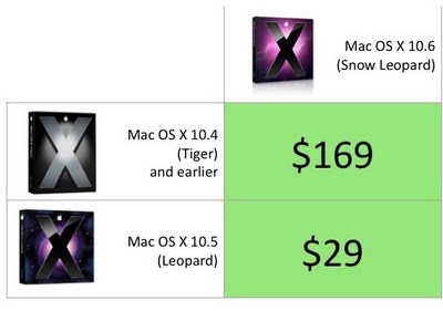
In contrast here's my version of the Mac OS X Snow Leopard upgrade chart.  The comparison to the Mac was inevitable, and I couldn't find that anyone else had created this chart yet.

The $169 price for users that don't have Leopard also include iLife and iWork.

Tuesday
Apr142009

Apple's 1 Billion Apps live countdown


Apple is using a live countdown timer for is 1 Billion App Countdown promotion.  It's almost real-time, and is a step better than when they did the 1 Billion Song Download a few years ago.

At the rate its going, they'll reach a billion before the end of the week!

Download an app and you’ll automatically get the chance to win a $10,000 iTunes Gift Card, an iPod touch, a Time Capsule, and a MacBook Pro.
 Also, there a link to enter the contest without buying an App.  You can enter 25 times a day.

Saturday
Jan032009

Exploded iPhone T-Shirt


I just caught this over on Daring Fireball.  You can buy this t-shirt at www.explodedphone.com or you can see many more versions on CafePress.

Monday
Dec292008

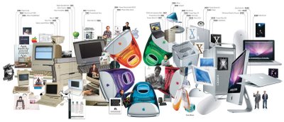
25 Years of Mac: Timeline


From Wired.com.  I like that this History of Apple isn't your traditional timeline.  It does go from left to right, but the images are mixed and overlapping.  It show a clear progression from beige to colors to white to silver.  The style also invites the viewer in to explore the details hidden in the image and find the extra images that specifically tagged with a date across the top.

Wednesday
Dec102008

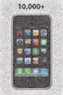
10,000+ iPhone Apps Mosaic


To help Apple celebrate 10,000 iPhone apps in the iTunes App Store, TapTapTap created this iPhone mosaic using icons from the available apps.

Check out the TapTapTap blog.

Here is the high-resolution image.

World of Apple is offering the image as a poster for $50

Monday
Nov032008

Where your Apple Tax goes...


A little humor Monday morning from the brilliant minds behind The Joy of Tech.  Click the link to see the full version.

Wednesday
Jul162008

iPhone 3G under the hood

Will all of the hype around the launch of the iPhone 3G, I wanted to share a simple infographic showing the circuitboard from inside one of the new phones.  It clearly identifies each major component and also adds what that compnent does inside the phone.  The graphic really adds a significant amount of depth to the article.

The full article is from TechOnline.

Monday
Jul072008

The iPhone Timeline

From iPhoneGold.org, is a cool little iPhone timeline.  I couldn't find an author to credit, just the website.

Found on digg.com