About
DFW DataViz Meetup
Join the DFW Data Visualization and Infographics Meetup Group if you're in the Dallas/Fort Worth area!
Search the Cool Infographics site

Custom Search
Subscriptions:
The Cool Infographics® Gallery:
How to add the
Cool Infographics button to your:
- iPhone
- iPad
- iPod Touch
Read on Flipboard for iPad and iPhone
Featured in the Tech & Science category
Tag Cloud
ad airplane America animals animated apple Apps art auto beer blog body book brand bubble budget business caffeine Calendar campaign cars CEO Characters chart charts Christmas circles client clothes color colors comic companies comparison computers conference connections contest Cooking cool corporations Data data visualization DataViz death design Digg discount drinks earth education election email emissions employment energy environment executive experience explanation Facebook flowchart food future gadgets games Giveaway Google government Guest Halloween health history holiday how-to humor illustration infection Infographic infographics InfoNewt innovation interactive interface internet interview iPad iphone jobs LinkedIN live logo map Marketing medical mind map mobile money movies music network news oil online periodic table personal Phone photo planets politics pollution population poster presentation presidential process real time recipes relative research safety scale schools science search SEO size social social media software space spending sports starship startup statistics subway sun survey taxes technology TED Television time timeline travel treemap twitter UK USA video visual Visualization war water wealth weather web Wikipedia wine words world YouTube
From the Bookstore
Copyright © 2007-2019, Randy Krum. All rights reserved.


 Randy
Randy

Reader Comments (6)
If Microsoft were to have to be ashamed of anything, it's having multiple versions of their OS in the first place; Which, absolutely, is frustrating beyond belief and is the root cause of having such confusing (well, to some - we're not all techies) charts.
Although I agree that the first chart is overkill on information, you could otherwise argue that the ZD Net created version might have a user look on the left for their current product, spot e.g. the Home Premium version, and realize they can do an in-place upgrade. Case closed. But, oops, that's not true because they're running a 32bit Vista Home Premium and were hoping to upgrade to a 64bit Seven Home Premium; they have to look completely elsewhere in the chart to figure that out.
Also.. what happened to Vista Starter in that chart?
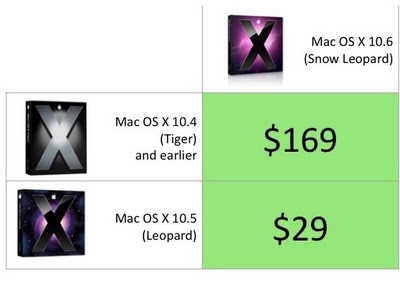
But getting back to chart cleanliness in general - well, OS X is OS X.. there's no multiple editions, therefore the upgrade chart does become a lot simpler. I suspect it could be even simpler if Apple were to allow upgrades from -any- previous OS X version for a single price. Shouldn't Apple be ashamed of charging $169 for older version upgrades? I realize the upgrade would include iLife and iWork, but those should be separately offered to keep the upgrade price down in the first place; perhaps to a single $49 charge.. that would reduce your chart to a single row.
http://www.cultofmac.com/windows-7-upgrades-chart-makes-brain-hurt-we-offer-the-mac-equivalent/14186" rel="nofollow">Windows 7 Upgrades Chart Makes Brain Hurt; We Offer the Mac Equivalent
The upgrade chart is missing a line for the PPC.
"From PPC" upgrade line should read "I can't do that Dave."
I have both PPC and Intel Macs, and I am not amused.
I figure I do a clean install every year or two anyway so when windows 7 debuts I'm planning on buying a new 1TB hard drive and installing on a clean drive.
Thanks Stephen. The only issue I have with that chart is that it leaves off the prices. But you're right, there are other ones out there.
cjensen, The chart should include that PPC Macs have a dead end with OS X Leopard 10.5.
very nice blog