About
Randy Krum
President of InfoNewt.
Data Visualization and Infographic Design

Infographic Design

Infographics Design | Presentations
Consulting | Data Visualizations

DFW DataViz Meetup

Join the DFW Data Visualization and Infographics Meetup Group if you're in the Dallas/Fort Worth area!

Search the Cool Infographics site

Custom Search

Subscriptions:


Feedburner

The Cool Infographics® Gallery:

How to add the
Cool Infographics button to your:

Cool Infographics iOS icon

- iPhone
- iPad
- iPod Touch


Read on Flipboard for iPad and iPhone

Featured in the Tech & Science category

Flipboard icon

Twitter Feed
From the Bookstore

Caffeine Poster

The Caffeine Poster infographic

Entries in America (10)

Tuesday
Aug212018

How America Uses its Land

Here's How America Uses its Land infographic

America's land use is very diverse and scattered throughout the states. By using surveys, satellite images and categorizations the U.S. Department of Agriculture divides the U.S. into six major types of land. Bloomberg took that data, and created the How America Uses its Land infographics. The infographics use the map to show both how much of the country is made up of a certain land use, and where the majority of it is located.

Using surveys, satellite images and categorizations from various government agencies, the U.S. Department of Agriculture divides the U.S. into six major types of land. The data can’t be pinpointed to a city block—each square on the map represents 250,000 acres of land. But piecing the data together state-by-state can give a general sense of how U.S. land is used.

Gathered together, cropland would take up more than a fifth of the 48 contiguous states. Pasture and rangeland would cover most of the Western U.S., and all of the country’s cities and towns would fit neatly in the Northeast.


Found on https://5wvelascoblog.com

Friday
May052017

Six Maps that Show America’s Infrastructure

Tim Meko, a graphic reported at the Washington Post, designs some fantastic data visualizations. Six Maps that Show the Anatomy of America’s Vast Infrastructure is a great visual exploration of what makes America run. Check out the original article for more explanation of each map and more visual details.

Found on FlowingData

Monday
Mar202017

What 770,000 Tubes of Saliva Reveal About America

Yep, it's a Map of America’s Diversity using the genetic data from the analysis of saliva samples. Ancestry.com gathed the data from 770,000 salva samples.

This unique map shows this country’s great migrations, the echoes of our pioneer ancestors in our genes today.

Each color on the map represents a present-day community of individuals tied together through their genetics. And the location of the dots show where each community’s ancestors lived over generations.

People moved east to west, less so north to south. See how the differently colored clusters form distinct horizontal bands? The red, blue, purple, and green dots fan out from right to left. This pattern means DNA confirms the descendants of immigrants to the East Coast moved westward.

While people certainly moved back and forth from the north to south as well, if people had moved in the same volume from north to south, you’d see the bands fanning downward and not just from east to west.

But instead you can see powerful forces pushed people westward, even showing that the Mason-Dixon line separates some of the clusters.

Catherine Ball, chief scientific officer at Ancestry and the leader of the study, commented to Wired“I have to admit I was surprised by that. This political boundary had the same effect as what you’d expect from a huge desert or mountain range.”

And not only can you clearly see the migration patterns westward, you can also see distinct communities of immigrants and their descendants.

Maps were generated with the maps R package using data from the Natural Earth Project (1:50 m world map, version 2.0). These data are made available in the public domain (Creative Commons CC0).

Also from the original study:


Thursday
Jul072016

Which Foods Are Really Healthy?

Is Sushi ‘Healthy’? What About Granola? Where Americans and Nutritionists Disagree

After surveying nutritionists and Americans, the NY Times has plotted the results, showing some surprising disagreements. Is Sushi ‘Healthy’? What About Granola? Where Americans and Nutritionists Disagree charts the differences in opinion, but where do you stand?

We surveyed Americans and a panel of nutrition experts about which foods they thought were good or bad for you.

Is popcorn good for you? What about pizza, orange juice or sushi? Or frozen yogurt, pork chops or quinoa?

Which foods are healthy? In principle, it’s a simple enough question, and a person who wishes to eat more healthily should reasonably expect to know which foods to choose at the supermarket and which to avoid.

Unfortunately, the answer is anything but simple.

The results suggest a surprising diversity of opinion, even among experts. Yes, some foods, like kale, apples and oatmeal, are considered “healthy” by nearly everyone. And some, like soda, french fries and chocolate chip cookies, are not. But in between, some foods appear to benefit from a positive public perception, while others befuddle the public and experts alike. (We’re looking at you, butter.)

They also created some supporting graphs that highlight the major differences. This one shows the largest differences where many more nutrition experts consider these foods to be healthy than the general public.

Foods considered healthier by experts than by the publicThanks to Karen for sharing on Facebook!

Friday
May132016

American Slavery Maps

American Slavery Maps Infographic

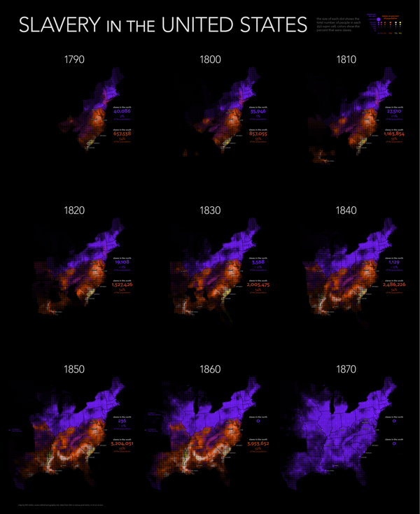
Bill Rankin at Radical Cartography has created nine uniform grid maps of American Slavery covering each decade from 1790 to 1870. I've combined them into the animated GIF you see above. Bill took a new approach in analyzing the historical data by 250 square mile units instead of the traditional data by county.

The gradual decline of slavery in the north was matched by its explosive expansion in the south, especially with the transition from the longstanding slave areas along the Atlantic coast to the new cotton plantations of the Lower South. And although the Civil War by no means ended the struggle for racial equality, it marked a dramatic turning point; antebellum slavery was a robust institution that showed no signs of decline.

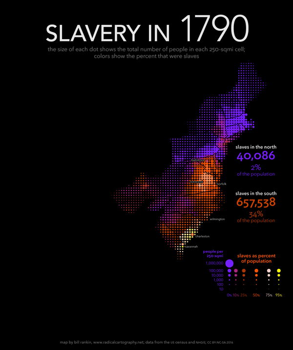
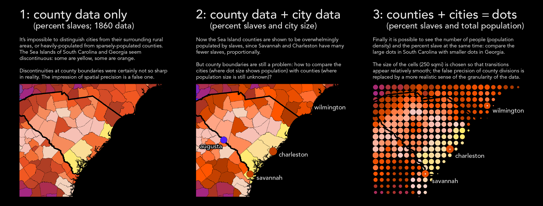
Mapping slavery presents a number of difficult problems. The vast majority of maps — both old and new — use the county as the unit of analysis. But visually, it is tough to compare small and large counties; the constant reorganization of boundaries in the west means that comparisons across decades are tricky, too. And like all maps that shade large areas using a single color, typical maps of slavery make it impossible to see population density and demographic breakdown at the same time. (Should a county with 10,000 people and 1,000 slaves appear the same as one that has 100 people and 10 slaves?)

My maps confront these problems in two ways. First, I smash the visual tyranny of county boundaries by using a uniform grid of dots. The size of each dot shows the total population in each 250-sqmi cell, and the color shows the percent that were slaves. But just as important, I've also combined the usual county data with historical data for more than 150 cities and towns. Cities usually had fewer slaves, proportionally, than their surrounding counties, but this is invisible on standard maps. Adding this data shows the overwhelming predominance of slaves along the South Carolina coast, in contrast to Charleston; it also shows how distinctive New Orleans was from other southern cities. These techniques don't solve all problems (especially in sparsely populated areas), but they substantially refocus the visual argument of the maps — away from arbitrary jurisdictions and toward human beings.

For a graphic explanation of this technique, see here.

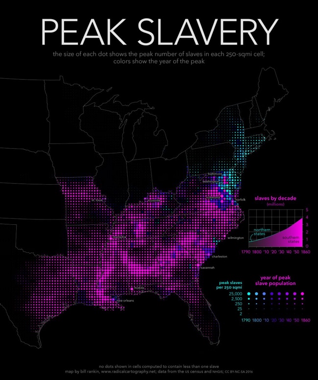
I appreciate him explaining his map technique! Each decade is a separate high-resolution map image, but Bill also created a fantastic combined map showing the highest Peak Slavery levels of slavery throughout the entire time period.

The bottom map shows the peak number of slaves in each area, along with the year when slavery peaked. Except in Delaware, Maryland, and eastern Virginia, slavery in the south was only headed in one direction: up. Cartographically, this map offers a temporal analysis without relying on a series of snapshots (either a slideshow or an animation), and it makes it clear that a static map is perfectly capable of representing a dynamic historical process.

American Slavery Peak Map


Additionally, you can download a high-resolution poster version showing all nine decades:

American Slavery Maps Poster


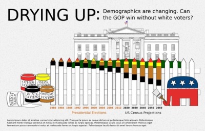
 Found on FlowingData and CityLab

Friday
May032013

Subways of North America

Subways of North America infographic

Now this is truly meta.  A subway map visualization of all the Subways of North America from Randall Monroe of xkcd.com.

For the pedantic rail enthusiasts, the definition of a subway used here is, with some caveats, “a network containing high capacity grade-separated passenger rail transit lines which run frequently, serve an urban core, and are underground or elevated for at least part of their downtown route.” For the rest of you, the definition is “an underground train in a city.”

About one in three subways stops in North America are in NYC

Another great design from Randall!

Wednesday
Mar132013

Beautiful Animated Wind Maps

The static image above doesn’t do these maps justice.  Go see the Wind Map on the Hint.fm site to truly appreciate the design work from artists Fernanda Viégas and Martin Wattenberg.

An invisible, ancient source of energy surrounds us—energy that powered the first explorations of the world, and that may be a key to the future. This map shows you the delicate tracery of wind flowing over the US. 

The animation is mezmerizing, and the interactive piece allows you to click-to-zoom in closer to any part of the map to see much more detail in a specific region.  The main page shows the map based on the most current weather information, but the Gallery page has some snapshots linked to specific points in time (like Hurricane Sandy).  I love that even the speed legend on the side is animated!

You can also buy a poster version as an art print.

Thanks to Jeff Jarvis for sharing this on Google+!

Monday
Mar112013

Wealth Inequality in America

The Wealth Inequality in America infographic video was posted on YouTube back in November 2012.  The video is a good example of what the best infographic designs accomplish: Make the complex understandable.  

Infographics on the distribution of wealth in America, highlighting both the inequality and the difference between our perception of inequality and the actual numbers. The reality is often not what we think it is.

The data visualization in the video is very powerful and effective.  It takes the huge numbers that our brains have trouble processing, and visualizes them in a way that we can understand.  Comparing numbers puts them into context for the viewer, and comparing the different fifths of the population works very well in this instance.

The data sources are clearly listed at the end of the video, and they are even made available as clickable links in the video description on YouTube (which is very helpful).  This helps the credibility of the video tremendously.  Not many viewers (4,336,254 views as of the day I post this) will click to the links to view the source data, but they’re there.  Transparency creates credibility.

However, it’s not clear who created and is publishing the video, and this hurts the credibility a little bit, at least to a skeptic like me.  The video was uploaded by the user politizane, whose account was created just to upload this video.  No history of other videos, and no links to a company or website.  The author/designer obviously has an agenda, and spent a lot of time or money creating the video.  It would enhance the credibility even more if the viewer knew who was publishing and promoting the video.

Thanks to Doug for sending the link!

Friday
Feb012013

America's New Minority

America's New Minority infographic

The demographics of America are changing, and America’s New Minority from 59 Liberty shows us how far we have come and predicts the next 40 years.  

With the country’s changing demographics, whites will drop under 50% of the population in the 2040s. Every Republican Presidential candidate since 1968 has won the white vote, but with the population shift can the GOP compete?

This graphic simply presents the data of a changing electorate. We went through numerous iterations attempting to find something appealing that presented the data accurately.

We worked with Projects by Chi/Donahoe on concepts, Ripetungi on design, and Hustle Labs for PR support.

For direct access to the data used, please view the spreadsheet here.

I really like how simple and strong the message is with this design.  The data will be surprising to many people, so it should be popular with social sharing.

I LOVE that they include a link to the raw data in a Google Docs spreadsheet for anyone to get their hands on the raw numbers from the data sources.  The link is in the additional text on the infographic landing page.  It would be more effective if the URL of the infographic landing page and the Google Docs spreadsheet were both included in the infographic so they would be readily available to readers who see the infographic posted on other sites.

They also share some of the early drafts and other versions of the design they considered on the infographic landing page.  You can see a couple here, but there are more on the page at 59 liberty.

America's New Minority infographic

America's New Minority infographic

Tuesday
Oct232012

Tracking American Poverty - interactive infographic

Tracking American Poverty - interactive infographic

Tracking American Poverty & Policy is an interactive infographic visualization site that breaks down the data about…you guessed it…poverty in America.

The site provides a sequence of interactive pages that start with the overall poverty numbers, and then break them down in more detail by race, gender, education, age and family type.  In addition to the initial pie charts for the official poverty rate, the visualizations change to show details for Near Poverty, In Poverty and Deep Poverty numbers when you hover your pointer over each chart.


Tracking American Poverty - interactive infographic

You also have the option on each page to change the year to see how the number have changed from 1967 - 2010.

Good visualization design by Two-N