About
Randy Krum
President of InfoNewt.
Data Visualization and Infographic Design

Infographic Design

Infographics Design | Presentations
Consulting | Data Visualizations

DFW DataViz Meetup

Join the DFW Data Visualization and Infographics Meetup Group if you're in the Dallas/Fort Worth area!

Search the Cool Infographics site

Custom Search

Subscriptions:


Feedburner

The Cool Infographics® Gallery:

How to add the
Cool Infographics button to your:

Cool Infographics iOS icon

- iPhone
- iPad
- iPod Touch


Read on Flipboard for iPad and iPhone

Featured in the Tech & Science category

Flipboard icon

Twitter Feed
From the Bookstore

Caffeine Poster

The Caffeine Poster infographic

Entries in maps (4)

Friday
May052017

Six Maps that Show America’s Infrastructure

Tim Meko, a graphic reported at the Washington Post, designs some fantastic data visualizations. Six Maps that Show the Anatomy of America’s Vast Infrastructure is a great visual exploration of what makes America run. Check out the original article for more explanation of each map and more visual details.

Found on FlowingData

Friday
Nov072014

The Most Detailed Maps from the Midterm Elections

The Most Detailed Maps from the Midterm Elections North Carolina infographic

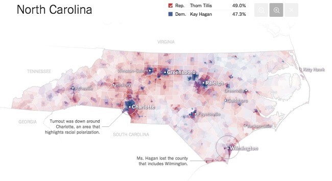
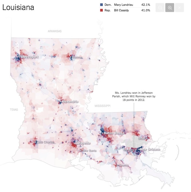
The team at the NYTimes has published these fantastic Most Detailed Maps from the Midterm Elections.

Why are we so confident these are the most detailed maps you’ll ever see from the 2014 Senate elections? Precincts are the smallest level of geography for publicly-reported election results. There were more than 175,000 precincts in the United States in 2012, fifty times the number of counties. The maps here show precinct-level results, where available, from some of the closest Senate races.

Maps exclude early votes in counties that do not report them by precinct. Some precinct boundaries are approximate.

I would call these Pop-Up Infographics, where the map is static, but additional details are shown in a pop-up frame when you hover over each voting precinct.

The Most Detailed Maps from the Midterm Elections Louisiana Infographic

Found on Flowing Data, and thanks to Mike Wirth for posting on Facebook!

Monday
Aug232010

Google Maps for Mobile timeline

Last week, Vic Gundotra, Vice President of Engineering ay Google, posted the Google Maps for Mobile timeline on the Google Mobile Blog as part of his post on the history of Google Maps for Mobile Devices.

Friday
Mar262010

The Best Small Cities to Buy A House (Infographic)

Fixr.com posted this infographic on their blog yesterday showing the statistics behinds the top 10 Best Small Cities to Buy A House in America.  I like the format of a larger infographic that combines a few different styles into one comprehensive image.  Combing map data, stylized bar charts and informative lists into one, easy-to-read infographic.

Imagine living in a small town where people are relaxed and friendly, no traffic jams, clean air, great education, fun leisure and culture, high salaries, and much more. We want to illustrate the top 10 small cities to live in the U.S taking into consideration such factors.

Thanks Andres for the link, and the chance to provide some input.  Nice job!