About
Randy Krum
President of InfoNewt.
Data Visualization and Infographic Design

Infographic Design

Infographics Design | Presentations
Consulting | Data Visualizations

DFW DataViz Meetup

Join the DFW Data Visualization and Infographics Meetup Group if you're in the Dallas/Fort Worth area!

Search the Cool Infographics site

Custom Search

Subscriptions:


Feedburner

The Cool Infographics® Gallery:

How to add the
Cool Infographics button to your:

Cool Infographics iOS icon

- iPhone
- iPad
- iPod Touch


Read on Flipboard for iPad and iPhone

Featured in the Tech & Science category

Flipboard icon

Twitter Feed
From the Bookstore

Caffeine Poster

The Caffeine Poster infographic

Entries in color (48)

Tuesday
Sep192017

40 Facts About the Psychology of Color

40 Facts About How the Psychology of Color Can Boost Your Website Conversions infographic

Color has always been a determining factor in a consumer's decision to buy a product. But with today's online shopping market, color decision is even more important than ever. It takes a consumer 90 seconds to make a product assessment and Marketing Profs says that 62%-90% of this judgment is based on product color alone! The 40 Facts About How the Psychology of Color Can Boost Your Website Conversions infographic outlines popular uses for the colors as well as some of the brands that use them. They have also included popular colors for specific shoppers like impulse buyers.

The infographic breaks down the rainbow and explains emotions associated with each hue, as well as in which industries each color is popular, and in which industries each color is not recommended.

For example, white and silver signify perfection, and you can see that in brands like Apple and Ralph Lauren, but many food brands—which prefer characteristics such as energy or excitement—opt for brighter colors.

Furthermore, certain colors speak to the psychology of certain types of buyers, according to the infographic. For example, navy blue and teal are often used to target budget shoppers, whereas pink, rose, and sky blue speak to traditional clothing buyers.

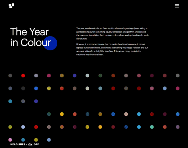
Notice how some of the statistics are visualized and others are just shown in text alone. The non-visualized data is perceived as secondary information or footnotes to the more prominent visualized data.

I also think they overuse the Radial Bar Chart style of visualizing data. I'm not a big fan of these since they are harder for readers to understand the comparisons.

Found on https://www.marketingprofs.com

Wednesday
Apr262017

Visualizing Climate Change

Climate Change is Rewriting the History Books is an infographic from Climate Central that uses a heatmap design style to show how average temperatures have changed over the last 137 years.

This March clocked in as the second warmest March on record when compared to the 20th century average, according to newly released data from the National Oceanic and Atmospheric Administration. NASA data published last week came to the same conclusion, comparing temperatures to a 1951-1980 baseline.

The NOAA data shows the planet was 1.9°F (1.05°C) above the 20th century average for March, the first time any month has breached the 1°C threshold in the absence of El Niño. This March is the latest freakishly hot month following three years in a row of record heat.

NOAA and NASA baselines don’t really tell the whole story. How much the world has warmed since pre-industrial times is a crucial measuring stick for international climate talks and a more accurate representation of how much climate change is altering the planet.

Using the baseline of 1881-1910, a new, more dire picture of global warming emerges. This March was 2.4°F (1.3°C) above the pre-industrial average by that measure. More notably, this March marks a whopping 627 months in a row of warmer than normal temperatures. If you were born after December 1964, you’ve never experienced a month cooler than average on this planet.

To understand what that looks like, take a peek at the global temperature chart below. Each month is represented by a box. Cool blues have been disappearing, replaced by a wave of unending heat. Climate change is likely to continue the streak of warmer than normal months into the foreseeable future as temperatures keep marching upward.

There are a few things about this design worth commenting on:

  • I'm accepting the data from NASA and NOAA at face value, because this blog discusses the visual communication and design of data. However, I can't find the data they used. It would be helpful if they provided the final data they used to build the visualization. Provide a spreadsheet with the data as an act of data transparency.
  • This looks like a great use of the Conditional Formatting capability in Microsoft Excel. If it wasn't designed in Excel, it easily could be.
  • Heatmaps or choropleth maps (ie. using color hue, density, shading, opacity, or saturation) are impossible for the reader to differentiate the exact difference between the values. You can get a general impression, but this is at the bottom of the Scale of Graphical Perception
  • In a heatmap, the designer chooses the minimum and maximum values, and the data dictates all of the actual color saturations shown for each month. The minimum would be solid blue, the midpoint would be white and the maximum value would be solid red.
  • In this case, the chart colors start near the average, not the minimum value. So, all of the months from 1881-1910 are very close to white because these are the values that were used to calculate the midpoint
  • The maximum temperature value is 1.9° higher than the average, and that value is shown as the fully saturated red color. This is a choice by the designer, and makes the average temperatures in the highest months visually appear as very dramatic.
  • This is the default setting for a function like Conditional Formatting. It takes the maximum value in a given dataset, and correlates that to the maximum color saturation. It's up to the designer to decide if this default setting is correct for visualizing the data.


  • The article suggests that the trend will continue with warmer temperatures in the future, so an alternate choice the designer could make is to set the maximum color saturation to something like 10°F over the Baseline. The current temperatures would look much less dramatic, but it would allow for future higher temperatures to be displayed on the same scale.


The choices a data visualization designer makes has a huge impact on how the data is perceived by the audience!

Wednesday
Jan042017

2016 The Year In Colour

The Year in Colour Brand Union Infographic

The Year In Colour from Brand Union looks back at 2016 and the dominant colors from the news stories every day of the year.

This year, we chose to depart from traditional season’s greetings (elves toiling in grottoes) in favour of something equally fantastical: an algorithm. We scanned the news media and identified dominant colours from leading headlines for each day of 2016.

However, it is important to note that no matter how far AI has come, it cannot replace human sentiments. Sentiments like wishing you Happy Holidays and our warmest wishes for a delightful New Year. This, we are happy to do in the traditional way: from the heart.

The design is interactive. Each dot will show you the dominant news story of the day when you hover over it, and clicking takes you directly to the article and the images used to determine the colors.

I'm not sure why the rows are 14 dots across; 2-weeks of days. This would have been a little easier to navigate if it matched the 7-day row layout of a standard calendar. Instead, the months are separated, but the dots are just shown as sequential days.

Thanks to Brianna for sending in the link!

Thursday
Oct202016

Electrocardiography Basics

Electrocardiography Basics infographic science illustration poster

Electrocardiography Basics is a new infographic science illustration poster design by Eleanor Lutz at TabletopWhale.com for Nerdcore Medical. You can purchase the printed poster for $19.99 from Nerdcore Medical.

This week’s collaboration with Nerdcore Medical was a fun chance to try a more simple style than I usually use. For this poster I wanted to show 11 different kinds of heartbeat EKGs in a colorful design.

I wanted to highlight the unique shapes of each EKG wave as the focal point of the poster. After trying a few different things, I decided to try and make a digital heartbeat “sunrise,” where each of the EKG waves defined a specific colorful section of the poster. I thought it would show off the simple shape of the waves, and also work as a practical way to section off the different descriptions.

I ended up designing each line in Illustrator, and then importing the shapes to Photoshop to add textured shadows, color overlays, and text. More... 

Eleanor followed up this design with a behind-the-scenes blog Rough Drafts and Sketches post about what went into her design process, and specifically the color palette selection process (a beautiful infographic design itself!).


Wednesday
Oct052016

The Top Colors of the Internet

The Top Colors of the Internet

Paul Hebert has done the research and visualized the Colors Used by the Ten Most Popular Sites on the Internet. You can see the fan chart above with changing background color that reveals some of the hidden colors.

The Internet is primarily blue!

Paul Hebert:

I was curious what colors were being used by large, popular sites, so I decided to find out.

By displaying the colors used in popular sites in a variety of ways we can glean interesting conclusions about modern trends in web design. Organizing the colors by hue, saturation and value provides viewers with a variety of different ways to view the data. Instead of forcing conclusions upon the user this visualization provides them with the information they need to draw their own insights. I scraped the data using PHP, then built the page using PHP, HTML, SCSS, and Javascript.

This data is current as of September 18th, 2016.

Although I've tried to make this site as accurate as possible there are some known issues which have not yet been resolved.
  1. Colors in images are not included.
  2. Some colors in stylesheets aren't actually used on the sites.
  3. Colors added by external javascript are not included.

All of the visualizations on the original site are interactive with pop-up information on the actual color, but you can see a few of the other static visualizations here.


Found on this great write-up by Wired

Wednesday
Jan272016

Color Trends from 2015

Color Trends of 2015 infographic

Hopefully by now you have stopped mistaking the date for 2015. So as we say our final good byes to 2015, let us take a look back on the year with Shutterstock's Color Trends of 2015 infographic.


Color Infographic Video from Shutterstock on Vimeo

Shutterstock's data team identified the fastest growing colors over the past year by matching pixel data with image download behavior from our customers including brand marketers and creative professionals around the
world.

The report identifies four colors that have grown most in popularity this year are:
Color #01B1AE contains mainly GREEN color, considered cyan and a cool color.
Color #2e1a47 contains mainly BLUE color, considered a dark pastel violet color.
Color #40c1ac contains mainly GREEN color, also considered cyan and a cool color.
Color #1F2A44 contains mainly BLUE color, considered a very dark desaturated blue.

Also an interactive map illustrates the top colors making an impact in 20 countries around the world. 
Thanks to Jenn for sending in the link!
Monday
Oct052015

The Power of Visual Branding

The Power of Visual Branding infographic

Whenever you are trying to connect with a consumer, there are many factors to keep in mind. The Power of Visual Branding infographic from Silicone Wristbands Direct discusses how to successfully use promotional materials to connect with your target audience.

Top Tips for Making Visual Branding a Success!

When it comes to marketing and promotion, visual branding is vastly important, whether it is for a business, charity or even an individual product.

Silicone wristbands are a huge part of visual marketing and have been proven to have an excellent effect throughout the world, however, to make them work for you and your promotion it is important that you consider the visual qualities of your marketing products. This is why we have created this brand new infographic below that includes the best tips for making visual branding work for you!

Good explanation of the thought that goes into the products in their business market. Silicone wristbands are their business, and one of the wearables mentioned in the infographic. However, the infographic is very informative for anyone in the wearables market, which makes it highly shareable.

The footer should include both a copyright (or Creative Commons) license and the URL link directly to the infographic landing page. Most infographics include only the link the company's home page (like this one), but that makes readers have to search the site to find the original, full-size infographic the company published. 

Thanks to Karen for sending in the link!

Monday
Sep212015

The Art of Color Coordination

The Art of Color Coordination infographic

The Art of Color Coordination infographic from Kissmetrics is a lesson on how to use the color wheel when picking colors to combine. The infographic introduces you to a variety of harmonies and schemes that you can use to your advantage.

Colors affect us in countless ways - mentally and physically, consciously and subconsciously.

Psychologists have suggested that color impression can account for 60% of the acceptance or rejection of a product or service. A bad color combination can have the same negative effect as poor copy and slow load times. In this infographic, we will briefly discuss color coordination and how you can use this to your advantage when designing your site. Special thanks to @speckboy, @smashingmag and @onextrapixel.

Great intro to choosing colors for a color palette used in web design, infographics, and even presentations. I often talk about these color choice schemes in my workshops and classes.

Thanks to Ray for posting the link!

Friday
Sep112015

RGB vs CMYK

RGB vs CMYK infographic

RGB vs CMYK infographic from Card Printing explores the differences between the two color modes. Your use of the finished product determines which color mode you should choose. RGB is the best choice when it comes to digital uses, and CMYK is perfect for printed products!

CardPrinting.us presents an infographic weighing the pros and cons of using both RGB versus CMYK color codes in the printing process.

Colorful and informative in equal measures, the infographic is divided in sections detailing the identifiers, stats, arsenal, strengths, weakness, and the verdict for each spectrum. RGB (red, green, blue) is at the right side, and CYMK (cyan, magenta, yellow, black) is at the left. Graphics and text make the infographic easy enough to understand even for those who aren’t well versed in color spectrum and printing process.

Reading through the infographic can help clients and artists decide on which works best for them, especially since the arsenal section lists down the tools and media suitable for both RGB and CMYK. As well, they can get tips from the strengths and weakness sections, plus the final verdict which states that as far as the digital realm is concerned, RGB wins while CMYK is tops in print form.

Nice simple comparison that uses the side-by-side format to explain the basic differences between the color modes. Perfect to send to that manager or executive that has no idea what you're talking about!

The infographic should have visualized the stats, like the difference in the number of colors. Also the direct URL to the infographic landing page should be included in the footer.

Found on Downgraf

Thursday
Sep032015

The Psychology of Colors in Marketing

The Psychology of Colors in Marketing infographic

The Psychology of Colors in Marketing infographic is a comprehensive guide to what a colors means in marketing materials. The infographic, created by Homestead, not only covers the meanings of the colors but how to use contrast and the intensity as well. The last bit gives examples of how big corporations use the colors to their advantage.

Do you feel inexplicably calm when surrounded by a sea of blue water or a forest of green trees? Perhaps you feel a slight agitation when looking at a red stop sign or stop light?

The reality is that color has a powerful psychological impact - and that this affect can be harnessed by webmasters and digital marketers alike to promote different buyer behaviors online. To learn more, check out our new "The Psychology of Colors in Marketing" infographic:"

The infographic is a little text heavy, but does a good job of using black text and icons for the descriptions so the colors only appear when they are meant to convey meaning in the infographic as an example.

The footer should include a copyright (or Creative Commons) license statement and the URL web page address directly to the infographic landing page so readers can find the original full-size version when bloggers repost the infographic without a link. I always include a link back to the original but most do not.

Found on http://www.digitalinformationworld.com