About
Randy Krum
President of InfoNewt.
Data Visualization and Infographic Design

Infographic Design

Infographics Design | Presentations
Consulting | Data Visualizations

DFW DataViz Meetup

Join the DFW Data Visualization and Infographics Meetup Group if you're in the Dallas/Fort Worth area!

Search the Cool Infographics site

Custom Search

Subscriptions:


Feedburner

The Cool Infographics® Gallery:

How to add the
Cool Infographics button to your:

Cool Infographics iOS icon

- iPhone
- iPad
- iPod Touch


Read on Flipboard for iPad and iPhone

Featured in the Tech & Science category

Flipboard icon

Twitter Feed
From the Bookstore

Caffeine Poster

The Caffeine Poster infographic

Entries in color (48)

Tuesday
Feb262013

Manhattan Building Heights as Land Value

Manhattan Building Heights infographic

Manhattan Building Hieghts by radicalcartography.net is an indirect measure of land value based on building height. The infographic is shaped like Manhattan itself, and the actual building’s color darkness shows their heights in their correct locations.

You can also see an alternate design using assessed tax value as the data set, and how that maps out land value differently.  

Found on http://visual.ly


Friday
Jan182013

Brockhaus Encyclopedia Infographics

Brockhaus Encyclopedia Infographics

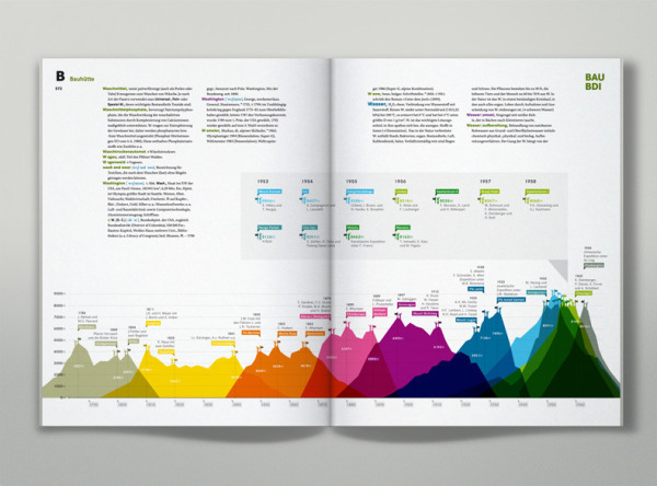
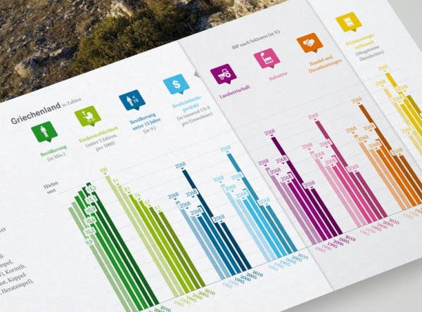
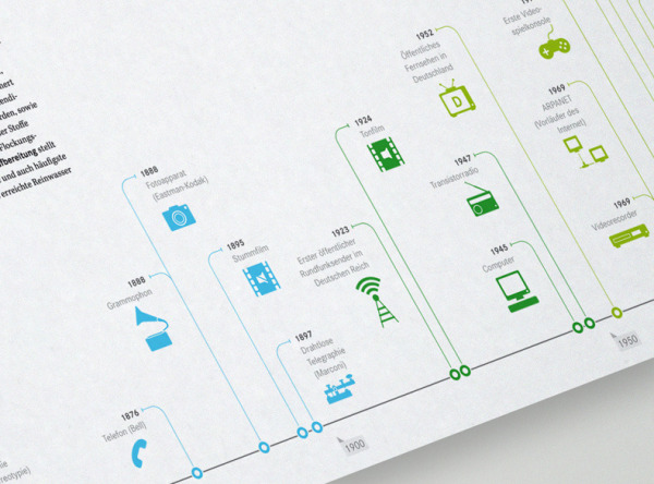
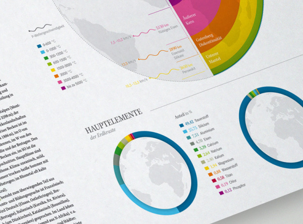
Check out the Brockhaus Encyclopedia Infographics, infographics and data visualizations in the new German Brockhaus Encyclopedia!  Designed by oberhaeuser.info, the design studio of Martin Oberhäuser.

Series of info graphics for brockhaus, a large encyclopedia publisher from germany. The info graphics visualize several statistics and informations of topics like: the worlds highest mountains and their first ascent, the languages of the world, comets close to the earth, world oceans, ecology, media evolution and so on. One graphic shows the evolution of the world population from 1950 to 2050. Six transparent pages (one for each 20-year period) overlap each other.

These are some beautiful designs.  I’m sorry an English version isn’t available.

Found in the Behance 100 Most Appreciated Projects of 2012

Brockhaus Encyclopedia Infographics

Brockhaus Encyclopedia Infographics

Brockhaus Encyclopedia Infographics


Tuesday
Nov272012

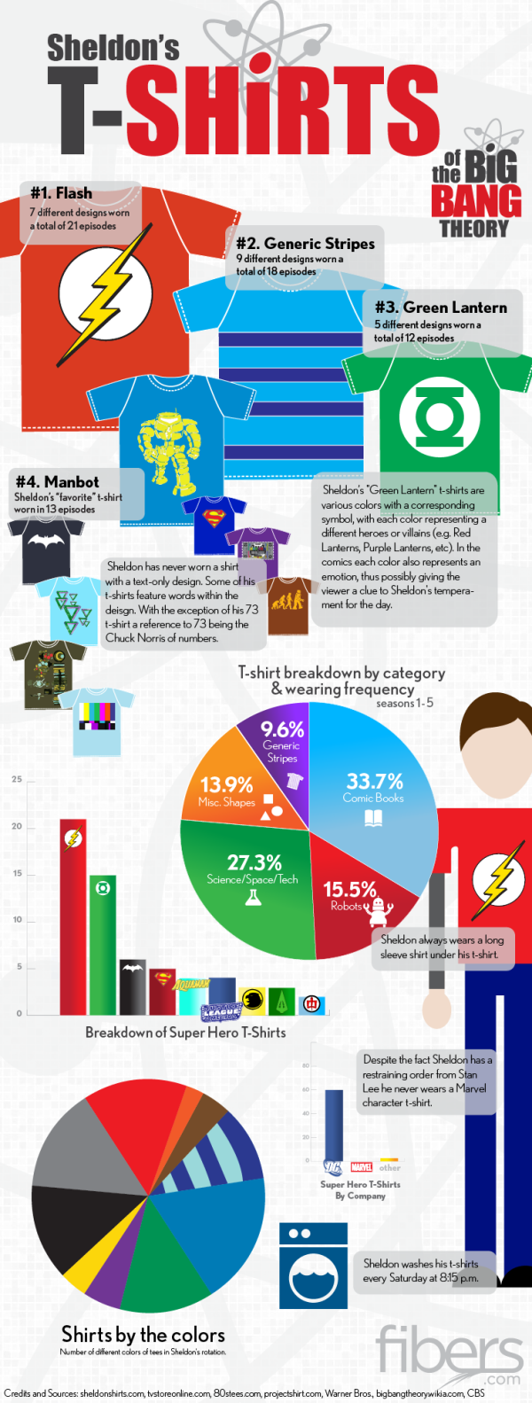
Sheldon's T-Shirts of The Big Bang Theory

Sheldon's T-Shirts of The Big Bang Theory infographic

If you have seen the comedy show The Big Bang Theory, then you know Sheldon…. If you haven’t seen it, go watch it and get back to us.  Have you ever noticed his wardrobe?  The Sheldon’s T-Shirts infographic from fibers.com tells you his favorite shirts, how often he wears his shirts, and even what colors he wears the most! 

Graphs, Charts and illustrated T-Shirts with correlating sizes to wearing frequency - would there be any other way to visualize Sheldon Cooper’s t-shirt collection from The Big Bang Theory? We think not.

Big thanks to Sheldon’s Shirts where we got most of the data for this graphic. You can find a lot of Sheldon’s Shirts for purchase on the following websites:

This is just a fun infographic that uses some data visualization to appeal to fans of the show.  Good design using publicly available data that has been complied in an engaging way.

The charts actually very well done.  Charts are color-coded to match the data.  Icons are included on the bars or in the pie slices, so no chart legends are needed.  This makes the data faster and easier to understand.

Found on Fibers.com

Monday
Sep242012

Star Wars Infographic Flowcharts

Star Wars infographics

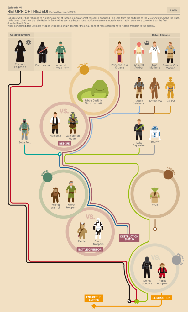
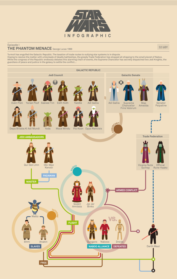
Marc Morera has designed some amazing Star Wars infographics charting the character progression, deaths and conflicts in the Star Wars movies, the animated series, comic books and major novels.  On the landing page, you will find them organized chronologically, so the Animated Series fits in between movies II and III.

Characters are illustrated as recognizable isotypes.  Each character’s plot line is color-coded, and the lines from the appropriate characters converge at circles representing the major conflicts along each story timeline. 

Star Wars infographics

The two examples shown here are reduced in size to fit on the blog, so go check out all of them on Marc Murera’s site for high-resolution versions.

Monday
Jul232012

True Colors: What Your Brand Colors Say About Your Business


True Colors: What Your Brand Colors Say About Your Business infographic

Does your companies brand reflect their business correctly? Check out True Colors: What Your Brand Colors Say About Your Business infographic from Marketo.

The most prominent brands in the world are defined by their colors. Think of McDonald’s golden arches, the name Jet Blue, and UPS’ slogan, “What can Brown do for you?” These companies, and many others, strategically use colors in their logo, website, and product to appeal to customers. As a B2B marketer, it’s important to think about how you utilize colors and what the colors you choose say about your business.

Research has found that different colors provoke very different reactions in people. Marketo choose to use the color Purple for branding because at the time Marketo was founded, purple was relatively un-used. Additionally, purple represents wealth, royalty, and richness which also has associations to leadership and revenue. Integrating your brand colors in your logo, landing pages, product, and more will help you achieve the highest impact. We put the rainbow under a microscope to find out how each color can help you connect with your consumers.

Designed by Column Five Media, this is a really good infographic.  The use of the specific colors in question make the design attractive and very easy to follow.  I also like the use of icons to show industries that use the different main colors.  The icons and bullet lists also help cut down on the amount of text the audience has to read.

A couple things I would change: 

  • There are a number of statistics at the top that should have been visualized instead of just making the fonts really big.
  • There are a number of what appear to be quotes from different sources about the power of colors, but the sources aren’t citied.  I assume they’re a part of the sources listed in the footer, but quotes should be immediately attributed.
  • Which Colors are Companies Using Most? adds up to 103%.  It’s not clear if these should be mutually exclusive or if the study counts multiple colors from the same company in the results.
  • The bottom should have a copyright and the URL link to the original infographic landing page. 

Thanks to Carra for sending in the link!

Tuesday
Apr102012

How Animals See The World

Ever wonder how you look to your dog or cat? Or how about the shark as he swims towards you? (Lets hope  you haven’t thought of the second one…) Well have no fear, all your answers lie within the How Animals See The World infographic from Mezzmer

Have you ever stopped and wondered what version of the world your beloved dog or cat sees the world in?  How is their perception colored and how do they perceive you?  Most of us take for granted the gift we are granted with sight, but it may surprise some of you to find out that many animals actually have much better vision than we do.  In fact, some see the world with some precision and accuracy, they put our eyesight abilities to complete shame.  Read on to learn more about the unique ways our animal friends see the world…

The design is longer than I like for infographic, but the content is fascinating.  Not many data visualizations, but I really appreciate the designer showing comparisons between what a human sees, and the equivalent view from the animals. 

Mezzmer is an eyeglass online retailer, so this infographic topic is information relevant to their business without feeling like an ad.  A great topic selection for a Marketing infographic.

Thanks to Christina for sending in the link!

Friday
Feb172012

Shutterstock Global Design Trends 2011

The Global Design Trends 2011 infographic from Shutterstock shares some of the image usage data that only they have due to the nature of their business.

After 8 years, 17 million images and over 200 million downloads, Shutterstock has become one of the world’s leading marketplaces for visual media. We have artists and photographers from more than 100 countries, and customers in more than 150. But perhaps most significant about these milestones is that it has led to tens of thousands of image searches each day – giving us valuable insight into design trends around the world.

From vintage-themed photographs, to vibrant vector graphics, here’s an infographic detailing what visual stories were told over the last year.

I love that Shutterstock has some unique data internally that they are analyzing in aggregate and now sharing with the world.  It’s not complicated, but I love that they actually included some of the most downloaded images in the design.  They are showing the reader what was popular instead of just telling the reader about it.  My favorite section is the Evolving Visual Vocabulary showing how the meaning of the image keywords is changing over time.

They made a couple unusual publishing choices.  The image posted on the blog is 714px wide (an odd number) so the small text is blurry and pixelated.  I don’t think they have enough detailed data in this design for a zooming viewer, but if you click on the image from their blog post, it takes you to the full 3,300 pixel wide image loaded into Zoom.it.  They also link to the high-resolution JPG image file, and (a great idea!) a lightbox on Shutterstock that includes all of the images highlighted in the infographic.

A handful of statistics are just listed in text instead of visualized like they should be: 150 countries, 16 million downloads, 6 million downloads, 5 million downloads, etc.

A couple standard things missing that a lot of designers seem to consistently miss: a copyright statement, the URL for readers to find the original infographic landing page (the specific blog post on Shutterstock in this case), and a credit mention for the designer (Shutterstock is all about designers!).  I hope the team at Shutterstock paid the license fes for using these images in their infographic design!  No need for a Sources statement, since all of the data comes from their own site server data.

Thanks to Aaron for sending in the link!

Tuesday
Jan312012

The Psychology of Color

The Psychology of Color is a cool infographic from CertaPro Painters of Louisville.

This new infographic from CertaPro Painters of Louisville shows how color evokes emotion and triggers your senses. It beautifully explores colors that should and should not be used in interior decorating, as well as why certain colors are used in advertising.

Designed by NowSourcing.com, I love the visual appeal of this design.  Obviously, it’s bright and colorful, but in all three sections of the layout (home, colors and advertising) they provide visual examples to back up their observations about different colors. I would love to have a house that colorful!

There is much more information on this subject, but this design also kept the information fairly simple and straightforward.  The colors make the design very “busy”, but the design doesn’t try to communicate too much information to the reader.

The design is missing the URL to find the original landing page, and a copyright statement.  I also found it odd that they needed to clarify that M&Ms are “an American Chocolate Candy”.  Aren’t M&Ms an international brand?

Thanks to Jay for sending in the link!  Also found on Infographic Journal.

Monday
Aug152011

The Crayon-Bow, Crayola Color Chart updated

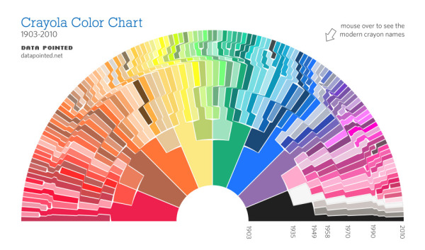
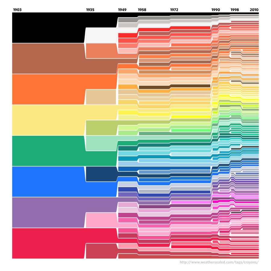
I’m not sure how I missed this, but the designer know as Velociraptor has updated his original Crayola Color Timeline that I posted about last year, into the the new Crayon-Bow (half rainbow - half rising sun).

The original was a square, straightforward representation, but the colors in the later years were shown in very small slices are hard to see.

A number of other visual layouts were tried, but the arc style visual not only allowed the colors from the later years to be easier to see, but the original eight colors pointing inwards look like the tips of brand new crayons as well.

I love the new version.  Found on Twitter: @printmag, @wired, @awaaza

Monday
Mar142011

Moviebarcodes: Whole Movies at a Single Glance

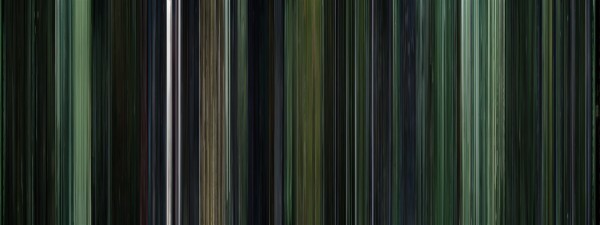
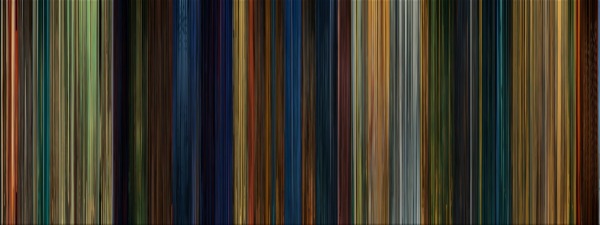
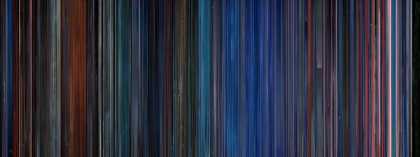
Moviebarcodes is a tumblr blog from an unknown author that posts these images generated from different movies.  Each frame of the movie is stretched tall and thin to create this single image from an entire movie.  The one above is from The Matrix, and you can see the green tint they used every time they were “in the Matrix”.

From Wired:

The person behind MovieBarcode, who wouldn’t reveal their identity or what they do for a living, told Wired.co.uk that the creative process can take a few hours on the slightly aged machine they are being processed on, “depending on the length of the movie and the quality of the outcome”.

Movies on the blog are chosen “due to the expected result, not for the movies themselves”. Besides colourful movies, the blog author prefers “movies with long shots such as Kubrick, Hitchcock and Weerasethakul, which can result in unique and interesting moviebarcodes”.

Although, some of them don’t seem to reveal anything interesting, a few of these did give some insights into the movie visuals.

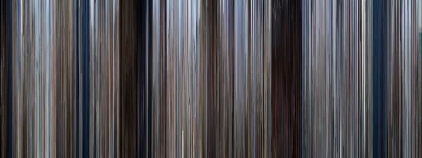
They spent a lot of time at sea in Jaws:


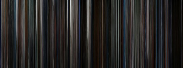
The Dark Knight was a very dark, almost colorless movie:


Kung Fu Panda was very colorful:


You can see the time spent in the digital, neon-blue world of TRON (1982):


Found on Wired.co.uk, VisualJournalism, FlowingData and Chart Porn.