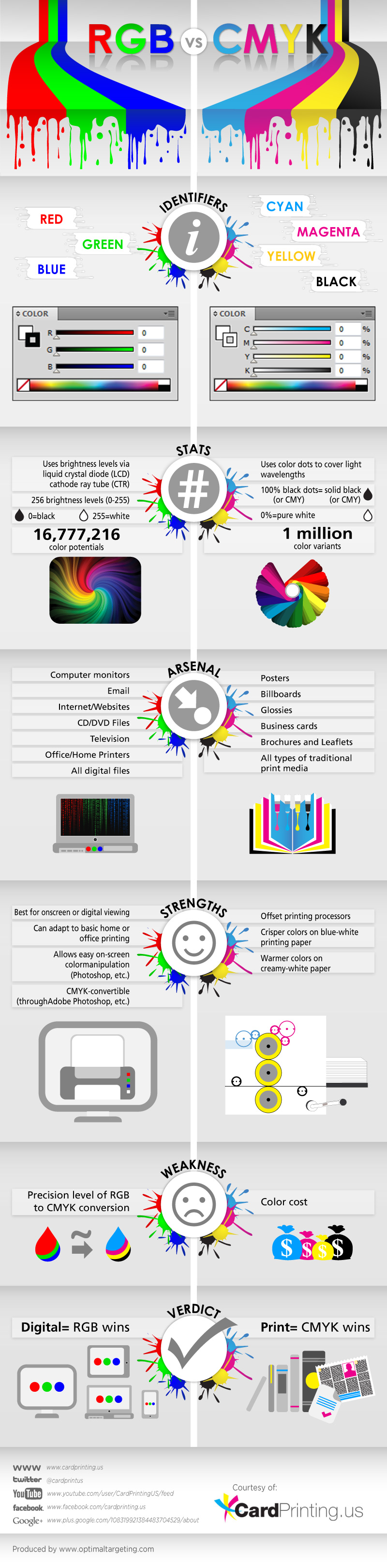
RGB vs CMYK infographic from Card Printing explores the differences between the two color modes. Your use of the finished product determines which color mode you should choose. RGB is the best choice when it comes to digital uses, and CMYK is perfect for printed products!
CardPrinting.us presents an infographic weighing the pros and cons of using both RGB versus CMYK color codes in the printing process.
Colorful and informative in equal measures, the infographic is divided in sections detailing the identifiers, stats, arsenal, strengths, weakness, and the verdict for each spectrum. RGB (red, green, blue) is at the right side, and CYMK (cyan, magenta, yellow, black) is at the left. Graphics and text make the infographic easy enough to understand even for those who aren’t well versed in color spectrum and printing process.
Reading through the infographic can help clients and artists decide on which works best for them, especially since the arsenal section lists down the tools and media suitable for both RGB and CMYK. As well, they can get tips from the strengths and weakness sections, plus the final verdict which states that as far as the digital realm is concerned, RGB wins while CMYK is tops in print form.
Nice simple comparison that uses the side-by-side format to explain the basic differences between the color modes. Perfect to send to that manager or executive that has no idea what you're talking about!
The infographic should have visualized the stats, like the difference in the number of colors. Also the direct URL to the infographic landing page should be included in the footer.
Found on Downgraf


 Randy
Randy