About
Randy Krum
President of InfoNewt.
Data Visualization and Infographic Design

Infographic Design

Infographics Design | Presentations
Consulting | Data Visualizations

DFW DataViz Meetup

Join the DFW Data Visualization and Infographics Meetup Group if you're in the Dallas/Fort Worth area!

Search the Cool Infographics site

Custom Search

Subscriptions:


Feedburner

The Cool Infographics® Gallery:

How to add the
Cool Infographics button to your:

Cool Infographics iOS icon

- iPhone
- iPad
- iPod Touch


Read on Flipboard for iPad and iPhone

Featured in the Tech & Science category

Flipboard icon

Twitter Feed
From the Bookstore

Caffeine Poster

The Caffeine Poster infographic

« Does Coffee Really Make You More Productive at Work? | Main | Talking Infographics on The PolicyViz Podcast »
Wednesday
Jan042017

2016 The Year In Colour

The Year in Colour Brand Union Infographic

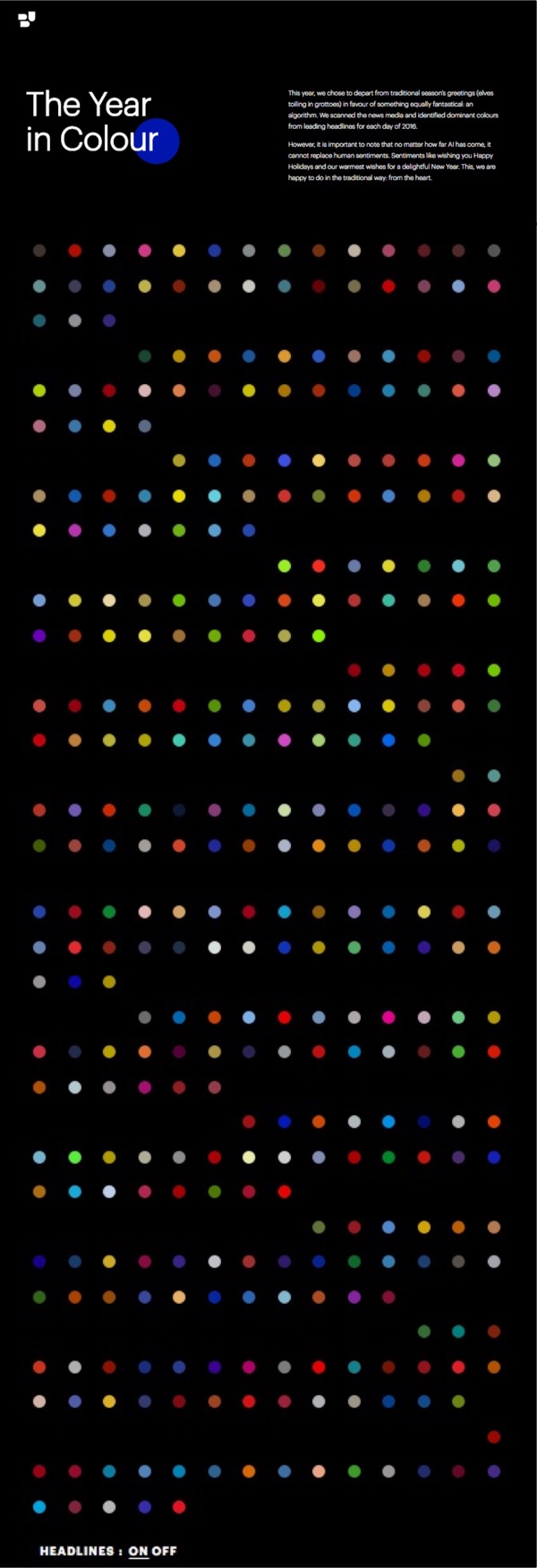
The Year In Colour from Brand Union looks back at 2016 and the dominant colors from the news stories every day of the year.

This year, we chose to depart from traditional season’s greetings (elves toiling in grottoes) in favour of something equally fantastical: an algorithm. We scanned the news media and identified dominant colours from leading headlines for each day of 2016.

However, it is important to note that no matter how far AI has come, it cannot replace human sentiments. Sentiments like wishing you Happy Holidays and our warmest wishes for a delightful New Year. This, we are happy to do in the traditional way: from the heart.

The design is interactive. Each dot will show you the dominant news story of the day when you hover over it, and clicking takes you directly to the article and the images used to determine the colors.

I'm not sure why the rows are 14 dots across; 2-weeks of days. This would have been a little easier to navigate if it matched the 7-day row layout of a standard calendar. Instead, the months are separated, but the dots are just shown as sequential days.

Thanks to Brianna for sending in the link!

PrintView Printer Friendly Version

EmailEmail Article to Friend

Reader Comments (1)

Very nice idea, but it could really use a pointer-events: none on the headline text, as the text often steals the focus if you mouseover a circle in the lower section of the screen, leading to flashing dots and text.
January 5, 2017 | Unregistered CommenterDFO
Editor Permission Required
While we are migrating to a new site design, you must have editing permission for this entry in order to post comments.