About
Randy Krum
President of InfoNewt.
Data Visualization and Infographic Design

Infographic Design

Infographics Design | Presentations
Consulting | Data Visualizations

DFW DataViz Meetup

Join the DFW Data Visualization and Infographics Meetup Group if you're in the Dallas/Fort Worth area!

Search the Cool Infographics site

Custom Search

Subscriptions:


Feedburner

The Cool Infographics® Gallery:

How to add the
Cool Infographics button to your:

Cool Infographics iOS icon

- iPhone
- iPad
- iPod Touch


Read on Flipboard for iPad and iPhone

Featured in the Tech & Science category

Flipboard icon

Twitter Feed
From the Bookstore

Caffeine Poster

The Caffeine Poster infographic

Entries in patterns (5)

Friday
Aug262016

Animal Migrations In Motion

Animal Migrations In Motion

Animal Migrations In Motion is a fantastic animated & interactive data visualization of the predicted migration patterns of almost 3,000 species in North and South America as our climate changes.

As climate change alters 
habitats and disrupts ecosystems, where will
 animals move to survive?
 And will human development prevent them from getting there?

This map shows the average direction mammals, birds, and amphibians need to move to track hospitable climates as they shift across the landscape.

Researchers from University of Washington and The Nature Conservancy modeled potential habitat for 2954 species using climate change projections and the climatic needs of each species.

This map was created by Dan Majka, who works for The Nature Conservancy's North America Region science team.

This visualization would not have been possible without the incredible prior work of the hint.fm wind map, cambecc's earth wind map, and Chris Helm's adaptation of cambecc's code.

It's mesmerising to watch! Just like some of the prior designs that inspired this one listed above. It's interactive, so you can move and zoom the part of the map being shown.

The description does leave a few unanswered questions. For instance:

  • What time period is being shown here?
  • What predicted climate changes and assumptions are being used?
  • What species are shown and how were they chosen?

Found on FlowingData!

Thursday
Aug112016

Predicting iPhone Release Date With DataViz

Predicting iPhone Release Date With DataViz

With no inside knowledge, I predict the new Apple iPhone announcement on September 7th, with an actual release on the Friday of the following week, on September 16th.

How do I know this? I fully expect Apple to stay true to their pattern for releasing iPhones every September. They have consistently had an announcement on a Tuesday or Wednesday early in September, followed by the actual release on the following Friday. (I think 2015 was an anomaly with an extra week before shipments)

We humans are still the best visual pattern recognition machines on the planet. Visual patterns are also one of the best ways to communicate an insight or a finding from within the data. In this visual, I've visualized just the important dates that show a clear pattern, and simplified the design to just the relevant information. You don't need the whole calendar or all of Apple's products to communicate this one insight about iPhones.

Check out all of my visualization of all of Apple's Release Patterns!

Wednesday
Feb112015

Sleeping Habits of the Rich & Famous

Sleeping Habits of the Rich & Famous infographic

Even though we are all told that the recommended amount of sleep is 8 hours, everyone seems to function differently on the same amounts of sleep. The Sleeping Habits of the Rich & Famous infographic from Big Brand Beds introduces the sleep cycles of famous and successful people. I guess one sleep cycle doesn’t fit all!

We’re always told about getting a regular, solid eight hours’ sleep when it comes to being productive and successful, but not everyone follows this seemingly sound advice. Some of the most famous, successful and driven people throughout history have had some very strange sleeping habits - from micro-kips to sleeping in phases. We’ve got the oddest rich and famous sleeping habits in this new infographic.

There’s no way I could work with the staggered sleep patterns of Thomas Edison or Leonardo Da Vinci.

I like this design with simple time scales to show the sleep patterns and the series of circles to show the total number of hours per day. The visualization is repeated for each person, so once you understand the first one, you can easily understand the rest.

The design should have included the URL directly to the infographic landing page in the footer so readers can easily find the original, full-size version when they see the infographic on another site. Since they used a blog post as the infographic landing page, it will get shuffled down the blog page quickly as they post additional content. Don’t make your readers hunt for your infographic, or they will just give up and move on.

Thanks to Dave for sending in the link!

Thursday
Nov212013

Finding Waldo by Visualizing Patterns

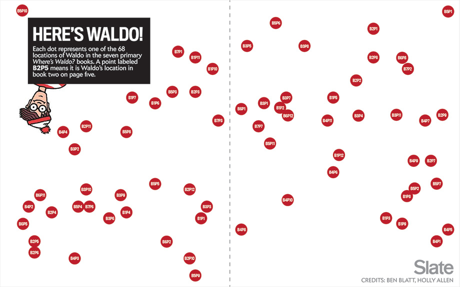
Where's Waldo BooksGraphic by Slate. Illustration by Martin Handford published by Candlewick Press.

Here’s Waldo is a great analysis and article by Ben Blatt on Slate.com about trying to determine a strategy for finding Waldo by visualizing patterns from the Where’s Waldo series of books.

In Chapter 1: The Science of Infographics of my new book, Cool Infographics, I cover that our ability to see patterns is a huge factor in why data visualizations and infographics are so effective.  Humans can see patterns and recognize differences where computers can’t.  You can read about this topic and more in the Free Sample Chapter available for download.

Illustrator Martin Handford published the first in his beloved series of Where’s Waldo books over 25 years ago.* The books challenge readers to find the titular cartoon man, clad in his trusty red-striped shirt and red-striped hat, as he hides in a landscape of red-striped red herrings. When attempting to find Waldo you can scan the page completely from top to bottom, or you can focus your search around certain landmarks where Waldo seems likely to be hiding (in a castle’s moat, riding a blimp). Neither approach is particularly efficient. Which got me to wondering: What if there’s a better way?

I sought to answer these questions the way any mathematician who has no qualms about appearing ridiculous in public would: I sat in a Barnes & Noble for three hours flipping through all seven Where’s Waldo books with a tape measure.

The map born of my experiment is below.

Mapping Waldo Locations

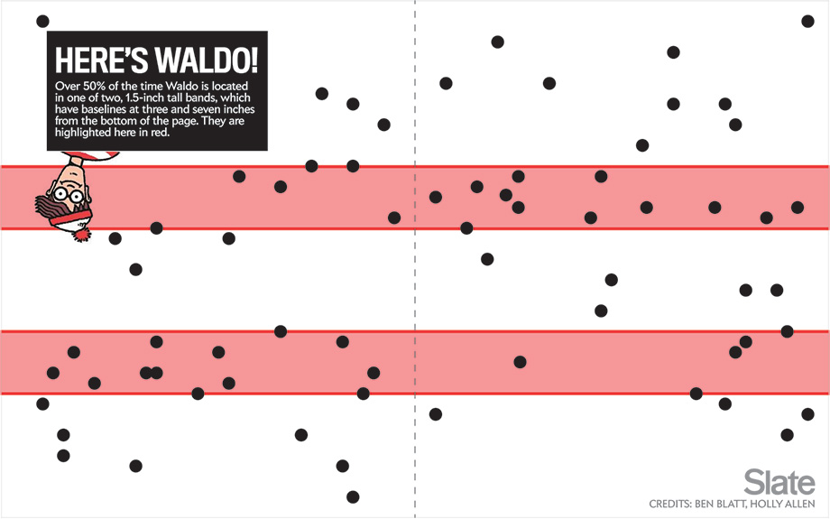
It may not be immediately clear from looking at this map, but my hunch that there’s a better way to hunt was right. There isn’t one corner of the page where Waldo is always hiding; readers would have already noticed if his patterns were so obvious. What we do see, as highlighted in the map below, is that 53 percent of the time Waldo is hiding within one of two 1.5-inch tall bands, one starting three inches from the bottom of the page and another one starting seven inches from the bottom, stretching across the spread.

Finding Waldo Patterns

Check out the complete story on Slate.com

Found thanks to a post by Mike Elgan on Google+!


Tuesday
Oct092012

Hurricanes Since 1851

Hurricanes Since 1851 infographic

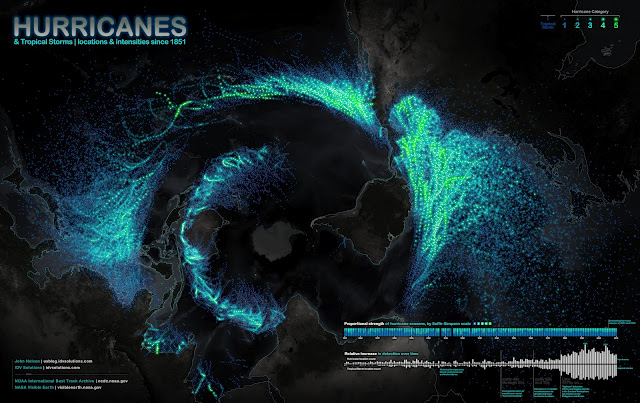
Science meets art in the Hurricanes Since 1851 infographic from John Nelson, IDV Solutions, on UXBlog. The infographic maps out storm paths and wind speeds of hurricanes since 1851.  The photo is the projection view of the globe from the south pole perspective.

Ok, here’s a bottoms-up view of known tropical storms and hurricanes dating back to 1851.  The fine folks at NOAA keep an archive of storm paths with wind speed, storm name, date, among other attributes, and are always updating and refining information for past events based on historical evidence and educated hunches.  The data are awesome and they make it available in several formats.  Here’s what it looks like slapped onto a polar projection (looking up at Antarctica) with point color tied to intensity

A couple of things stood out to me about this data…

1) Structure.
Hurricanes clearly abhor the equator and fling themselves away from the warm waters of their birth as quickly as they can.  Paging Dr. Freud.
The void circling the image is the equator.  Hurricanes can never ever cross it.

2) Detection.
Detection has skyrocketed since satellite technology but mostly since we started logging storms in the eastern hemisphere.  Also the proportionality of storm severity looks to be getting more consistent year to year with the benefit of more data.

Data visualization design reveals patterns and makes data understandable, and this is a huge, effective data visualization.

Thanks to Renee for sending in the link!