


Hurricanes Since 1851
 Randy
Randy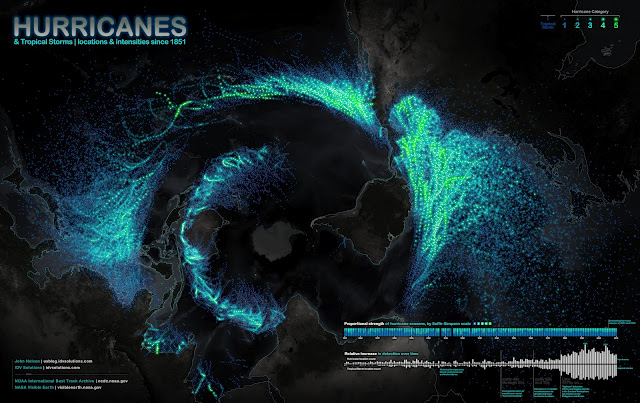
Science meets art in the Hurricanes Since 1851 infographic from John Nelson, IDV Solutions, on UXBlog. The infographic maps out storm paths and wind speeds of hurricanes since 1851. The photo is the projection view of the globe from the south pole perspective.
Ok, here’s a bottoms-up view of known tropical storms and hurricanes dating back to 1851. The fine folks at NOAA keep an archive of storm paths with wind speed, storm name, date, among other attributes, and are always updating and refining information for past events based on historical evidence and educated hunches. The data are awesome and they make it available in several formats. Here’s what it looks like slapped onto a polar projection (looking up at Antarctica) with point color tied to intensity…
A couple of things stood out to me about this data…
1) Structure.
Hurricanes clearly abhor the equator and fling themselves away from the warm waters of their birth as quickly as they can. Paging Dr. Freud.
The void circling the image is the equator. Hurricanes can never ever cross it.
2) Detection.
Detection has skyrocketed since satellite technology but mostly since we started logging storms in the eastern hemisphere. Also the proportionality of storm severity looks to be getting more consistent year to year with the benefit of more data.
Data visualization design reveals patterns and makes data understandable, and this is a huge, effective data visualization.
Thanks to Renee for sending in the link!

Reader Comments (2)
Thanks