About
Randy Krum
President of InfoNewt.
Data Visualization and Infographic Design

Infographic Design

Infographics Design | Presentations
Consulting | Data Visualizations

DFW DataViz Meetup

Join the DFW Data Visualization and Infographics Meetup Group if you're in the Dallas/Fort Worth area!

Search the Cool Infographics site

Custom Search

Subscriptions:


Feedburner

The Cool Infographics® Gallery:

How to add the
Cool Infographics button to your:

Cool Infographics iOS icon

- iPhone
- iPad
- iPod Touch


Read on Flipboard for iPad and iPhone

Featured in the Tech & Science category

Flipboard icon

Twitter Feed
From the Bookstore

Caffeine Poster

The Caffeine Poster infographic

Entries in financial (9)

Wednesday
May232018

The Real Cost of Unproductive Meetings

The Real Cost of Unproductive Meetings infographic

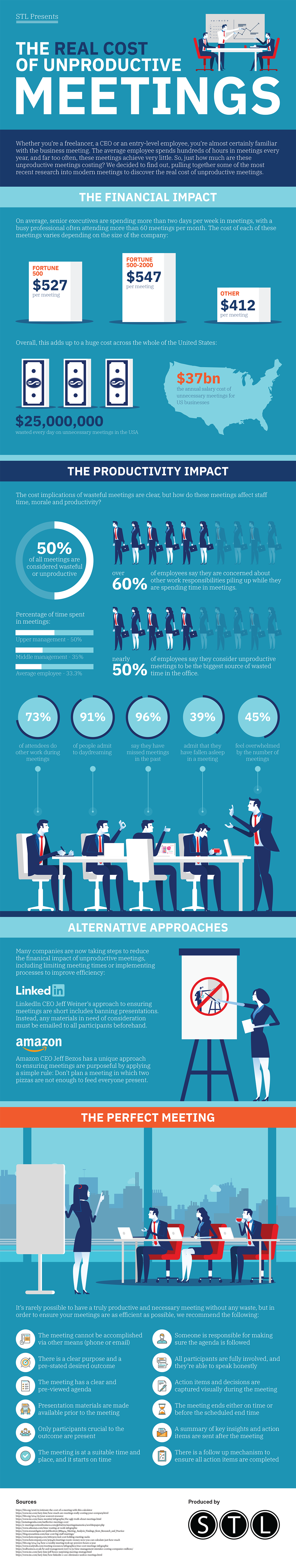
Meetings are important to a companies success no matter what the size; however, unproductive meetings can be extremely costly. STL produced The Real Cost of Unproductive Meetings infographic as a guide to help put on the most effient meeting possible to avoid a large financial impact.

They're not only far-too-frequently used and often a little bit dull, but those corporate meetings could be costing your business thousands (or even millions) every year.

A study by Bain & Company back in 2014 found that 15% of a businesses' time is spent on meetings, and that number has been increasing steadily for many years. Given the value we place on this time, how much of it is actually productive

For our latest infographic, we decided to take a look at the true cost of meetings, and present a formula for the perfect meeting - so, if you simply must hold one, at least you can make sure it's as productive and cost effective as possible.

Overall, a good infographic with some good data and information.

However, I take issue with how some of the data is visualized. In the Financial Impact section, vertical bars are shown to represent the cost of meetings. These bars don't accurately represent the values being shown with the $12 bar half the height of the $527 bar. Either the design just eye-balled the size of the bars, or this is a non-zero baseline bar chart that starts somewhere around $300. This is cvisually misleading to the audience, especially when the scale isn't shown.

The footer infomation is missing both a Copyright (or Creative Commons) license and the URL to either the company or the infographic landing page is missing. How are readers suppsed to find the original post?

Thanks to Dave for sending in the link!

Tuesday
Oct032017

SwissLeaks: the map of the globalized tax evasion

SwissLeaks: the map of the globalized tax evasion infographic


SwissLeaks: the map of the globalized tax evasion infographic from Martin Grandjean shows the countries that were affected the most by the HSBC "Swiss Leaks" data.

HSBC “Swiss Leaks” data shared by the International Consortium of Investigative Journalists reflect the globalization of tax evasion. While billions of dollars are inconceivable, mapping the origin of bank account holders allows an overview. This map is only a small contribution to the understanding of the Swiss Leaks data.

Why this map?

This map does voluntary not strictly stick to the geographical reality. It is a response to too many maps published in the media these days that are made unreadable by regrettable graphic choices: top-ten limited, overlapping points, colored territories (small countries and islands disappear), etc.

What does it show?

The number of affected countries and their diversity is very important. Note the strong presence of the Caribbean. In proportion to their population, South and East Asia are very poorly represented, while the Middle East is over-represented. The strong presence of “tax havens” is explained by the use of intermediates by the holders of bank accounts.

A great example of using the area of the squares to represent the amounts.

Created by Martin Grandjean

Tuesday
Jun032014

What the Heck is a Bitcoin

What the Heck is a Bitcoin infographic

The Bitcoin is the first widely traded digital crypto-currency that is decentralized and unregulated. Find out more from the What the Heck is a Bitcoin infographic by SumAll.

Exchanges rising and falling, disputes over inventorship, wild accusations, rapid inflation and deflation, anger, confusion, and sadness. We’re talking about everyone’s favorite unicorn money: Bitcoin. Bitcoin’s six year road to the spotlight has been fraught with more turbulence than a flight through a hurricane in a Learjet, and since mid 2013 it’s only gotten more crazy.

SumAll has just added bitcoin exchanges, mining pools, and mining workers to our range of data platforms to allow our customers to keep tabs on the market and the progress of mining pools. For those who own or mine bitcoins, SumAll is now their one-stop-shop for keeping tabs on all things bitcoin, monitoring their mining efforts, and keeping a close watch over their investments.

For those who don’t own or mine bitcoins, chances are you have no idea what we’re talking about.

If you have an interest in bitcoins and don’t want to be that out-of-the-loop guy at the party who just keeps nodding his head in agreement and staring at your drink, we made this handy infographic to explain a few basic concepts to get you started. Soon you’ll be buying all your pizza–and rent–with bitcoins

Good design that tells a story to the audience, but this one uses too much text.  I wish they had included some data visualizations about the difficulty to mine bitcoins or the strength of the encryption.  The one dataset they did visualize was the value of bitcoins from Jan-Dec 2013.  The value changes so rapidly, including that one data visualization can quickly make the infographic feel old and out-of-date.  For a longer Online Lifespan, the design should focus more on the long-term, consistent information about bitcoins and not the most recent trending data.

This is a good example of the company, SumAll, using an infographic as part of their email marketing campaign.  The infographic was included as the highlight in one of their email blasts to customers with a link back to the full design on their website!

Friday
Nov152013

Two Years Without Steve Jobs: Has Apple Crumbled?

Two Years Without Steve Jobs: Has Apple Crumbled? infographic

Has Apple Crumbled? is an infographic from WhoIsHostingThis.com that takes a close look at the business and financial results of the last couple of years under Tim Cook’s leadership.

With the passing of Steve Jobs in 2011, many tech industry experts were quick to predict that his company, Apple, Inc., would soon falter without its charismatic founder at the helm. Yet in the years since Jobs’ successor, Tim Cook, has taken the wheel, Apple has not only continued on, but flourished.

The design starts off well, but gets lazy towards the bottom with a number of statistics shown in text only, and not visualized.  Readers will perceive these values as less important and visually skim right over them.  With a mix of visualized data and text only data, the text only values are perceived as secondary information and often ignored.

I really like the character illustrations. They are minimal, but still easily recognizable.  The same goes for the product icons.  Minimal but easily recognizable.

The footer does a good job with sources and the company logo, but should have also included the URL link back to the original infographic landing page so readers can find the full-size original version.

Found on MacTrast.com

Thursday
Jul252013

PepsiCo Q2 2013 Performance Infographics

PepsiCo has begun to publish an official infographic along with each of their quarterly earnings reports to investors and analysts.  The PepsiCo Q2 2013 Performance infographic was just released online to coincide with the press release and earning call to analysts.

I love seeing infographics used in this way, and I think we will be seeing many more of them from other companies.  Visualizaing the financial data can make the complex filings much easier for investors to understand.

As much as I love this idea, this particular design needs help visualizing the data.  Big fonts are not data visualizations, and many of the financial stististics presented were shown in text only.  It takes a data visualization to put the values into perspective for the audience, and make them easier to understand.

This is the second infographic in the series.  It appears that each one will be released with a unique website dedicated to hosting the infographic.  This on can be found at: www.pepsicoinfographicq2.com, and a PDF version is also available to download from the site.  You can find the infographic from the prior qurter here: www.pepsicoinfographicq1.com.  The infographics were also published on the PepsiCo Multimedia Downloads section of the Media page.

Thanks to Chris Hoyt for posting on Google+

Tuesday
Feb122013

Visualizing AOL's Return to Growth after 8 Years

Visualizing AOL's Return to Growth after 8 Years infographic


Sometimes you only need one data visualization or chart to tell your story.  Statista recently published the infographic AOL Returns to Growth After 8 Years with only this bar chart of year-over-year revenue since Q1 2008, which clearly shows the last five years of quarterly losses.

This chart shows AOL’s revenue growth since the first quarter of 2008. In the fourth quarter of 2012, the former internet heavyweight returned to positive growth after 8 years of declining revenues.

The latest results mark a milestone in CEO Tim Armstrong’s quest to transform his company from an internet service provider into a digital media company. Since AOL’s spin-off from Time Warner in 2009, the company had acquired TechCrunch and The Huffington Post to re-position itself as an ad-selling provider of premium online content.

The above chart nicely illustrates the slow progress AOL has made in the past 2 years.

Not an infographic in the modern online interpretation of telling complete stories in one image file, but more in-line with the definition of infographics simply as “information graphics”.

I’m not sure why they didn’t show the complete 8 years of data in the chart.  By only showing 5 years of data in the chart, they really didn’t support their claim that it has been 8 years of losses for AOL.

Found on Visual Loop.

Wednesday
Aug012012

VISA London Economic Outlook

VISA London Economic Outlook infographic

VISA was smart and jumped on the London band wagon.  Designed by Bright Blue Day, the VISA London Economic Outlook infographic from Visa Europe shows a summary of the Olympics impact report.

The London 2012 Olympic and Paralympic Games will deliver an £804m consumer spending injection for the UK this summer and an economic legacy worth £5.33bn by 2015, according to Visa’s report, “Realising a Golden Opportunity: Visa Europe’s London 2012 Olympic and Paralympic Games Expenditure and Economic Impact Report”.

The report looks at the consumer expenditure and economic output related to the Games and its distribution across the country. It is based on Visa’s unique insight into consumer spending in the UK and spending data from previous Games and major sporting events.

We have also produced a unique infographic providing an easily-digested visual summary of the report’s findings.

This is a great use of an infographic as an executive summary of a much larger report.  This builds awareness, interest and traffic to a report that VISA Europe obviously spent a lot of money to sponsor.

A few thoughts about the infographic design:

  • The call-out circles surrounding the map of the UK should be sized to match their values.
  • The doughnut charts don’t work for the Distribution of Economic Activity.  The percentages are too close together, so all of the doughnuts look almost the same.  I think a pair of bars for each location, but keeping the scale consistent across all locations would have worked much better.
  • I love the icons for the business sectors
  • The color scheme is fantastic!  Simple, directly tied to VISA and makes the overall design bold without being gaudy.
  • The monument silhouettes from London are easily recognizable, and work nicely in the background without drawing too much attention.
  • The bottom should have a clear copyright, and the direct URL link to the original infographic landing page.

They also created a short infographic video based on the static infographic:


The infographic is available as a high-resolution JPG image file or a high-resolution PDF.

The designer at Bright Blue Day was Ollie Flippence.  Great job Ollie!  Thanks for sending in the link!

Tuesday
Jul242012

How Banks Make Money From Home Loans

How Banks Make Money From Home Loans infographic

How Banks Make Money From Home Loans is explained right here in this infographic from Tomorrow Finance. We are even given the outstanding figure of $13.4 trillion of outstanding mortgage debt.

What the Frac?

How banks make money from home loans.

Fractional Reserve Banking refers to a banking system which requires the commercial banks to keep only a portion of the money deposited with them as reserves. The bank pays interest on all deposits made by its customers and uses the deposited money to make new loans.

This design does a good job of showing the audience the scale of the amount of money involved.  Each $100 stack of bills is carefully used to visualize the amount of money being used in the explanation, and it makes a bigger impact by making it visual.

The sources are carefully documented and all of the visualizations appear to match the numerical values.  At the bottom should be some type of copyright or Creative Commons statement, and the text URL back to the original infographic to help readers find the high-resolution version when they see posts of this on other sites.

The designer here did a really good job of telling a simple, focused story in the the infographic that is quick and easy for readers to understand.

Tuesday
Jun262012

Client: Avoid the Dip from IPO Lockups

Wealthfront Lockup Avoid the Dip infographic

Avoid the Dip: The Effect of Lockup on Stock Price is a new infographic InfoNewt designed for Wealthfront.

A flood tide of shares is hitting the market in May and June, as a number of the high-profile tech IPOs from the fall emerge from lockup periods, including Jive Software (JIVE), Zynga (ZNGA) and Angie’s List (ANGI).

If you’re one of the employees of the 28 companies whose lockups are expiring in May or June, you’re wondering how to diversify your portfolio and when to sell.

Here’s our research on the question of what to do in the days immediately following the lockup expiration, presented visually to help you see the dip that typically follows the end of the lockup.*

As valuable financial information to many employees of the tech companies going IPO this year, Wealthfront looked back at 254 prior technology company IPOs to chart “The Dip” that consistently have a price dip the first day after the Lockup ends.

Don’t understand what a Lockup is?  That’s explained in the infographic as well.

Thanks to the team at Wealthfront!