About
Randy Krum
President of InfoNewt.
Data Visualization and Infographic Design

Infographic Design

Infographics Design | Presentations
Consulting | Data Visualizations

DFW DataViz Meetup

Join the DFW Data Visualization and Infographics Meetup Group if you're in the Dallas/Fort Worth area!

Search the Cool Infographics site

Custom Search

Subscriptions:


Feedburner

The Cool Infographics® Gallery:

How to add the
Cool Infographics button to your:

Cool Infographics iOS icon

- iPhone
- iPad
- iPod Touch


Read on Flipboard for iPad and iPhone

Featured in the Tech & Science category

Flipboard icon

Twitter Feed
From the Bookstore

Caffeine Poster

The Caffeine Poster infographic

Entries in investors (3)

Wednesday
Jun222016

Venn Diagram shows Tesla-SolarCity-SpaceX overlap

Venn Diagram shows Tesla-SolarCity-SpaceX overlap

Yesterday (June 21, 2016) Tesla Motors offered to acquire SolarCity for $2.8 billion in stock. Unless you pay close attention, you may not realize that these are both companies headed by Elon Musk. The Wall Street Journal (subscription required) has visualized the shared investors and board members with this clear Venn Diagram showing the overlap between his three companies: Tesla, SolarCity and SpaceX.

The graphic helps put the merger news into context for the readers. The best infographics and data visualizations make complex information more approachable and understandable for the audience, and this one does that very well.

Found on TechCrunch, where you can see the design.

Thursday
Jul252013

PepsiCo Q2 2013 Performance Infographics

PepsiCo has begun to publish an official infographic along with each of their quarterly earnings reports to investors and analysts.  The PepsiCo Q2 2013 Performance infographic was just released online to coincide with the press release and earning call to analysts.

I love seeing infographics used in this way, and I think we will be seeing many more of them from other companies.  Visualizaing the financial data can make the complex filings much easier for investors to understand.

As much as I love this idea, this particular design needs help visualizing the data.  Big fonts are not data visualizations, and many of the financial stististics presented were shown in text only.  It takes a data visualization to put the values into perspective for the audience, and make them easier to understand.

This is the second infographic in the series.  It appears that each one will be released with a unique website dedicated to hosting the infographic.  This on can be found at: www.pepsicoinfographicq2.com, and a PDF version is also available to download from the site.  You can find the infographic from the prior qurter here: www.pepsicoinfographicq1.com.  The infographics were also published on the PepsiCo Multimedia Downloads section of the Media page.

Thanks to Chris Hoyt for posting on Google+

Monday
Jul152013

The Investfographic

Investfographic

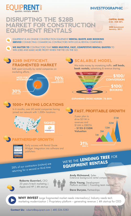
The Investfographic from EquipRent.com is the infographic they designed in-house to share with potential investors. Visual aids and infographics are becoming a valuable tool for companies to communicate with potential investors and shareholders.  Consider this to be a visual elevator pitch.

Using an “InvestFoGraphic” to raise capital

As a serial entrepreneur, I am always looking for an edge that makes a company standout and be noticed during capital raising times.

With the advent of new software tools like Prezi to boost your presentations, we decided to creatively put together a colorful investment infographic handout that completely complied with our goal of keeping our story concise, relevant, and exciting. The typical handout (1-page executive summary) that we had previously given VCs was heavy on words explaining in great detail what our company did and how successful we had been. This new graphic handout was riddled with bold and exciting claims about our company and our industry. The underlying theory behind using the infographic was to hook them first, grab their attention and then be ready to talk business. 

The exciting news is that we are now in final discussions with several investor groups to close our funding. We know the infographic wasn’t the main reason for getting to this final phase, but we do know that differentiating yourself makes you more memorable and shows investors you and your company plan on being different than the massess.

Remember the advice that the great Rod Stewart gave years ago:  Every picture tells a story, don’t it!

The team at EquipRent uses the design as a talking point at investor events.  They found it much easier to point out the visuals and discuss each point with their investors.  They shared with Cool Infographics, a few of the comments made by investors after seeing the design:

  • “I can quickly see what is different about this company than reading a typical one-page executive summary.”
  • “I have never seen anyone use an infographic for investor purposes,  other than to distinguish market trends.”
  • “Definitely sets you a part…like a cool and different resume.”

Thanks to Nate for sending in the link!