About
Randy Krum
President of InfoNewt.
Data Visualization and Infographic Design

Infographic Design

Infographics Design | Presentations
Consulting | Data Visualizations

DFW DataViz Meetup

Join the DFW Data Visualization and Infographics Meetup Group if you're in the Dallas/Fort Worth area!

Search the Cool Infographics site

Custom Search

Subscriptions:


Feedburner

The Cool Infographics® Gallery:

How to add the
Cool Infographics button to your:

Cool Infographics iOS icon

- iPhone
- iPad
- iPod Touch


Read on Flipboard for iPad and iPhone

Featured in the Tech & Science category

Flipboard icon

Twitter Feed
From the Bookstore

Caffeine Poster

The Caffeine Poster infographic

Entries in DataViz (17)

Monday
Apr182016

Experts Predict the Future of Data Analytics and Visualization

IBM Watson Analytics is a data discovery service that guides data exploration, automates predictive analytics and enables dashboard and data visualization creation. Through their Expert Series videos, Watson Analytics explores the future trends of data analytics. I had the pleasure of participating in this series, along with other prominent figures in the field.

Watch these interviews to learn about today’s trends in data visualization, data analysis, and which trends we think will have the most significant impact on the future of analytics.


What trends in data visualization are you seeing today and what are the opportunities for the future? (2:24)

Cathy Harrison (@VirtualMRX), Randy Krum (@rtkrum), William McKnight (@williammcknight), Tony Adams (@tonyadam)


Which trend do you think will have the most significant impact on the future of Analytics and why? (1:52) (1:44)

Deborah Berebichez (@debbiebere), Randy Krum (@rtkrum), Anil Batra (@AnilBatra), Valdis Krebs (@OrgNet), Christopher Penn (@cspenn)


What is your #1 tip for anyone who is asked to use data to inform business decisions? (2:22)

Deborah Berebichez (@debbiebere), Miles Austin (@milesaustin), Juntae DeLane (@JuntaeDeLane), Anil Batra (@AnilBatra), Tony Adams (@tonyadam)


What trends in data analysis are you seeing today, and what are the opportunities for the future? (2:19) (1:37)

Emilio Ferrara (@jabawack), Bob E. Hayes (@bobehayes), John D. Cook (@JohnDCook), Juntae DeLane (@JuntaeDeLane), Miles Austin (@milesaustin)


You can also subscribe and follow all of the IBM Watson Analytics videos on YouTube:


Friday
Apr152016

The Truthful Art by Alberto Cairo: Interview & Giveaway

The Truthful Art is the newest book by Alberto Cairo, and the second book of a longer, planned series. Following the huge acclaim and success of his last book, The Functional Art, Alberto expertly dives into getting data visualizations both accurate and designed for effective communication. 

This month I am giving away one signed copy of The Truthful Art! Register on the Giveaways Page by April 30th to be entered.

The Truthful Art explains:

• The role infographics and data visualization play in our world

• Basic principles of data and scientific reasoning that anyone can master

• How to become a better critical thinker

• Step-by-step processes that will help you evaluate any data visualization (including your own)

• How to create and use effective charts, graphs, and data maps to explain data to any audience

Alberto Cairo is the Knight Chair in Visual Journalism at the University of Miami, where he teaches courses on infographics and data visualization. He is also director of the Visualization program of UM's Center for Computational Science, and Visualization Innovator in Residence at Univisión, besides being a consultant for several tech companies. He is the author of the books The Functional Art: An Introduction to Information Graphics and Visualization (2012) and The Truthful Art: Data, Charts, and Maps for Communication (2016).

Everyone should follow Alberto Cairo on Twitter (@albertocairo)! He is one of the most vocal dataviz experts online, and shares his wisdom and insights openly. Also, you can download a sample of the new book with the first 40 pages of the book available on Google Drive.

I sent Alberto a handful of questions about The Truthful Art:

Who is the book intended for?

In the Epilogue I joke that I wrote 'The Truthful Art' for my past self, 8 or 10 years ago. As a journalist and designer, I didn't receive appropriate training in data reasoning in college, and that led me to make many mistakes in my career. The book is for communicators of any kind (journalists, graphic designers, marketing folks) who need to deal with data on a regular basis. It's certainly a book about data visualization and infographics, but it also covers the steps that come before you start designing anything: Getting your information as right as possible.

How do you define the difference between a visualization and an infographic?

In the book I explain that the boundary between these and other genres is very fuzzy. For me, an infographic is a combination of words and visuals (charts, maps, diagrams, illustrations) that makes a certain story understandable for people. The designer decides what data to show, and how to structure it, sometimes as a narrative or story. A data visualization doesn't necessarily tell a story, but it enables people to come up with their own conclusions, by letting them explore the information. Infographics emphasize explanation, data visualizations emphasize exploration.

What does it mean for a visualization to be truthful?

The whole book deals with this topic. In general, it requires a proper, honest, and thorough exploration of your information; asking people who know more than you do about it; and then a proper choice of visual forms to represent it.

Why are we more likely to accept visual information as truth?

It's not just visual information, it's any kind of information. We human beings aren't skeptical by nature. Our default is belief.

It is only when we become aware of the multiple ways our own brain, and other people, can trick us that we begin questioning what we see, read, hear, and feel. It is true, though, that recent research has shown that visualizations make messages more credible; this is something that can be used for good or for evil.

I don't know why many of us tend to take visualizations at face value, but it may have to do with the fact that most of us unconsciously associate charts and data maps with science. Those graphics look so precise, so crisp, so elegant! They must be accurate and truthful, right? --Well, perhaps not!

How difficult is it to choose the right chart style?

Not that difficult if you think about the message that you want to convey, or the tasks you want to enable, instead of relying just on your personal aesthetic preferences. I love maps, and I wrote an entire, long chapter about them for the book, but that doesn't mean that everything should be a map. A map may give you certain insights, but may also obscure others. In many cases, a chart may be better.

How can we become better skeptics and critical thinkers when we see data visualizations?

The key is to remember a maxim that I repeat in the book: A visualization is not something to be seen, but something to be read. Approach data visualizations and infographics not as beautiful illustrations (although beauty is a very important feature) to be looked at quickly, but as visual essays. Read them carefully, ask yourself if the designer is showing everything that needs to be shown. Remember that a single number or variable means very little on its own. In infographics, context is everything, and comparisons are paramount.

Is complexity the enemy of good data visualization design?

Far from it. Many designers believe that data visualizations and infographics are intended to “simplify” data. As my friend, the designer Nigel Holmes, has repeatedly said, infographics shouldn't simplify, but clarify. Clarification in some cases means reducing the amount of information you present, but in many others it requires you to increase it. In the book I show some examples of graphics that fail because their designers reduced the data so much that they rendered it meaningless. If a story is complex, its representation will necessarily be complex as well.

This said, it is good to be reminded of that old maxim commonly attributed to Einstein: Everything should be as simple as possible, but not simpler. Over-complicated visualizations are also problematic. If your message is simple or trivial, why creating an extremely intricate graphic?

What’s available for readers on the book website: http://www.thefunctionalart.com/p/the-truthful-art-book.html?

For now, www.thefunctionalart.com contains my blog, contact information, information about both books, and some other resources. I have added software tutorials, and will soon post some of the data from the book. My professional website, http://www.albertocairo.com/, which will be launched soon, will contain more resources.

Are you speaking at any upcoming presentations or webinars?

Yes. I post most of my speaking engagements and consulting gigs here: http://www.thefunctionalart.com/p/speaking-schedule.html

Where’s the best place to follow you online?

My blog and Twitter. I use Twitter (@albertocairo) to take notes for myself, and save interesting resources, so if you want to see what I see or read what I read, that's the place to go!


Monday
Mar282016

BallR: Interactive NBA Shot Charts

BallR: Interactive NBA Shot Charts

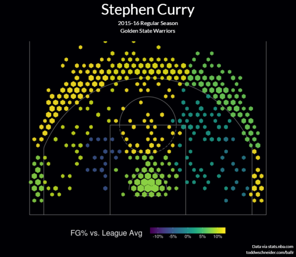
BallR: Interactive NBA Shot Charts is a tool built by Todd W. Schneider that takes the NBA's Stats API data and creates a visual representation of an NBA player's season. You can pick any NBA player and season to create the shot chart. The above infographic is an example of a hexagonal chart of Stephen Curry's Field Goal Percentage (FG%) relative to the league average within each region of the court during the 2015–16 season.

The NBA’s Stats API provides data for every single shot attempted during an NBA game since 1996, including location coordinates on the court. I built a tool called BallR, using R’s Shiny framework, to explore NBA shot data at the player-level.

BallR lets you select a player and season, then creates a customizable chart that shows shot patterns across the court. Additionally, it calculates aggregate statistics like field goal percentage and points per shot attempt, and compares the selected player to league averages at different areas of the court.

Hexagonal charts, popularized by Kirk Goldsberry at Grantland, group shots into hexagonal regions, then calculate aggregate statistics within each hexagon. Hexagon sizes and opacities are proportional to the number of shots taken within each hexagon, while the color scale represents a metric of your choice, which can be one of:

  • FG%
  • FG% vs. league average
  • Points per shot

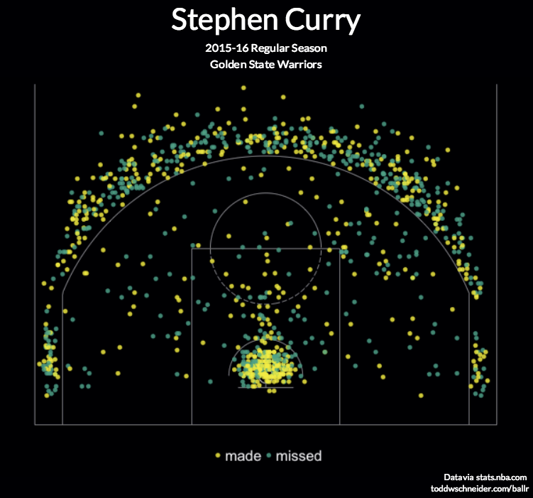
Scatter charts are the most straightforward option: they plot each shot as a single point, color-coding for whether the shot was made or missed. Here’s an example again for Stephen Curry


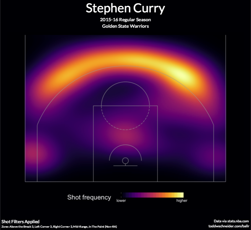
Heat maps use two-dimensional kernel density estimation to show the distribution of a player’s shot attempts across the court.

Anecdotally I’ve found that heat maps often show that most shot attempts are taken in the restricted area near the basket, even for players you might think of as outside shooters. BallR lets you apply filter to focus on specific areas of the court, and it’s sometimes more interesting to filter out restricted area shots when generating heat maps. For example here’s the heat map of Stephen Curry’s shot attempts excluding shots from within the restricted area (see here for Curry’s unfiltered heat map).

Built using R's Shiny framework, I really like this interactive dataviz. The code designed to create this was also published on GitHub so anyone can check it out and try your own modifications. Very cool!

Found on Flowing Data.

Friday
Feb052016

January Roundup of DataViz News

I sent this out to the Cool Infographics Mailing list previously, but I wanted to share on the blog as well. This will be a regular feature sent out to email subscribers, but I haven't decided if I will always post these on the blog as well. Thoughts?

If you're not a subscriber, you can join the email list HERE. I try to send only a few emails per month, and load with them valuable information on dataviz news, design tools, tips, upcoming dataviz events, giveaways, discounts, discussions and other valuable links.

Please tweet links to any DataViz news that should be included in future emails to @rtkrum


Roundup of DataViz Insights, Tools, Tips and News


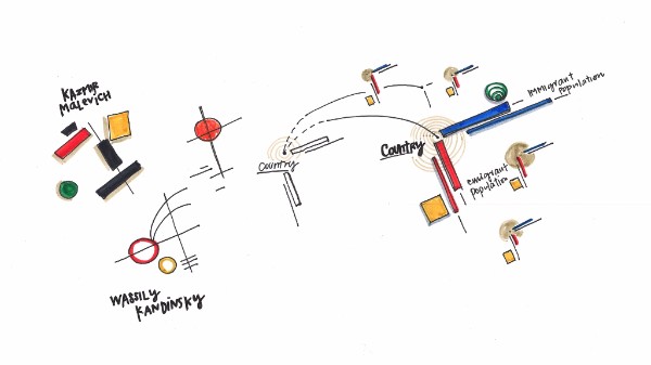
  • Can a love of abstract art and infographic design be combined? They have more in common than we originally thought! This article by Giorgia Lupi delves into how this type of infographic was applied in explaining the "global brain drain."
  • A woman of many talents, Dona Wong, author of Wall Street Journal Guide to Information Graphics, tells all when it comes to creating infographics that have a purpose. With infographics, data needs to be more than just design. It should provide real insight into the findings, that are easily digestible for its viewers. Read more here if you’d like to apply her wisdom to the marketing world. She will also be speaking at the AMA Analytics with Purpose Conference next week. 
  • The New York Times has announced that Amanda Cox has been named has been named editor of The Upshot
  • Visually has now been acquired by Scribble Live, a leading content marketing platform, in the hopes of uniting data and creativity to reach target audiences more effectively.


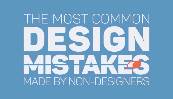
Visme Graphic Design Mistakes By Non-Designers


  • Don’t be making these design mistakes! If you’re a designer, or if you’re just getting your foot in the door, use tips from Visme to ensure that each design you make is a hit. Use discount code COOL30 for a lifetime discount 30% off your subscription.
  • Are you a Prezi user? If so, they’ve updated a new feature to create charts using your data. Check out their tutorial.
  • Your business can benefit from telling stories by visualizing data. Data Storytelling: Big Data's Next Frontier from James Kerr on Inc. provided 5 Tips to establish a necessary data storytelling environment for your business. 
  • IBM's free online dataviz site, manyeyes, was shuttered on Dec 31st, and the visualization tools are being rolled into IBM Watson Analytics over time. To learn more about what they’re offering see, click here.
  • KANTAR and Information Is Beautiful have announced the 2015 Information is Beautiful award winners! Check out the whole gallery.
  • Malofiej 24: Infographic World Summit registration is now open, with an impressive lineup of speakers coming March 6-11 in Pamplona, Spain.
  • The O'Reilly Strata+Hadoop World Conference will be taking place from March 29-31 in San Jose, CA. Use code AFF20 for 20% off tickets you can purchase here.
  •  has opened for the OpenVis Conference in April, which will be held in Boston. 
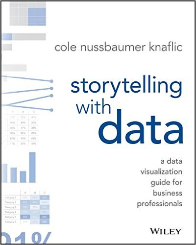
  • If you're in San Francisco, there will be a public workshop detailing storytelling using data with Cole Knaflic on February 8th.
  • A FREE one-day event in Miami, FL will be held on February 20 in celebration of World Information Architecture Day.


New DataViz Books:

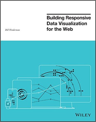
Building Responsive Data Visualization for the Webby Bill Hinderman


Storytelling with Data: A Data Visualization Guide for Business Professionalsby Cole Nussbaumer Knaflic


Monday
Jan252016

Building Responsive Data Visualization for the Web

Building Responsive Data Visualization for the Web book cover

Building Responsive Data Visualization for the Web by Bill Hinderman is a new book that just came out in November. I had the pleasure of helping Bill as the Technical Editor on the book last year, and I can say it's a fantastic guide to structuring your data and building your code for interactive data visualizations that work perfectly on every screen size.

January Giveaway! This month I am giving away one signed copy to a randomly chosen winner. Register on the GIVEAWAYS page by 11:59pm CT on January 31, 2016 to be entered. A winner will be randomly selected on February 1st.

Data is growing exponentially, and the need to visualize it in any context has become crucial. Traditional visualizations allow important data to become lost when viewed on a small screen, and the web traffic speaks for itself – viewers repeatedly demonstrate their preference for responsive design. If you're ready to create more accessible, take-anywhere visualizations, Building Responsive Data Visualization for the Web is your tailor-made solution.

Building Responsive Data Visualization for the Web is a handbook for any front-end development team needing a framework for integrating responsive web design into the current workflow. Written by a leading industry expert and design lead at Starbase Go, this book provides a wealth of information and practical guidance from the perspective of a real-world designer. You'll walk through the process of building data visualizations responsively as you learn best practices that build upon responsive web design principles, and get the hands-on practice you need with exercises, examples, and source code provided in every chapter. These strategies are designed to be implemented by teams large and small, with varying skill sets, so you can apply these concepts and skills to your project right away.

Responsive web design is the practice of building a website to suit base browser capability, then adding features that enhance the experience based on the user's device's capabilities. Applying these ideas to data produces visualizations that always look as if they were designed specifically for the device through which they are viewed. This book shows you how to incorporate these principles into your current practices, with highly practical hands-on training.

  • Examine the hard data surrounding responsive design
  • Master best practices with hands-on exercises
  • Learn data-based document manipulation using D3.js
  • Adapt your current strategies to responsive workflows


I asked Bill to answer a few questions about his book:

Who is the book intended for?

The book is for a development and design team that is looking to shift toward responsive, mobile-first practices.  While it's certainly geared most toward data visualization projects, the book spends a hefty amount of time building responsive design tenets before then getting specifically into visualization.


What’s the most important thing to make a great data visualization?

In my mind, the most important thing in making a great data visualization is the output being actionable.  The goal of a visualization is always to make something more clear, right?  All of the data is already...there, in its raw form.  So the initial goal, the more achievable goal, is clarity. But making something clear, and then also making it actionable - that is - pushing the reader/viewer/user toward actually doing something with the data, is where greatness shows up.


Do you see everyone moving towards responsive data visualization, or are a lot of companies holding back?

No, I actually don't.  I see a huge amount of people holding back, really with the same reasoning that plagued responsive design in its early stages.  That being: "People don't want to do that on mobile."  Which is, quite frankly, ridiculous.  Every study Pew has put out (I reference plenty of them in the book) shows that as soon as someone is given the opportunity to do something on mobile, they do it.  Moreover, there's an increasing amount of mobile-only users, rather than simply mobile-first.  Very soon, desktop users are going to be seen as an antiquated, legacy type of use case, rather than the default.


What's the difference between Responsive Data Visualization and Responsible Data Visualization?

Responsive data visualization is the practice of building data visualizations in such a way that they adapt, respond to, and feel natural regardless of whatever device type a user is accessing them with, and whatever the data set looks like.  In this way, it is the responsible way to visualize data.  So...there isn't one, I suppose.


What do you mean in the book by “Think Small”?

So a concept that's very closely tied to responsive design is thinking mobile-first.  That is: designing first for your most limited use case: a small screen, a bad network, sloppy, finger-based gestures.  In data visualization, we actually have an even more limited use case: no screen at all.  That's where building a good API comes into play.  Thinking of the smallest, most limited use case, say, an external call to your API from a different website, and building toward that first.  That way, as you gain real estate, features, bandwidth, you are simply enhancing something that already has a great foundation.


What are your thoughts on D3.js and its future?

It's the best, and I love it and if I could, I would shower it with chocolates.  D3.js is, if you're able to devote a development resource to learning it, the absolute best way to create a visualization on the web, because it uses all the languages of the web.  Because it isn't some applet, or some plugin, or some...image, I suppose, it just works intuitively like you are building normally for the web.  Because of this, I think the future is bright.  Even if it were never to be updated again (which isn't the case), it would still implicitly grow in functionality as web languages evolve and grow around it.


What’s available for readers on the book website: http://responsivedatavisualization.com/?

The website has snippets from every chapter of the book, along with exercises and code samples that go along with the practice sections in the chapters.  All of the code links to GitHub, and can be forked, built locally, and compared with solutions.


Are you speaking at any upcoming presentations or webinars?

I am!  I'll be speaking at Strata + Hadoop World San Jose in March (http://conferences.oreilly.com/strata/hadoop-big-data-ca).


Where’s the best place to follow you online?

The best places to follow me online are my own website (billhinderman.com), LinkedIn (linkedin.com/in/williamHinderman), or Twitter (twitter.com/billHinderman).


Thursday
Jan072016

Three Simple Resolutions to Design Better DataViz

Welcome back to the office! You’re back to work in the new year with energy and ambitions of doing better work than you’ve ever done before. Very quickly though, you fall back into the old routine and find yourself making the same charts and the same presentation slides as always. There are tight deadlines, pressure from your boss, and it’s just easier to use the templates.

Let me offer a few simple resolutions that can make your content and business communication significantly better this year.

Visualize Your Data

Visuals are so much more powerful than text and numbers. I can’t tell you how many presentations and infographics I see from lazy designers that just make the numbers really big.

“Big fonts are NOT data visualizations!”

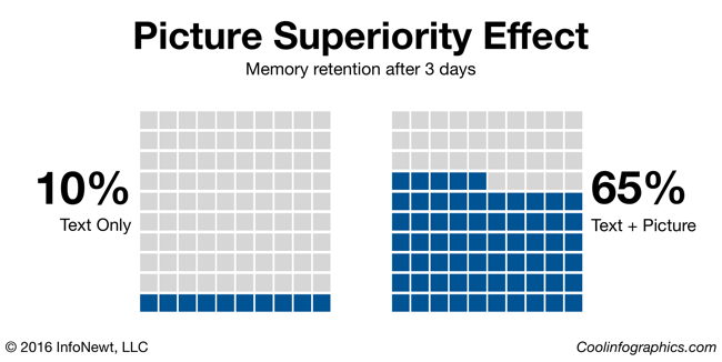
Picture Superiority Effect infographic

Our brains process visual information faster and more easily than text, and visual information is 650% more likely to be remembered by your audience than text alone (Brain Rules, John Medina, 2009). If you want to communicate a clear message, and you want your audience to remember that message, make it visual.

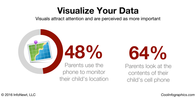
Visualize Your Data infographic

Look at these two statistics. They could be on a presentation slide, in a report, or included in an infographic. Your eye is drawn to the visualized number on the left, with both a doughnut chart and an illustration of the concept of GPS location. You as the reader are more likely to remember that statistic on the left than the number on the right, which just shows the stat in a big font size.

Remove Chart Legends

It’s frustrating that the most popular charting software in the world, Microsoft Office, always includes a chart legend by default. The “tyranny of the default” is that most designers will just accept it, and not improve their charts. It’s your responsibility as the dataviz designer to make your charts as easy as possible to understand.

Legends that are separate from the visualization of the data make your readers work much harder, looking back and forth between the data and the legend, to understand your visualization. Make understanding your data visualization much faster and easier by moving the data descriptions into the chart itself, and connected to the actual data.

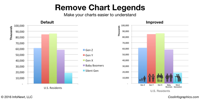
Remove Chart Legends infographic

Here you can see the default column chart created by PowerPoint on the left, and an improved version on the right. In this example, I removed the chart legend and added the data descriptions below each column. To add a visual element, I also added stock icons to visually represent the age groups as images on top of the chart. These chart improvements only took 10 minutes to create, and the chart is much easier to read.

Try New Ways to Visualize Your Data

You do want your audience to remember your data, right? You’re trying to help them make better decisions based on your information, and for that to be successful they have to be able to remember your data. Purchase decisions, voting decisions, health decisions, financial decisions, business decisions, and many more are all impacted by the information people have, and can remember.

Breaking out of the Big 3 charts is tough. Bar charts, line charts and pie charts (the Big 3) make up most of the dataviz in the world. However, they can also make your data look like everyone else’s. In order for visuals to be memorable to your audience the visuals need to be unique and different.

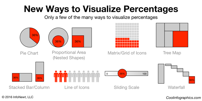
Visualizing Percentages infographic

Consider a single percentage statistic: 36%. A percentage is actually two numbers in comparison. Your data value as it compares to 100%. Pie charts are the most common way to visualize a percentage, but there are easily more than 25 different ways to visualize this statistic.

Visit sites these sites to discover new ways to visualize your data:

Design Better DataViz This Year

I ask you to make your own resolution to improve your charts and dataviz designs this year. Start with the three resolutions above, and start communicating data more effectively.

Monday
Dec142015

DataViz Gift Guide 2015

Some of the best DataViz themed gifts for the holiday season, with some great deals and discounts as well.

BOOKS

DataViz Gift Guide 2015 Books


POSTERS

DataViz Gift Guide 2015 Posters

  • Timeplots.com - 20% OFF all infographic posters, Discount Code “coolinfo”
  • HistoryShots - Check out PopWaves, the updated History of Pop/Rock Music poster!
  • Pop Chart Lab - Running a 12-Days of Christmas sale in December


TOOLS

DataViz Gift Guide 2015 Tools

  • Visme.co - Free trial, 40% OFF first payment (monthly or yearly subscription), Discount Code “COOL40”
  • The Noun Project - Free with attribution or $9.99/month unlimited. Creating, Sharing and Celebrating the World’s Visual Language
  • IBM Watson Analytics - Free & Paid editions. Predictive analytics and data visualization. Analyze your data in minutes on your own without downloading software.


TRAINING

DataViz Gift Guide 2015 Training


CONFERENCES

DataViz Gift Guide 2015 Conferences

What else would you add to your DataViz wish list?

Page 1 2