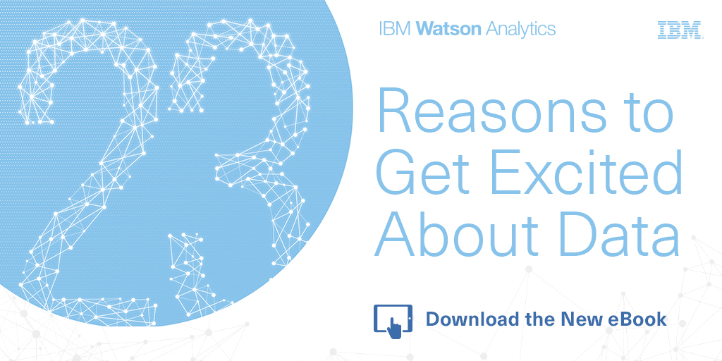
The team at IBM Watson Analytics has released a free, new eBook 23 Reasons to Get Excited About Data that explores the latest trends, practical applications and predictions about big data. I'm honored to have been included in the book as an expert on data visualization, along with all of the other IBM Watson Analytics applications!
These days, everyone’s tossing around the term “big data.” The term is nothing new – businesses have been collecting and analyzing data since the 1950s, before the two words were ever even uttered. Take a look back in time and you’re likely to see someone laboriously poring over a sheaf of spreadsheets, manually going through row after row to identify trends and gain insights.
More people are doing more things – personally and professionally – with data, and best practices will continue to develop. Self-serve, more democratized data analytics will Get Bigger, Get Faster and Get Cloudier!
I participated in an IBM video series about big data and visualization that you can see HERE. Data visualization is such an important conponent for humans to the analyze data, discover insights and communicate our findings to others! I'm very passionate about helping people understand how important data visualization truly is! Here are a couple of the thoughts I contributed to the ebook:
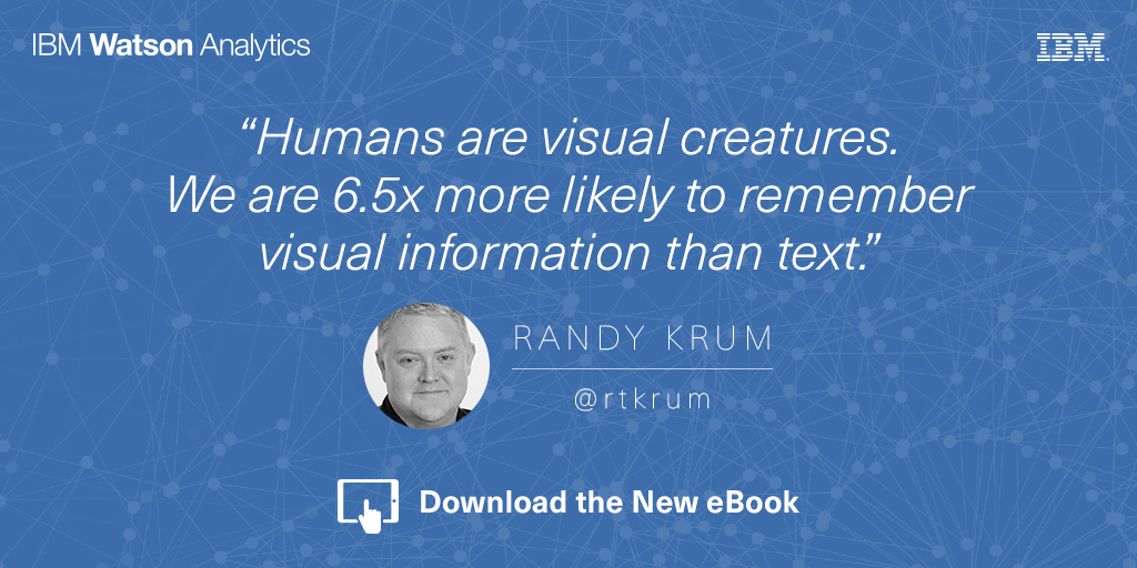
Humans are visual creatures. We can process visual information extremely fast, and are 6.5 times more likely to remember visual information than text. These are incredibly important facts when you are trying to communicate data to others. Use data visualizations to help your audience understand your information, and remember it later when it could influence their decisions or behavior. - Randy Krum
Data visualization is a language of context. You dramatically improve comprehension of your data when you design a visualization that puts your data into context for the audience. This can be a series of data points over time, or comparing your data to reference data to give the audience the perspective of how your data fits into a bigger picture. Storytelling with data is more than designing a chart, it’s the art of communicating specific insights from your data. - Randy Krum
Are you doing everything you could with your data? The future of data, along with predictive analytics and data visualization, is very exciting! Grab the free ebook now!
IBM Watson Analytics is a data discovery service that guides data exploration, automates predictive analytics and enables dashboard and data visualization creation. Through their Expert Series videos, Watson Analytics explores the future trends of data analytics. I had the pleasure of participating in this series, along with other prominent figures in the field.
Watch these interviews to learn about today’s trends in data visualization, data analysis, and which trends we think will have the most significant impact on the future of analytics.
What trends in data visualization are you seeing today and what are the opportunities for the future? (2:24)
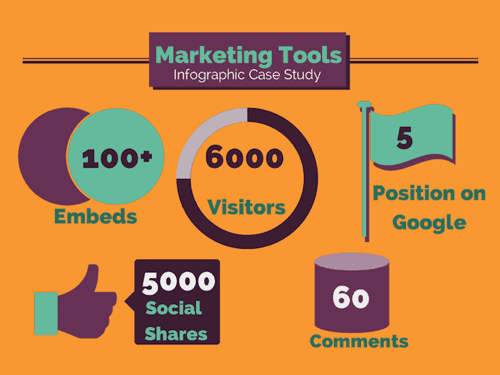
Creating an infographic is no simple task. A lot of time and resources go into the data research and design of a good infographic, but not always into figuring what happened after publishing it on the Internet. Where many companies miss the mark with their infographics is in their tracking efforts after the infographic has been released. Pageviews, social shares, reposts, backlinks, and more are all part of measuring the success of an infographic.
It is important to understand that infographics need as much promotional and tracking support as articles, videos, advertisements, and even the products and services their business is marketing. Learning what works and doesn’t work should be a huge part of future marketing plans.
The work of tracking an infographic starts the day it’s published online. Here are five key areas a company should focus on after they've released an infographic.
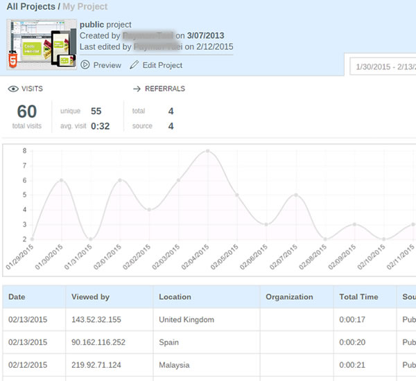
To make sure you get the most out of your infographic, make sure it is published on the company’s website on a dedicated landing page or if that’s not available, in it’s own blog post. That will provide a dedicated landing page URL as the one primary link in posts to drive all the views and backlinks to one place. By creating a landing page you can access your own web analytics to see pageviews, traffic patterns and referring sites. You also have control over which social sharing buttons to include for default text and sharing statistics.
An often overlooked ally to tracking infographics after their release is your company’s own website analytics. When you examine the metrics of the overall company website, inbound links can become a jackpot for insights about who picked up your content.
Pro Tip:
Use inbound links to keep track of pick-up, and target new outlets for future outreach efforts.
An alternate (or secondary) method would be to publish your infographic on a hosted platform like Visme or SlideShare. These platforms display the infographic within an enclosure that can be embedded and shared on other sites, and gather the analytics from all of the sites displaying the enclosure in one tracking report.
For many companies, the goal of publishing infographics is to attract links and visitors to its own website. To find all of those links, you have to go looking for them.
Pro Tip:
Use an SEO backlink tool like Majestic SEO Site Explorer, Moz Open Site Explorer, or even do a Google search of the full landing page URL (another advantage of having a dedicated landing page URL). These tools will allow you to be able to find all of those valuable backlinks.
Be sure to check the value of links from those sites. One strong link can be worth more than many weak links. Google call this PageRank, Moz calls this Authority, and Majestic calls this Trust. Choose one metric for your tracking so you are comparing the same type of score across all of the sites that link to your infographic landing page.
Go through your list of industry specific websites, blogs, and news media outlets you pitched the infographic to, and search their website to see if anything pops up (wait about a week or two before searching to give time for an article to be written).
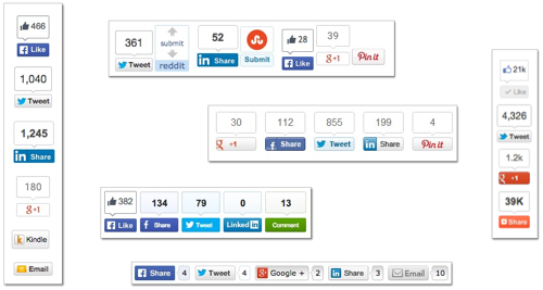
3. Social Share Counters
Social media can be used as a good indicator of how well your content is performing online, especially when looking at social shares from a specific media site pick-up. It’s important to remember that social sharing doesn’t help your own website’s pagerank, but it does build widespread awareness and exposure of your infographic content.
Pro Tips:
a. Use the counters from the social share buttons you set-up on the dedicated landing page.
b. Search Twitter (and other social media sites) for the full URL link to the landing page to find other social media posts that didn’t use your buttons but did link back to the infographic.
c. Check the social share button counters on other sites that reposted the infographic for additional sharing stats.
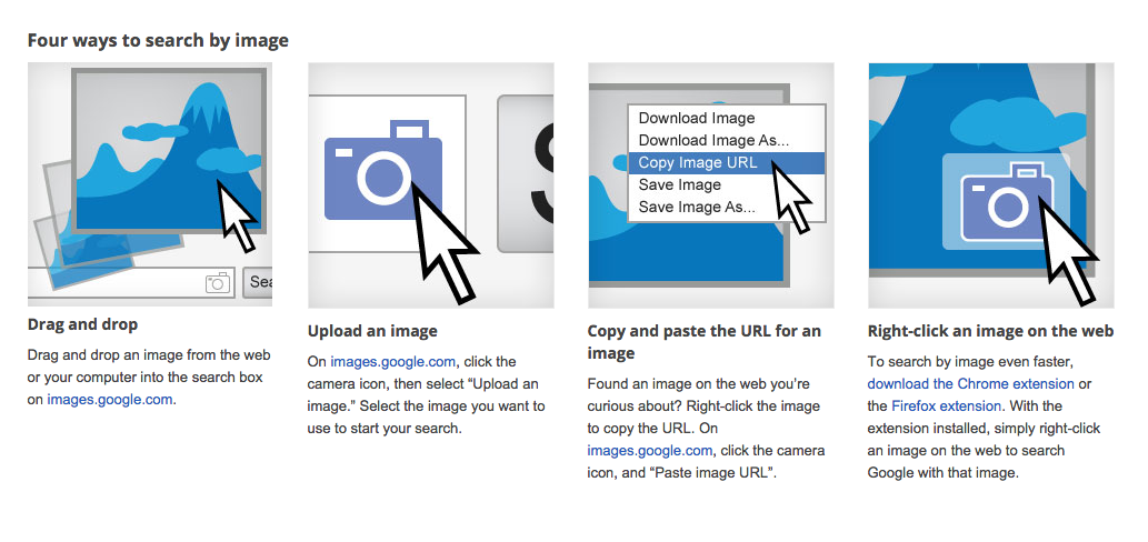
4. Reverse Image Search
When a blogger, media outlet, or journalist has chosen to write about your infographic, it doesn't always mean they will also take the time to include a link back to your website, or will even remember where they found the infographic. Reverse Image Search is a valuable tool to use to find reposts of your infographic that don’t link back to your website..
Reverse Image Search is a service offered by Google, Bing and TinEye. They allow you to drag and drop, upload your own image or choose an image online to start the search. The results will list all of the web pages in their index that include that image, in any size. This is the best way to find sites that posted your infographic without linking back to your landing page.
Reach out to any high value sites you find that published your infographic but didn’t include a link. Politely thank them for sharing your infographics, and ask them to add a link back to the original landing page.
5. Gather Your Results
Pull together all of the results you found into a summary that your company can use as a benchmark to evaluate future published content. Your web analytics, combined social shares, backlinks from sites and image-only posts together paint an overall picture of how well your infographic performed.
Site that have seen their own success from posting your infographic are more likely to post future infographics from you as well. Start building an outreach list of people and sites that appreciate your content.
Even the slightest effort put into tracking your infographic can significantly improve your understanding of the value of visual content. In order to understand it’s value, you have to understand its reach. Then, you can evaluate how your content is performing, and make any changes needed to make future content more likely to garner the pick-up and exposure your team or company seeks.
Remember, you can’t improve what you don’t measure!
Are there any other tracking methods you use to keep track of your infographics or other visual content? How do you measure success for infographic (or any visual content)?
Update on Wednesday, July 15, 2015 at 3:02PM by
Randy


 Randy
Randy