About
Randy Krum
President of InfoNewt.
Data Visualization and Infographic Design

Infographic Design

Infographics Design | Presentations
Consulting | Data Visualizations

DFW DataViz Meetup

Join the DFW Data Visualization and Infographics Meetup Group if you're in the Dallas/Fort Worth area!

Search the Cool Infographics site

Custom Search

Subscriptions:


Feedburner

The Cool Infographics® Gallery:

How to add the
Cool Infographics button to your:

Cool Infographics iOS icon

- iPhone
- iPad
- iPod Touch


Read on Flipboard for iPad and iPhone

Featured in the Tech & Science category

Flipboard icon

Twitter Feed
From the Bookstore

Caffeine Poster

The Caffeine Poster infographic

Entries in content (6)

Wednesday
Dec302015

Designing Infographics That Last

The web is inundated with new content on an hourly basis. So much so that it can be hard for any content to stand out. Readers have an attention span shorter than a goldfish! With trending hashtags, sponsored posts and the brevity of posting with fewer than 140 characters, hot trending topics often play a factor in the success of your infographics. But it doesn’t have to. 

While we’re busy flitting from one project to the next, always looking ahead, it’s possible to lose track of our content once it has passed the design phase. But the long-term success of your content relies on more than just good design. I define the Online Lifespan of your infographic as the amount of time it remains relevant to the audience, and it plays a huge role in the measurable success of your content. 

First, you need to determine your project’s goals. What is your goal for this infographic? Are you looking for a short-term boost in traffic? Or are you looking to post content that readers will view and share for years to come? 

Sometimes your infographic works with an online lifespan somewhere in between. For example, the annual “Death & Taxes” poster visualizes the Federal Budget and has a lifespan of a year before its information becomes outdated when a new budget is released.
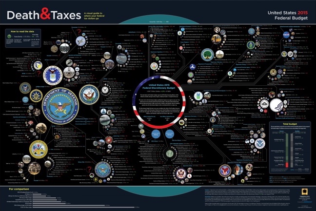
Death and Taxes poster infographic

SOURCE: Timeplots

If you’re looking for longevity, however, choosing a lasting topic for your content can work to your advantage. Here are just a few of the benefits:

  • More bang for your buck: It essentially costs you the same amount of time and resources to design an infographic with a short online lifespan as it would for a design with a long lifespan. You spend the same amount of time and effort in your design and research, but gain two very different results.
  • Visibility: No one will be searching for the Top 10 Christmas Traditions in 2015 after December 25, 2015, so all of your traffic needs to happen within a short period of time. A longer-lasting way to frame this infographic would be to create a timeline of Christmas traditions over the last few hundred years. Although this isn’t typically “evergreen” content, you’ll see a resurgence of traffic every year around Christmas time. Without a hard end-date, your infographics can live on driving views, backlinks and social shares for years to come.

History of Christmas Traditions infographic

SOURCE: Balsam Hill

  • Less maintenance: Once you’ve created a piece of evergreen content, there’s little to no maintenance necessary to keep your content relevant.

While there are situations where trendy and timely content can work in your favor, creating content with a longer online lifespan can lead to longer lasting success. It all comes down to the topic choice and the type of data.

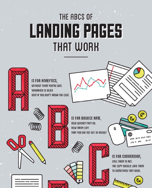
Selecting your topic is the most important factor in determining the online lifespan of your infographic. Jumping on a breaking news topic is a great way to get your client some quick visibility, but does little to increase its long-term exposure. However, coming up with truly evergreen content like the infographic below will keep your content relevant long after you’ve created it. 

Wine and Food Pairing Chart infographic

SOURCE: Wine Folly

Keep these goals in mind when selecting a topic for your next infographic. A blend of trending topics and evergreen content can build a very robust content strategy.

Tuesday
Jul142015

Pro Tips to Track Results from Infographics

Creating an infographic is no simple task. A lot of time and resources go into the data research and design of a good infographic, but not always into figuring what happened after publishing it on the Internet. Where many companies miss the mark with their infographics is in their tracking efforts after the infographic has been released. Pageviews, social shares, reposts, backlinks, and more are all part of measuring the success of an infographic.

It is important to understand that infographics need as much promotional and tracking support as articles, videos, advertisements, and even the products and services their business is marketing. Learning what works and doesn’t work should be a huge part of future marketing plans.

The work of tracking an infographic starts the day it’s published online. Here are five key areas a company should focus on after they've released an infographic.


1. Dedicated Landing Page for Analytics


via: CopyBlogger

To make sure you get the most out of your infographic, make sure it is published on the company’s website on a dedicated landing page or if that’s not available, in it’s own blog post. That will provide a dedicated landing page URL as the one primary link in posts to drive all the views and backlinks to one place. By creating a landing page you can access your own web analytics to see pageviews, traffic patterns and referring sites. You also have control over which social sharing buttons to include for default text and sharing statistics.

An often overlooked ally to tracking infographics after their release is your company’s own website analytics. When you examine the metrics of the overall company website, inbound links can become a jackpot for insights about who picked up your content.

Pro Tip:

Use inbound links to keep track of pick-up, and target new outlets for future outreach efforts.

An alternate (or secondary) method would be to publish your infographic on a hosted platform like Visme or SlideShare. These platforms display the infographic within an enclosure that can be embedded and shared on other sites, and gather the analytics from all of the sites displaying the enclosure in one tracking report.


2. Track the Value of Backlinks


via: Pole Position Marketing

For many companies, the goal of publishing infographics is to attract links and visitors to its own website. To find all of those links, you have to go looking for them.

Pro Tip:

Use an SEO backlink tool like Majestic SEO Site Explorer, Moz Open Site Explorer, or even do a Google search of the full landing page URL (another advantage of having a dedicated landing page URL). These tools will allow you to be able to find all of those valuable backlinks.

Be sure to check the value of links from those sites. One strong link can be worth more than many weak links. Google call this PageRank, Moz calls this Authority, and Majestic calls this Trust. Choose one metric for your tracking so you are comparing the same type of score across all of the sites that link to your infographic landing page.

Go through your list of industry specific websites, blogs, and news media outlets you pitched the infographic to, and search their website to see if anything pops up (wait about a week or two before searching to give time for an article to be written).


3. Social Share Counters


Social media can be used as a good indicator of how well your content is performing online, especially when looking at social shares from a specific media site pick-up. It’s important to remember that social sharing doesn’t help your own website’s pagerank, but it does build widespread awareness and exposure of your infographic content.

Pro Tips:

a. Use the counters from the social share buttons you set-up on the dedicated landing page.

b. Search Twitter (and other social media sites) for the full URL link to the landing page to find other social media posts that didn’t use your buttons but did link back to the infographic.

c. Check the social share button counters on other sites that reposted the infographic for additional sharing stats.


4. Reverse Image Search


When a blogger, media outlet, or journalist has chosen to write about your infographic, it doesn't always mean they will also take the time to include a link back to your website, or will even remember where they found the infographic. Reverse Image Search is a valuable tool to use to find reposts of your infographic that don’t link back to your website..

Reverse Image Search is a service offered by Google, Bing and TinEye. They allow you to drag and drop, upload your own image or choose an image online to start the search. The results will list all of the web pages in their index that include that image, in any size. This is the best way to find sites that posted your infographic without linking back to your landing page.

Via: Google Images

Pro Tip:

Reach out to any high value sites you find that published your infographic but didn’t include a link. Politely thank them for sharing your infographics, and ask them to add a link back to the original landing page.


5. Gather Your Results

Pull together all of the results you found into a summary that your company can use as a benchmark to evaluate future published content. Your web analytics, combined social shares, backlinks from sites and image-only posts together paint an overall picture of how well your infographic performed.

via: Razor Social

Pro Tip:

Site that have seen their own success from posting your infographic are more likely to post future infographics from you as well. Start building an outreach list of people and sites that appreciate your content.


Even the slightest effort put into tracking your infographic can significantly improve your understanding of the value of visual content. In order to understand it’s value, you have to understand its reach. Then, you can evaluate how your content is performing, and make any changes needed to make future content more likely to garner the pick-up and exposure your team or company seeks.

Remember, you can’t improve what you don’t measure!

Are there any other tracking methods you use to keep track of your infographics or other visual content? How do you measure success for infographic (or any visual content)?

Friday
May302014

What Makes the Perfect Blog Post?

What Makes the Perfect Blog Post? infographic

What Makes the Perfect Blog Post? infographic from blogpros.com takes information gathered from 100 highly ranked blog posts and puts it together so we can learn from those best practices.  Even though the infographic can stand on its own, it was published as a companion piece to a much more detailed article.

Always interested in what goes into the best content we can publish, we recently performed an analysis of 100 top blog posts across a number of popular sites, including Forbes, Mashable, KISSMetrics and SearchEngineWatch. The data speaks for itself, but the conclusions are up to you. What do you see in the data? Here’s what we think.

The simple color palette makes the data visualizations very easy to read.  Some of them are very well know publishing tips like providing social sharing buttons and including images.  I don’t believe that the number of characters in a title has any bearing on its success, but good titles are very important.

I don’t know if any of these factors had any influence on whether these blog posts were popular or not.  These are purely observations by the designer and may be considered to be correlated instead of causing blog post success.

Thursday
Apr242014

Smart Ways to Combine Content Marketing With SEO

Smart Ways to Combine Content Marketing With SEO infographic

The Smart Ways to Combine Content Marketing With SEO infographic is essentially a big list of the most popular online services in a number of different categories.  Published by blogmost, it’s meant as a reference tool for Marketers to help plan out their content strategies.

Trying to build High Quality Links without paying anyone? This infographic reveals techniques to build them and complete details of good website + mentioned Great SEO & SMO tools for better Marketing.

No data or numbers, the most prominent sites and companies are shown for 26 different online service categories.  The randomness of circle sizes appears to visualize some type of information, but there’s no data behind them.  It’s just the designer sizing them to fit the different logos and icons.

The design does a fantastic job of using logos and icons in place of text.  This makes the overall design faster and easier for the audience to read through.  It’s a much more enjoyable experience than reading the text name of all the different companies, brands and sites.

Some description at the top would be helpful to describe how the sites were chosen for readers that find the infographic on other sites.  The URL of the infographic Landing Page on the blogmost site in the footer would also be helpful for the readers to be able to find the original full-size version and associated text.

Found on Visual.ly

Wednesday
Apr232014

11 Essential Ingredients Every Blog Post Needs

11 Essential Ingredients Every Blog Post Needs infographic

If every blog followed the 11 Essential Ingredients Every Blog Post Needs in this infographic, they would be much more successful. From opening with a bang to killer bullet points, this infographic uses intriguing words to increase the uniqueness of it’s take home message. Created by copyblogger.

So. You think you’ve got yourself a good blog post.

You chose your writing style. You knocked out the first draft. You allowed it to sit for an hour or a day.

Now it’s time to edit that bad dog — ruthlessly. So that it has a fighting chance in the trenches.

You’ll want to pay attention to the details like avoiding goofy, but common,grammar mistakes. You’ll want to choose your words carefully so you say what you mean.

This will allow you to shed excess copy so that you have a lean, muscular article.

But you’re not done. You also must ensure that your blog post has all of the essential ingredients it needs.

Ingredients like these, as presented in this infographic by our lead designer Rafal Tomal. Print it, pin it, but whatever you do … use it.

No numbers or data, but this well-designed infographic clearly walks the reads through a sequence of tips for blog post writing.  Illustrations help relate to each point, and make them more memorable, but I don’t understand a few of them (Why does an alien UFO abduction represent a good subhead?  I would have like to see some statistics to back up why there are good blogging tips.

Yay!  The URL in the footer takes readers straight to the infographic landing page on the copyblogger site, which makes it easy for everyone to find the original infographic and the supporting article.


Found on Google+ and Reviews N Tips

Monday
Apr212014

Choosing a Social Media Platform

Choosing a Social Media Platform infographic

Released about a year ago, the Choosing The Most Effective Social Media Platforms infographic was published by Edge Media and designed by Infographics.SG.  Photos, video, articles or text?  Depending on the type of content you are generating, your choices for effective social platforms are different.

Facebook, Twitter, Pinterest, Google+, LinkedIn. Etc. So many social media platforms. And so little time. (And manpower. And ideas.) 

There are costs involved to maintaining a social presence. It is vital for brands / companies / organisations to market on the right platform(s) in order to optimize their resource allocation. 

Use this infographic to help you choose the most efficient social media platform(s) according to factors like your goals, target audience and capabilities.

 The design includes a good mix of data visualization methods and the bold colors are eye catching to the audience.  However, some of the charts are difficult to understand.  The polar grid used for the “What Do You Aim To Achieve?” section does not clearly communicate the information to the readers.  I also the the colors should have been color-coded to be relevant to the specific social media brand colors. 

They also leveraged the infographic content into a SlideShare presetnation.  This allows them to utilize the content they already created on another social platform to reach a different audience.


Thanks to Brian for posting on Google+