About
Randy Krum
President of InfoNewt.
Data Visualization and Infographic Design

Infographic Design

Infographics Design | Presentations
Consulting | Data Visualizations

DFW DataViz Meetup

Join the DFW Data Visualization and Infographics Meetup Group if you're in the Dallas/Fort Worth area!

Search the Cool Infographics site

Custom Search

Subscriptions:


Feedburner

The Cool Infographics® Gallery:

How to add the
Cool Infographics button to your:

Cool Infographics iOS icon

- iPhone
- iPad
- iPod Touch


Read on Flipboard for iPad and iPhone

Featured in the Tech & Science category

Flipboard icon

Twitter Feed
From the Bookstore

Caffeine Poster

The Caffeine Poster infographic

Entries in training (3)

Sunday
Jan282018

Design Better Charts in PowerPoint Class on Skillshare

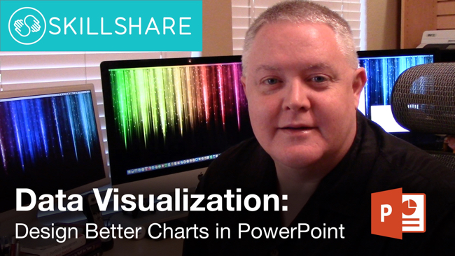
This week I launched my first class on the Skillshare platform. Data Visualization: Design Better Charts in PowerPoint is a 10-lesson class covering how to apply data visualization design principles specifically to the default charts created in Microsoft PowerPoint. Too many people click the chart button and think they're done!

If you know of anyone else that’d be interested to learn how to Design Better Charts in PowerPoint, I’d appreciate if you’d share the link with them too. Thanks!

Class Description:

Most PowerPoint charts suck! Your company spends a huge amount of time and resources on research and data analysis, but when it comes time to present your results, the default charts from PowerPoint are nothing special. Learn how to apply core data visualization design principles to create charts that clearly make your audience go “Ah-Ha!”

If you’re just using the default chart templates in PowerPoint, you’re making a big mistake. Your charts will look like the same default charts your audience sees in every other presentation, and it makes you and data look generic. Those default chart are only meant to be the starting point (you have to start somewhere), but you need to customize your charts to effectively communicate your own insights and key message to your audience in a unique, memorable way.

This course will focus applying data visualization design best practices to charts created in Microsoft PowerPoint. 

  • Choose a Key Message
  • Write a Good Title
  • Remove the Chart Legend
  • Reduce Visual Noise
  • Use Color with Purpose
  • Add Chart Elements

If you’re not familiar, Skillshare is an online subscription learning community with thousands of classes on everything from business to graphic design to fashion – it’s the Netflix of learning. You can use THIS LINK to see my class and sign up and get two free months! That's plenty of time to take my class and try out a few others. Once you're a member, you have access to all of classes that Skillshare offers, and there are thousands of them.

If you're already a Skillshare member, then you already have access. Please check out my class, and share with your network of friends and co-workers. Follow me on Skillshare to catch any future class I post as well!

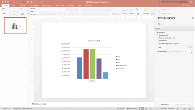
Here's a quick timelapse of the sample file I use for demostration in the class. This will give you an idea of how the data visualization design principles are applied to a bar chart in PowerPoint:

I want to thank Skillshare for inviting me to record the class, and the support they provided for planning, editing and promoting the class.

I have more video projects and big news to announce planned for this year, so stay tuned!

Monday
Dec142015

DataViz Gift Guide 2015

Some of the best DataViz themed gifts for the holiday season, with some great deals and discounts as well.

BOOKS

DataViz Gift Guide 2015 Books


POSTERS

DataViz Gift Guide 2015 Posters

  • Timeplots.com - 20% OFF all infographic posters, Discount Code “coolinfo”
  • HistoryShots - Check out PopWaves, the updated History of Pop/Rock Music poster!
  • Pop Chart Lab - Running a 12-Days of Christmas sale in December


TOOLS

DataViz Gift Guide 2015 Tools

  • Visme.co - Free trial, 40% OFF first payment (monthly or yearly subscription), Discount Code “COOL40”
  • The Noun Project - Free with attribution or $9.99/month unlimited. Creating, Sharing and Celebrating the World’s Visual Language
  • IBM Watson Analytics - Free & Paid editions. Predictive analytics and data visualization. Analyze your data in minutes on your own without downloading software.


TRAINING

DataViz Gift Guide 2015 Training


CONFERENCES

DataViz Gift Guide 2015 Conferences

What else would you add to your DataViz wish list?

Monday
Oct122015

Giveaway: Data Visualization Training Video Package

I have ONE Data Visualization - 5-Course Video Training package from O'Reilly to give away in October! This is a great giveaway! Regular price $309.99, Over 14 Hours of online training

Register HERE by 11:59pm on October 30, 2015 to be entered.

A winner will be randomly selected on Oct 31st.

Successful data visualizations allow you to impart meaning and emphasis to your data points. This Learning Path will teach you how to display trends, patterns, and outliers while you discover the power of letting your data to speak. Once you’ve finished, you’ll be able to efficiently communicate volumes of data with ease. The Data Visualization training package includes all five course videos:

  1. An Introduction to d3.js: From Scattered to Scatterplot, Presented by Scott Murray | 2 hours 52 minutes
  2. Learning to Visualize Data with D3.js, Presented by Rafael Hernandez | 3 hours 52 minutes
  3. Using Storytelling to Effectively Communicate Data, Presented by Michael Freeman | 1 hour 30 minutes
  4. Effective Data Visualization, Presented by Jeff Heer | 2 hours 52 minutes
  5. Intermediate D3.js, Presented by Scott Murray | 3 hours 38 minutes