5 Great TED Talks about DataViz
 Randy
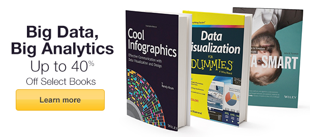
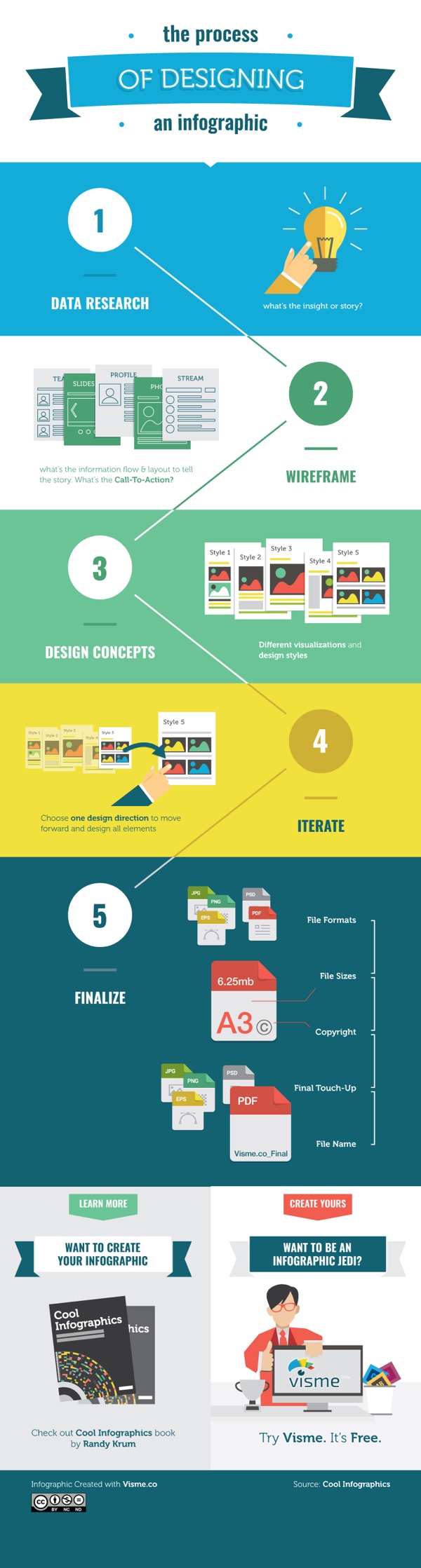
RandyDataViz is a broad term that has been trending for years, so what exactly is DataViz, and why does it matter? DataViz (or data visualization) is simply the visual representation of data or information. For example, charts, maps, diagrams, infographics, icons and illustrations are all forms of data visualization. It is commonly understood that humans are visual creatures. We understand visual information faster than reading text, and we are more likely to remember visual information later when it can impact a decision or behavior. As the amount of data we generate continues to increase, we need more efficient ways to understand and communicate insights from the data, and this is where DataViz is very effective.
The world is changing, and the world of DataViz is changing. In this ever evolving world, one thing is constant, TED’s ability to understand the pulse of what’s next. This is no more apparent than when TED talk influencers focus on the world of dataviz. From DataViz guru David McCandles talk on The Beauty of Visualization to medical doctor and statistician Hans Rosling talk on The Best Stats You’ve Ever Seen, you can experience the depth and breadth in the world of DataViz.
David McCandless - The Beauty of Visualization
“Design is about solving problems and providing elegant solutions, and information design is about solving information problems.”
McCandless' repertoire of visualized data has ranged from politics and climate to pop music trends. But it’s not the actual graphics that present McCandless’ true brilliance. Rather, it’s his ability to discover new ways to combine data in a fresh and interesting way. In his TED Talk, he discusses his process of turning complex data into simple yet engaging graphics.
TED Talk: http://www.ted.com/talks/david_mccandless_the_beauty_of_data_visualization
Chris Jordan - Turning Powerful Stats into Art
“That's what I'm trying to do with my work, is to take these numbers… and to translate them into a more universal visual language, that can be felt. Because my belief is, if we can feel these issues… then they'll matter to us more than they do now.”
Artist and photographer Chris Jordan has a passion for American consumption. He strives for unique visualizations of some of Western culture’s most unimaginable statistics, solidifying the phrase, “a picture is worth a thousand words.” In his speech, Jordan invites the audience into the inspiration and process behind some of his best work- including his powerful visualization of America’s annual incarceration rate.
TED Talk: https://www.ted.com/talks/chris_jordan_pictures_some_shocking_stats
Aaron Koblin - Visualizing Ourselves… With Crowd-Sourced Data
“Our lives are being driven by data, and the presentation of that data is an opportunity for us to make some amazing interfaces that tell great stories.”
From Johnny Cash’s final music video to animating the paths of every North American airline flight, Aaron Koblin’s work is all about fun. As more and more social data becomes available, Koblin discusses how he feels it’s his obligation to tell stories through visualizations. Standing by his belief that data makes us more human, Koblin shares how interface can be used as a powerful narrative device.
TED Talk: https://www.ted.com/talks/aaron_koblin
Hans Rosling - The Best Stats You’ve Ever Seen
“We want to see how the world is changing. Why are we not using the data we have? Because the data is hidden down in the databases. And the public is there, and the Internet is there, but we have still not used it effectively.”
It’s guaranteed that you've never seen data presented like Hans Rosling presents it. His genius stems from his ability to transform development statistics into animations that make the information clear, intuitive, and playful. In this legendary TED Talk (the first of many TED Talks he has given), Rosling discusses the idea that making information more accessible has the potential to change the quality of the information itself.
TED Talk: https://www.ted.com/talks/hans_rosling_shows_the_best_stats_you_ve_ever_seen
Jer Thorp - Make Data More Human
“I believe that this world of data is going to be transformative for society… By bringing the human element into this story, I think we can take it to tremendous places.”
Deeply inspired by science, Jer Thorp creates beautiful data visualizations to put abstract data into a human context. At TEDxVancouver, he shares some of his finest work, and delves deeper into why his art focuses on bringing big sets of data to life.
TED Talk: https://www.ted.com/talks/jer_thorp_make_data_more_human

;)

;)
;)
;)