False Visualizations: Sizing Circles in Infographics
Accuracy is the most important aspect of an infographic design!
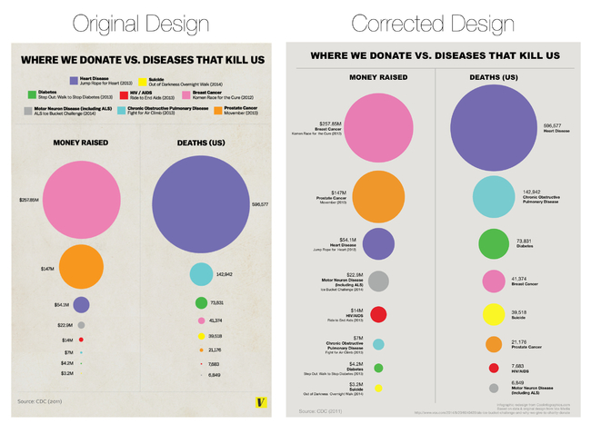
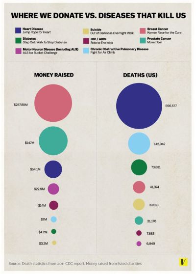
Last week, the article The Truth about the Ice Bucket Challenge by Julia Belluz on Vox Media included the infographic, Where We Donate vs. Diseases That Kill Us, that used proportionally sized circles as its data visualization. The problem with this design is that the circle sizes don’t match the values shown. This is a false visualization and significantly over exaggerates the smaller amounts of money contributed to each charity and the deaths attributed to each cause.
This causes problems because readers often just look at the visuals without reading the actual numbers. They start with the assumption that a visualization accurately represents the data. The Vox Media story and infographic already have over 12,000 shares on Facebook, and this is a great case study for designers to understand how important it is to visualize data accurately.
As readers, we see the area of two-dimensional shapes on the page to represent the different values, but design software only allows width and height adjustments to size shapes. Designers make the mistake of adjusting the diameter of circles to match the data instead of the area, which incorrectly sizes the circles dramatically. It takes some geometry calculations in a spreadsheet to find the areas and then calculate the appropriate diameters for each circle. To demonstrate, I created this corrected version of the infographic.
My Google Docs spreadsheet of the correct circle area and diameter calculations is available here.
Assuming this was a design mistake, and there was no intent to deceive the audience, this is a common mistake that many designers make. So many designers, that I included an entire section on this topic in the Cool Infographics book to help designers understand how to size the area of circles.
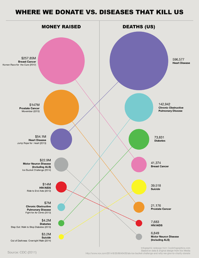
I made one other improvement to the corrected design above by removing the color legend and listing the charities and causes of death right next to the appropriate circles. This makes the whole visualization easier for the audience to read by eliminating the need to look back-and-forth from the circles to the color legend to figure out what each circle represents. Placing the text next to each circle keeps the information in the reader’s field of view which minimizes eye movement.
Sticking with the circles data visualization style, I wanted to take the design a little bit further. I would recommend one of two alternate improvements. First, adding colored connecting lines is one way to make it easier for the audience to find the related circles in the columns sorted in descending order.
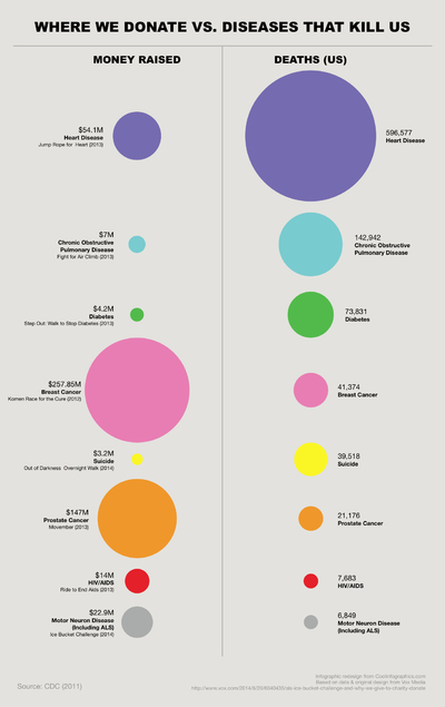
A second alternative would be to sort the lists to line up the related circles. This makes it much easier for the audience to see the direct comparisons between charitable contributions and death rates related to the same cause.
I’m passing over any discussion about whether using proportionally sized circles (a bubble chart) is the best visualization method for this data. If a designer makes the choice to use sized shapes, my point is that the data visualizations in the infographic must match the numbers using area. David Mendoza published a good analysis worth reading and designed an alternative way to visualize the data in his article, This Bubble Chart Is Killing Me.
How else would you improve this design?
NOTE: I was able to contact the designer who created the infographic at Vox Media, and he had already realized his error after the infographic had been published. As I had guessed, he had mistakenly adjusted the diameter of the circles instead of the area. He told me that he’s working on updating the official infographic design in the article, but it hasn’t been published on the Vox Media site yet.
 Randy
Randy
As the designer from Vox promised, they have now posted a corrected version of the Where We Donate vs. Diseases That Kill Us infographic with the circles sized correctly. Kudos to Vox for handling the error professionally and correctling it quickly.
 Data,
Data,  Huffington Post,
  Visualization,
  charity,
  circles,
  death,
  design,
  infographics,
  money
money 


Reader Comments (11)
Otherwise--thanks so much for the variations and for the correction of size representations. Makes it much more clear.
Chris - I'm just guessing, but I think the top two circles are different to reinforce two separate units of measure in the data. Dollars vs. Deaths. Avoids any impression that the top two circles are somehow equivalent.
Bernhard - You bring up one of many discussions about the data itself, which is why I focused on just visualizing the data they did include correctly. Why only the one major charity for each disease? The solution to Heart Disease is diet and exercise, so should it have equal funding to cancer? Suicide is not a disease, and has no prescription cure that can be researched unless you include depression.
Thanks again for the invaluable insight!
In the Google Docs spreadsheet, I chose a diameter of 2 inches to represent $257M, and the spreadsheet calculates the rest of the diameters based on the proportional differences in dollar amounts. Check the formulas.