About
Randy Krum
President of InfoNewt.
Data Visualization and Infographic Design

Infographic Design

Infographics Design | Presentations
Consulting | Data Visualizations

DFW DataViz Meetup

Join the DFW Data Visualization and Infographics Meetup Group if you're in the Dallas/Fort Worth area!

Search the Cool Infographics site

Custom Search

Subscriptions:


Feedburner

The Cool Infographics® Gallery:

How to add the
Cool Infographics button to your:

Cool Infographics iOS icon

- iPhone
- iPad
- iPod Touch


Read on Flipboard for iPad and iPhone

Featured in the Tech & Science category

Flipboard icon

Twitter Feed
From the Bookstore

Caffeine Poster

The Caffeine Poster infographic

Entries in UX (3)

Friday
Sep162016

Mapping the Disciplines of User Experience Design

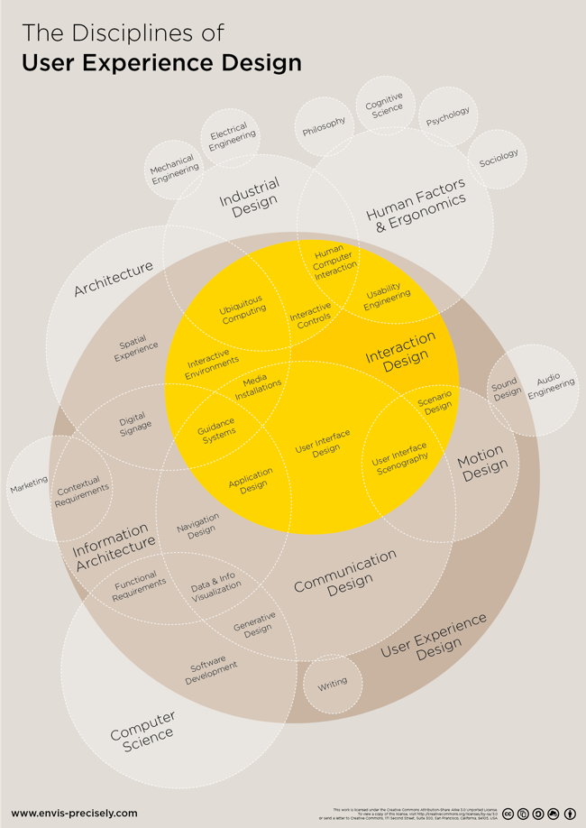
Mapping the Disciplines of User Experience Design infographic

Mapping the Disciplines of User Experience Design is an uber-complex Venn Diagram. The original concept by Dan Saffer at KickerStudio was given a clean DataViz overhaul by Thomas Gläser who was with envis precisely at the time.

An infographic approach to visualize all players of the interactive field

. It shows the different areas and how they connect and overlap.

The diagram is based on the work of Dan Saffer

It's a couple years old, but all of the files were published on Github under Creative Commons 3.0 Attribution-ShareAlike so anyone can Adpapt or Improve the design going froward.

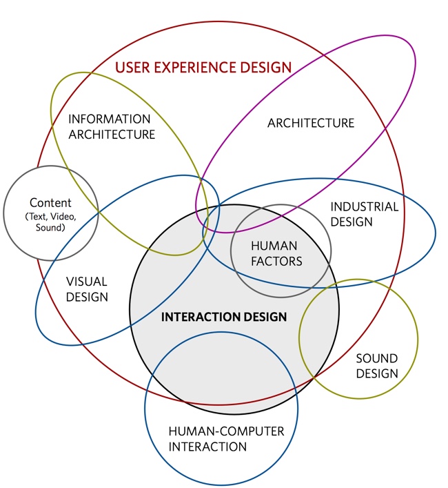
You can see the original concept from Dan Shaffer here:

Found on FastCoDesign

Friday
Aug052016

Big Design 2016 Discount & Giveaway

Big Design 2016 Conference

The Big Design 2016 conference is coming up September 8-10 in Addison, TX (in the DFW area)! Big Design is a fabulous conference covering User Experience, Design, Data Visualization, Digital Marketing, Content Strategy and Usability! This year I'll be there signing copies of Cool Infographics, and I'll be giving a new talk "What Is Good Dataviz Design?"

First, I have a discount code from Big Design that will get you 20% OFF the registration cost!  Use the code DATAVIZ during checkout to get the 20% discount.

Second, this month's giveaway is one free pass to the Big Design 2016 conference! Register on the GIVEAWAYS page before 11:59pm CT on August 19, 2016 to be entered. I will randomly chose a winner on August 20th.

Monday
Aug242015

The Spectrum of User Experience Design

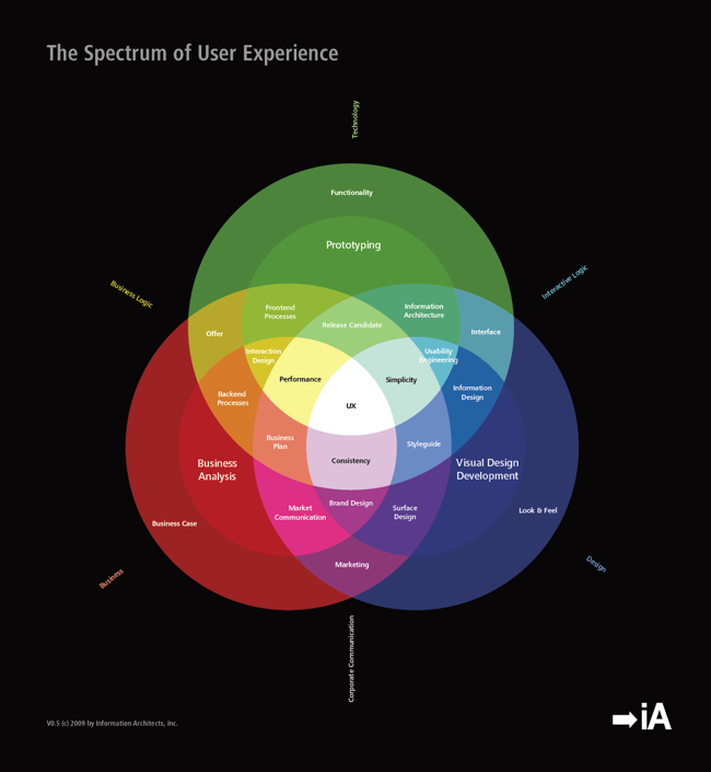
The Spectrum of User Experience Design

The Spectrum of User Experience Venn Diagram came up again recently in a discussion with a client, and looking back I realized I had never posted it here on Cool Infographics. Designed in 2009 by Oliver Reichenstein at iA (Information Architects), this is one of those everlasting designs that is even more relevant and popular today than when it was designed.

Oliver posted about it's origins here

Can’t we just all get along? Or leave each other alone? We can’t. The product, the interface and the communication build on the tension between the economic, the technological and the design force.

The business department and the engineers need to agree on a product definition that guarantees high performance; engineers and designers need to work together to make the interface as simple as possible; and designers need to team up with the business folks to get the communication consistent.

Six years later and I still love it!