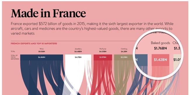
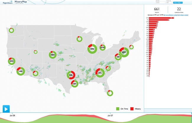
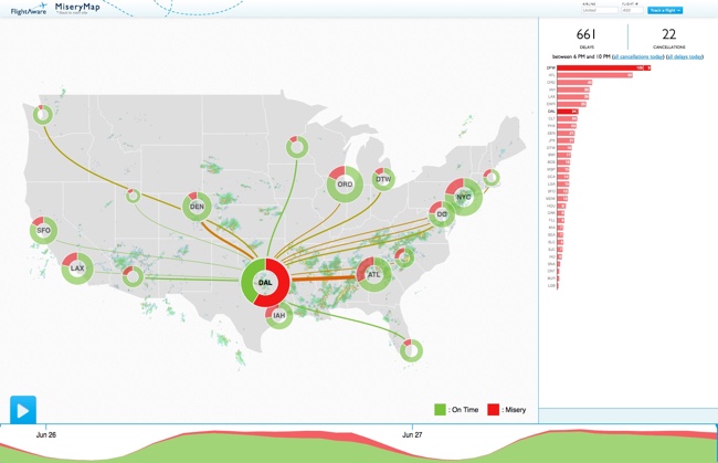
About
Randy Krum
President of InfoNewt.
Data Visualization and Infographic Design

Infographic Design

Infographics Design | Presentations
Consulting | Data Visualizations

DFW DataViz Meetup

Join the DFW Data Visualization and Infographics Meetup Group if you're in the Dallas/Fort Worth area!

Search the Cool Infographics site

Custom Search

Subscriptions:


Feedburner

The Cool Infographics® Gallery:

How to add the
Cool Infographics button to your:

Cool Infographics iOS icon

- iPhone
- iPad
- iPod Touch


Read on Flipboard for iPad and iPhone

Featured in the Tech & Science category

Flipboard icon

Twitter Feed
From the Bookstore

Caffeine Poster

The Caffeine Poster infographic

Entries in Sankey (3)

Tuesday
Jul122016

Made in France

Made in France Raconteur Infographic Sankey

The Made In France infographic by Raconteur uses a Sankey Diagram to plot the many-to-many relationships of top exports with top destination countries.

Infographic outlining French exports and top 10 importers, alternative exports including caviar, cigars and horsemeat and most popular markets

France exported $572 billion of goods in 2015, making it the sixth largest exporter in the world. While aircraft, cars and medicine are the country's highest-value goods, there are many other exports to varied markets.

I'm confused by the introductory paragraph. I don't see aircraft, cars or medicine in the data visualization or represented anywhere else. Did they just choose 8 random product categories they wanted to include?

Showing the two separate values for "Total Exports" and "Total of Top 10 Importers" is confusing. Especially when the Top 10 value is shown within the sankey diagram, but broken apart and connected to the 18 countries shown across the bottom of the visualization.

I really appreciate the magnifying glass interactive feature on the landing page! I like this approach better than the standard zooming interface you soo on many other large, complicated infographics.

Made in France Raconteur Infographic Magnify

Wednesday
Jun292016

The U.S. MiseryMap of Flight Delays

The U.S. MiseryMap of Flight Delays Map Infographic

Stuck in an airport? The MiseryMap from FlightAware shows a real-time view of flight delays and cancelations at the top 30 airports in the U.S.

Doughnut charts highlight the totals for each major city (combining airports if there are multiple) and hovering or clicking a specific city will show the flight routes (sankey diagram style) that are experiencing delays and cancelations. The full details are shown in the barr chart sidebar.

Pressing the play button will animate the map for the last 48 hours showing the changes to the weather map overlay, and delays in 4-hour increments. The overall size of each doughnut also seems to represent the total number of flights from that city in each 4-hour increment.

The U.S. MiseryMap of Flight Delays Map Infographic DFW

Thanks to Mary Kaye for sharing the link!

Friday
May012015

Food Poisoning Outbreaks Digested

Food Poisoning Outbreaks Digested infographic

The Food Poisoning Outbreaks Digested infographic is the static graphic winner for the Food Poisoning challenge put on by Kantar Information is Beautiful Awards. Designed by Andrew Park, the infographic ranks the number of food outbreaks within different categories like specific cuisine or the toxin/pathogen. 

Using a Sankey diagram, the visualisation charts the percentage breakdown for food poisoning outbreaks by national cuisine, food type, pathogen/toxin and contributing factor where the cuisine type was known.

The diagram concludes with the “most lethal combination”, highlighting the top factors that led to an outbreak.

I thought it would add context to frame the Sankey diagram in a human body, as though it was being eaten and spreading through the body like a disease.

I really like this approach to a Sankey Diagram that breaks the original total into four different categories of data.