About
Randy Krum
President of InfoNewt.
Data Visualization and Infographic Design

Infographic Design

Infographics Design | Presentations
Consulting | Data Visualizations

DFW DataViz Meetup

Join the DFW Data Visualization and Infographics Meetup Group if you're in the Dallas/Fort Worth area!

Search the Cool Infographics site

Custom Search

Subscriptions:


Feedburner

The Cool Infographics® Gallery:

How to add the
Cool Infographics button to your:

Cool Infographics iOS icon

- iPhone
- iPad
- iPod Touch


Read on Flipboard for iPad and iPhone

Featured in the Tech & Science category

Flipboard icon

Twitter Feed
From the Bookstore

Caffeine Poster

The Caffeine Poster infographic

Entries in disease (7)

Friday
May012015

Food Poisoning Outbreaks Digested

Food Poisoning Outbreaks Digested infographic

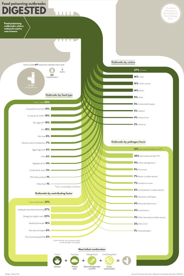
The Food Poisoning Outbreaks Digested infographic is the static graphic winner for the Food Poisoning challenge put on by Kantar Information is Beautiful Awards. Designed by Andrew Park, the infographic ranks the number of food outbreaks within different categories like specific cuisine or the toxin/pathogen. 

Using a Sankey diagram, the visualisation charts the percentage breakdown for food poisoning outbreaks by national cuisine, food type, pathogen/toxin and contributing factor where the cuisine type was known.

The diagram concludes with the “most lethal combination”, highlighting the top factors that led to an outbreak.

I thought it would add context to frame the Sankey diagram in a human body, as though it was being eaten and spreading through the body like a disease.

I really like this approach to a Sankey Diagram that breaks the original total into four different categories of data.

Thursday
Feb192015

Busting Myths About Hand Sanitizers

Busting Myths About Hand Sanitizers infographic

The Debunking the Myths About Alcohol-Based Hand Sanitizer infographic from PURELL clears up some of the most common misconceptions about their products. 

All germs are bad germs, right? Not necessarily. Using hand sanitizer dries out hands? Some don’t, but PURELL® Advanced Hand Sanitizer won’t strip your hands of their natural moisturizers. There is much confusion today around antibiotics, antibacterial soaps and hand sanitizers, as well as their effectiveness and whether they contain harmful chemicals like Triclosan (which Purell does not). Learn the truth about alcohol-based hand sanitizers as 7 of their most common myths are debunked for good.

Infographics are a fantastic way for companies to help consumers better understand complicated products and issues. Health and safety are some of the top concerns from consumers, and the team at PURELL has done a great job here of addressing the top concerns and misunderstandings they hear about their products.

The use of the infographic as part of a larger marketing campaign is also a great use of the data and design assets that have been created. The larger campaign includes videos, a SlideShare presentation, the infographic and a downloadable PDF.

Tuesday
Oct142014

20th Century Death

20th Century Death infographic

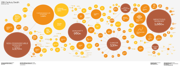
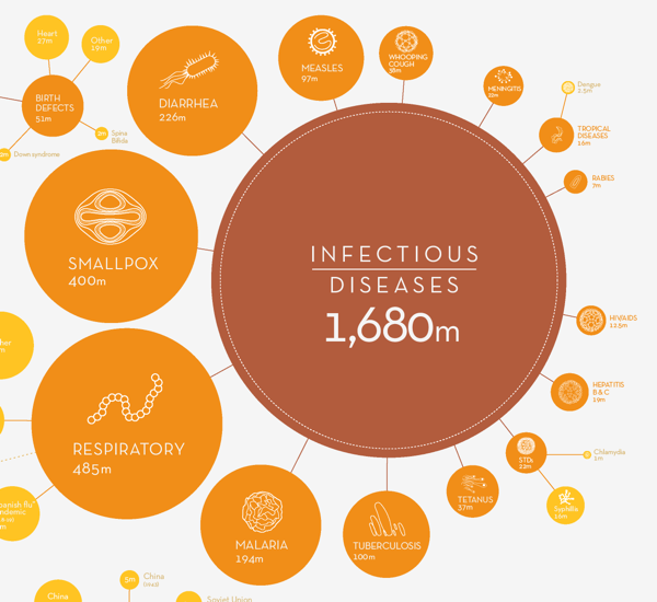
20th Century Death infographic from Information is Beautiful, visualizes the main causes of death during the 20th century by grouping each cause into general categories and then branching off more specifically.

Visualizing the major causes of death in the 20th Century.

Originally a 6m x 2m commission by the Wellcome Collection as a companion piece to the London exhibition: ‘Death: A Self-Portrait – The Richard Harris Collection’ (Nov 2012).

Appropriate choice of color scheme since red has a negative association like death, and red, orange, and yellow are an analogous color scheme due to their proximity on the color wheel. I would have loved to see more graphic pictures like the ones used in the infectious disease group and the animal subgroup.

I think this is a great application of a bubble chart. The audience isn’t trying to make specific value comparisons, but instead should get a general feel for the large differences in the causes of death.

I love that David McCandless and his team has made his data transparent and available to anyone. The data values are posted in a public Google Spreadsheet available at http://bit.ly/20thdeath

Found on Information is Beautiful

Thursday
Sep112014

A Comprehensive Look at the Ebola Virus

A Comprehensive Look at the Ebola Virus infographic

The newest outbreak of Ebola virus caused a lot of panic due to the lack of public knowledge of the disease. Buddy Loans has created A Comprehensive Look at the Ebola Virus infographic to increase (or maybe in this case decrease) the public’s exposure to the disease.

2014 has seen the worst outbreak of Ebola Virus Disease (EVD) in history, with WHO reporting more than 1,700 cases worldwide (as of August this year). In this infographic we take an in-depth look at the virus (formally known as Ebola Haemorrhagic Fever) and its history, origin, genus, transmission, symptoms, fatality rate, and treatment.

All information is correct as of mid-August 2014. Data sources include the World Health Organisation (WHO), the Center for Disease Control (CDC), Medecins Sans Frontieres (MSF), the BBC, The Guardian, and other high profile news outlets.

Infographics that explain anything health or medical related tend to be a little word heavy, due to their job of thoroughly and explaining complex information. This is a very clean design that implies authority and credibility, and uses a very simple red-blue color scheme. 

The chart in the History of Ebola Outbreaks section is interesting. They chose to only include the data of the biggest outbreak years instead of including every year on the timeline. This is a good method to use when you have a lot of specific data you want to highlight in a small space. If this infographic was focusing on a comparison between the good years and the bad years of Ebola, then including the data sets from smaller years would be appropriate.

The stacked bar chart is also a little tough to understand, and might have worked better as a clustered bar. The blue bar is the total number of reported cases, and the red bar is the portion of those cases that resulted in death. Not the normal way that people use a stacked bar chart.

I like that each section uses a different visualization method (bar chart, map, doughnut chart, etc.).  That makes it easier for the audience to read through clear separations between the sections.
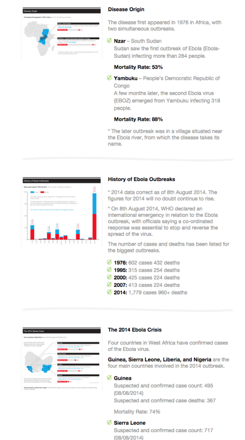
The infographic landing page is also worth noting. On the original landing page, they correctly included some intro text, the full infographic, social sharing buttons and embed code for anyone that wants to post the infographic on their own site. They added a longer text description with more information about each data visualization. This gives reads additional incentive to view the original web page and provides additional text for the search engines to associate with the infographic.

Thanks to David for sending in the link!

Tuesday
Jul022013

Can Washroom Soap Can Make You Sick?

Can Washroom Soap Can Make You Sick? infographic

Can Washroom Soap Can Make You Sick? from GOJO Industries brings to light a growing health risk in public restrooms everywhere.  Restaurants, offices, stores, hotels and more.  Those bulk soap dispensers (on the wall or built into the counter) that janitors refill by just pouring in more soap can easily become infected, and the bacteria can survive and grow inside the soap dispenser!  Yuck!

It’s hard to believe, but you could actually walk away with more bacteria on your hands after washing with soap from a refillable bulk soap dispenser in a public restroom. The contamination could even include fecal matter!

How could this be? Check out the infographic below to find out how this happens, discover smart alternatives, and see how you can help protect your family’s health by being a voice for change.

Designed by InfoNewt, this design walks the reader through a clear sequence of information.  It conveys a simple story with easy to understand information and clear sources for credibility.

  • What’s the problem? 
  • How does it happen?
  • What’s the specific risk?
  • What’s the solution to the problem?
  • What can the reader do?

This is a persuasive infographic design that ends with a very specific call-to-action.  Sign the e-petition online to support the cause or forward the infographic to someone that can make a difference.

Monday
Mar252013

The Water Rich vs The Water Poor

The Water Rich vs The Water Poor infographic

The USA is lucky to be in the top 5 countries that have annual renewable water resources. Because of this, we are very wasteful. This is considered to be “Water Rich”.  For the countires that are considered Water Poor, they do not have the wasteful luxury, in fact 88% of fatal cases are due to inadequate water access. The Water Rich vs Water Poor infographic by seametrics.com tells the story of both water rich countries and water poor countries.

While some might say gold or diamonds, as far as human life goes, water is the world’s most precious commodity.  As the world population increases, and industry continues to expand, Earth’s freshwater reserves are being stretched dangerously thin.  See the disparity in water consumption between wealthy and underdeveloped nations.

This is a good side-by-side comparison design, that has a lot of information.  Maybe too much information, because it can be overwhelming to readers.

Thanks to Ngoc for sending in the link!


Side note: There are only 5 DAYS LEFT to participate in the Cool Infographics Start 2013 Clean charity drive!  If you are able, please visit our campaign on Charity:Water and donate to the cause of providing clear, drinkable water to everyone that needs it.

Monday
Dec312012

Water Changes Everything

I have heard it argued that clean water has been the single greatest medical advancement in mankind’s history.  With effects including longer lifespan, reducing diseases, reducing birth defects and generally improving health, it’s easy to undertand how important clean water is.  Water Changes Everything is an infographic promotional for the Charity Water organization.

I’ve started the “Start 2013 Clean” campaign to raise $1,000 for Charity Water from Cool Infographics readers.  Start off 2013 right, and help me support making the world a better place.

Almost a billion people live without clean drinking water. We call this the water crisis. It’s a crisis because it only starts with water — but water affects everything in life.

Health. Education. Food security. And the lives of women and children, especially.

We can end the water crisis in our lifetime. But first we have to let everyone know it’s happening. Learn how water changes everything — and share this with everyone you know. 

It was an infographic map design by John Snow in 1854 that led to the discovery that a cholera outbreak in Soho, London was geographically tied to the location of a water well.  At the time, the popular belief was that cholera was airborne, and people would become sick by breathing “bad air.”  But John Snow’s early data visualization of reported cases was used to convince local officals to shut down the potentially contaminated well (by removing the handle).  This action is commonly credited with ending the epidemic.

Original map made by John Snow in 1854. Cholera cases are highlighted in black.

Video was designed by Jonathan Jarvis, who also designed the Crisis of Credit infographic video, and the voiceover is Kristen Bell.

Found on Daily Infographic and FastCoDesign