About
Randy Krum
President of InfoNewt.
Data Visualization and Infographic Design

Infographic Design

Infographics Design | Presentations
Consulting | Data Visualizations

DFW DataViz Meetup

Join the DFW Data Visualization and Infographics Meetup Group if you're in the Dallas/Fort Worth area!

Search the Cool Infographics site

Custom Search

Subscriptions:


Feedburner

The Cool Infographics® Gallery:

How to add the
Cool Infographics button to your:

Cool Infographics iOS icon

- iPhone
- iPad
- iPod Touch


Read on Flipboard for iPad and iPhone

Featured in the Tech & Science category

Flipboard icon

Twitter Feed
From the Bookstore

Caffeine Poster

The Caffeine Poster infographic

Entries in travel (66)

Thursday
Dec272007

The Transatlantic Superhighway


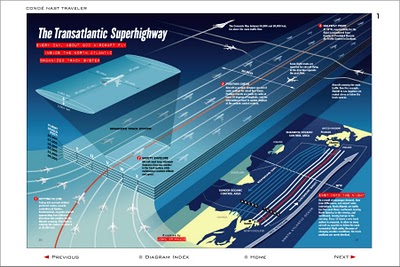
I never really thought about it, but I'm sure the flight patterns over the Atlantic are actually this tightly controlled. Now the news that President Bush made some of the military flight paths available over the holidays makes more sense. The Transatlantic Superhighway is one of the diagrams on John Grimwade's Information Graphics site.

Wednesday
Dec262007

Nichloas Felton's Personal Annual Report

Nicholas Felton (www.feltron.com) has created his own personal 2006 Annual Report, looking back at his life during 2006 and using maps, charts, timelines and facts to visually track his activities. With pages dedicated to photos, travel, drinking, reading and food, he plots out his one-year history.

Tuesday
Dec182007

Reasons to go to VizThink 2008


In the spirit of practicing what you preach, the team for the VizThink 2008 conference has created a visual guide to "Why come to VizThink 2008?". This graphic definitely has the feel of XPlane. David, did you guys create this one for the conference?

It's coming up soon! Jan 28-29 in San Francisco, CA. (VizThink link)

Monday
Dec032007

Infographic Airport Video

I came across this on Janine Swainston's blog:

The animated story of one man's epic journey, created entirely from public domain symbols. In other words, an airport story told in the language of airport infographics.

Thursday
Nov082007

Flight Explorer Snapshot


Reader submission (thanks Karen).

On the NATCA (National Air Traffic Controllers Association) website is this U.S. map showing every airline flight currently in the air. The information is delayed by 5 minutes. Also, the graphic isn't interactive, so you can see any information about the dots (like which flight it is).


You can also zoom into nine select cities to see the flights in the air and the flight numbers. So the next time you're lying in the grass with your kids (in one of the major cities) looking up at the sky, you could (if you wanted to) figure out where that airplane is going.

See also: Flight Patterns

Saturday
Oct062007

Flight Patterns


The images at Flight Patterns are really cool, but the videos are awesome (I think my favorite is the color coded)! Created by Aaron Koblin at UCLA, he took the daily flight data from the FAA and plotted the flight paths over the U.S. over time.

Found on Visual Complexity.

Page 1 ... 3 4 5 6 7