About
Randy Krum
President of InfoNewt.
Data Visualization and Infographic Design

Infographic Design

Infographics Design | Presentations
Consulting | Data Visualizations

DFW DataViz Meetup

Join the DFW Data Visualization and Infographics Meetup Group if you're in the Dallas/Fort Worth area!

Search the Cool Infographics site

Custom Search

Subscriptions:


Feedburner

The Cool Infographics® Gallery:

How to add the
Cool Infographics button to your:

Cool Infographics iOS icon

- iPhone
- iPad
- iPod Touch


Read on Flipboard for iPad and iPhone

Featured in the Tech & Science category

Flipboard icon

Twitter Feed
From the Bookstore

Caffeine Poster

The Caffeine Poster infographic

Entries in patents (2)

Friday
Apr262013

The Importance of Childhood Education

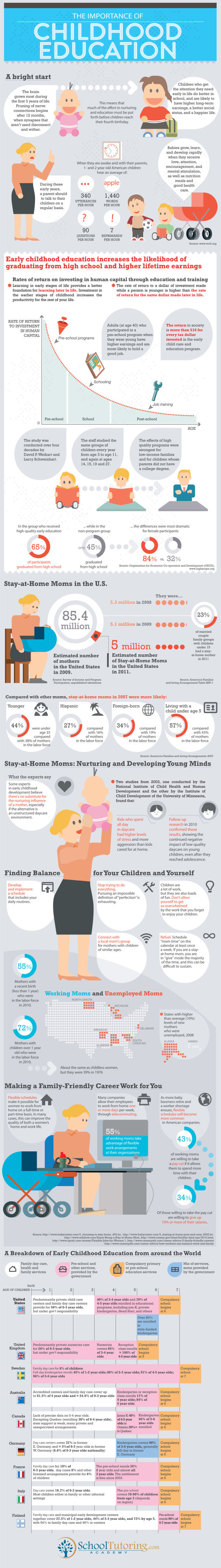
A helpful infographic for soon-to-be parents. The Importance of Childhood Education infographic from SchoolTutoring Academy takes information about kids with early childhood education and attention and compares them to kids who did not. But it isn’t all bad news for moms, the infographic gives a few tips on how to survive being a stay-at-home mom as well as some positive job information. Then see how the United States matches up with other countries on early childhood education.

While there can be no denying the heavy importance of early education for a child, this education infographic delves much deeper by looking at how future success in life can often be predetermined by the quality of early eduction.

It also explores the often overlooked importance the role the parent plays, especially the Mother. How important is it for Moms to stay at home with their children during early learning? What steps can working Moms take to secure the best educational foundation for their child? All these topics are researched presented in the infographic. The last segment compares the different education paths taken by countries from around the world. From birth to age 7, we look at the different educational institutions that counties from Canada to Germany to Italy to the United States use to start their children’s educations.

If you have any comments or thoughts on the information included in this infographic or education in general, please use our comment section below. You can also see our previous infographic discussing the cost of rising education.

Although the information included in the design is great, this infographic has a lot of text.  Too much text.  That much text in a design will turn away potential readers even before they start.

Thanks to Shell for sending in the link!

Monday
Jul302012

Olympic Swimming 2012: Faster, Better, Stronger

Olympic Swimming 2012: Faster, Better, Stronger infographic

CREAX created this infographic for their June 2012 newsletter. Every day, they analyse tens of thousands of patents and look for clues of “the next breakthrough innovation” in all kinds of industries.  In their Olympic Swimming 2012: Faster, Better, Stronger infographic, they combined their knowledge of innovation with the upcoming olympics.  The infographic links the performances of swimmers with technology in swimming gear, pools and venues for the last 10 Olympics, and their predictions for the future.

At CREAX we are always fishing for the latest technological evolutions. Infected with Olympic fever, we wanted to investigate the link between technological evolutions and athletic performance. We had a closer look at swimming in the Olympic games since 1972. We took a deep dive into scientific literature, patents, Youtube movies and old school pictures of macho men in speedos and designed the Next Generation of Swim Equipment!

This design had a number of really cool data visualization styles that are nicely customized to the data they represent.  Just remember that the 2012 data is their suggestion, not the actual data from the current Olympics!

  • I like that each visualization matches the timeline across the top for consistency, and the monument silhouettes are great for each location.
  • The timeline of swimming pool lanes is great, as the overal width changed over the years.
  • I liked the depth of the swimming pool as an inverted bar chart, but the small icons of Speedo swimsuits are totally unnecessary and detract from the data.
  • Love the isotype hair styles
  • I like actually seeing designs of the swim suit styles, and I guess the flags are for the gold medal winner for each Olympics?

Overall, a good design.  The text blocks are too small to be full-justified.  A copyright statement and the URL to the high-resolution original infographic should be included at the bottom.

Thanks to Frederik for sending in the link!