About
Randy Krum
President of InfoNewt.
Data Visualization and Infographic Design

Infographic Design

Infographics Design | Presentations
Consulting | Data Visualizations

DFW DataViz Meetup

Join the DFW Data Visualization and Infographics Meetup Group if you're in the Dallas/Fort Worth area!

Search the Cool Infographics site

Custom Search

Subscriptions:


Feedburner

The Cool Infographics® Gallery:

How to add the
Cool Infographics button to your:

Cool Infographics iOS icon

- iPhone
- iPad
- iPod Touch


Read on Flipboard for iPad and iPhone

Featured in the Tech & Science category

Flipboard icon

Twitter Feed
From the Bookstore

Caffeine Poster

The Caffeine Poster infographic

Entries in CEO (14)

Friday
Oct122007

Radial Organization Chart

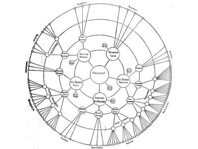
Found on Visual Complexity, this chart from 1924 is an interesting variation of an organization chart. With the authoritarian leader in the center, the subordinates are mapped outward from the center. Rings at different radii show peer level responsibility.

Friday
Sep212007

AT&T: A History


In 1984, the government broke up "Ma Bell" as a monopoly. Since then it has slowly be pulling back together. This infographic really puts all the pieces back together in a simple way that you understand immediately. Kind of like a free-form timeline, instead of the traditional, left-to-right timeline visual. The AT&T brand name is still so strong, Cingular chose to rename all of their stores AT&T after their recent merger.

Found on FreePress.net

Sunday
Aug262007

E-mail Analysis


Origianally from a NYTimes.com article in 2005, I found reference to this recently on Adam Smith, Esq. (A free registration to NYTimes.com is required to view the full size image)

Some Computer Science professors analyzed one week of e-mail traffic from Enron (about 500,000 emails) in May 2001 looking for patterns that would help investigators narrow down their search. This infographic is the result showing the email connections between employees

Saturday
Aug042007

Executive Salary Comparison


Portfolio.com has a number of good interactive infographics on their News & Markets/Multimedia page.

This Salary Comparison is simple but hugely informative showing the difference in number and visual representation of size, but also over time as you move the slider on the left. In 2005 the difference between the average worker and the CEO is so large it doesn't fit on the screen anymore. But that is down from 2000 when the difference was the largest at 548x.

Page 1 2