About
Randy Krum
President of InfoNewt.
Data Visualization and Infographic Design

Infographic Design

Infographics Design | Presentations
Consulting | Data Visualizations

DFW DataViz Meetup

Join the DFW Data Visualization and Infographics Meetup Group if you're in the Dallas/Fort Worth area!

Search the Cool Infographics site

Custom Search

Subscriptions:


Feedburner

The Cool Infographics® Gallery:

How to add the
Cool Infographics button to your:

Cool Infographics iOS icon

- iPhone
- iPad
- iPod Touch


Read on Flipboard for iPad and iPhone

Featured in the Tech & Science category

Flipboard icon

Twitter Feed
From the Bookstore

Caffeine Poster

The Caffeine Poster infographic

Entries in earth (63)

Wednesday
Jun092010

Our Amazing Planet: Top to Bottom infographic


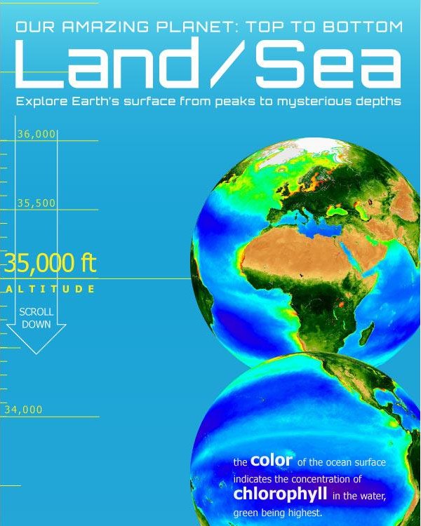
Designed by Karl Tate, Our Amazing Planet: Top to Bottom is a cool infographic that looks at the scale of things from the upper atmosphere to the deepest ocean depths.


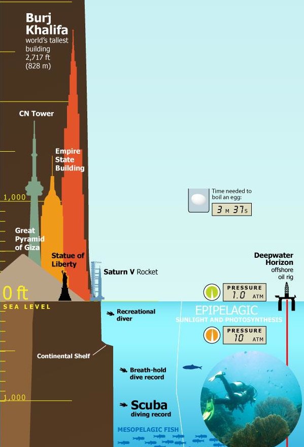
The infographic is HUGE (14,677 pixels tall), and that keeps it accurate to the scale.  It’s unreadable when the entire infographic is viewed on the screen, and that adds to the readers grasp of how big this scale really is.


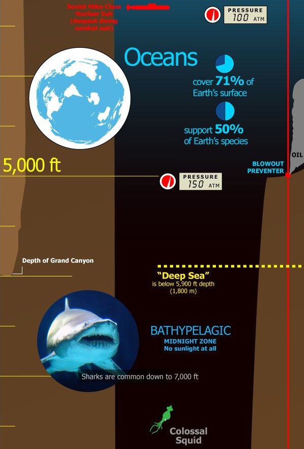
It’s also timely with recent events, showing the depth of the Deepwater Horizon oil rig spill, and drilling depth.  You can view the entire image on OurAmazingPlanet.com.


Friday
Feb192010

Emily Schwartzman Wins Haiti Infographic Contest!

Emily Schwartzman has won the GOOD contest to design an infographic about the earthquake impact to Haiti.  A high-resolution version is available on the GOOD site.

We’re proud to announce the winner of our latest infographic contest, where we asked readers to design an infographic about the recent earthquake in Haiti. We at GOOD conferred with Aaron Perry-Zucker of Design for Haiti, and we’ve come to a decision.

Emily Schwartzman—whose graphic, “Aftermath of the Haiti Earthquake,” clearly and concisely depicts both the human toll of the earthquake and the scope of the earthquake itself—is our winner. Schwartzman will take home our prize package, including a GOOD T-shirt and a free subscription. You’ll be able to see her infographic in print in our next issue as well as on the Design for Haiti site.

Excellent job Emily!

Tuesday
Feb022010

Big Brothers: Satellites Orbiting Earth

Michael Paukner has created a great infographic, Big Brothers: Satellites Orbiting Earth.  Visually showing which countries own all of the space junk currently orbiting Earth (functional, dysfunctional and floating debris).  We apparently have Saturn-envy as we attempt to create rings around our planet.

You’ve got to feel bad for countries like Chile, who used to have a single working satellite in orbit, but the warranty ran out and it doesn’t function anymore.

View the high-resolution image on Flickr.

Wednesday
Apr292009

How Long Will It Last?


Good infographic from the New Scientist showing how many years we have left of our key natural resources.  Essentially these are basic bar and pie charts, but dressed up to make the overall graphic more compelling.  The message is still clear though, and the author gets his point across very strongly.

This comes from a 2007 article in the New Scientist called "Earth's Natural Wealth: an Audit" that include two more infographics as well.  The first is a map of where in the world are these natural resources are.


The next is a bubble graphic showing the scale of how much of each resource an average American will consume during their lifetime.


The Source listed on the first infographic: Armin Reller, University of Augsburg, Tom Graedel, Yale University

Found on FlowingData.com and numerous Twitter references.  Thanks Nathan.

Monday
Mar232009

Planets, a Solar System Visualizer


Check out Planets, an interactive solar system visualizer.  It lets you change the focal point so you can see the planetary motions as if you were standing on any of the planets.  A great way to understand retrograde motion.

Thanks Paul, for the link.

Friday
Mar132009

Humans!

Watch more cool animation and creative cartoons at aniBoom

Here's a fun one for Friday.  Humans!  by Reza Rasoli.  Reminds me of The Matrix when Mr. Smith calls the humans a virus on the world.

Humans! is a 60 second global awareness PSA sensationalizing the excessive, all-consuming nature of the human being. This cute and naive Earth stands no chance against such an insatiable parasite. Witness its utter demise in a fun and sickening kind of way.
Thanks Hannu for the link!

Tuesday
Feb242009

Space Debris video


Sticking with the Space Debris theme, the ESA (European Space Agency) has this hi-res video on their website showing how crowded Earth orbit has become from 1968-2000.  Same issue as the image yesterday, that the objects are not to scale.  At this scale you would expect constant collisions, but at actual scale you wouldn't be able to see any objects at all.
In this animation, catalogued space debris are shown accumulating around Earth in 4-year increments, including payloads, rocket bodies, and fragments. While the debris objects are not shown to scale, the representation of their density is accurate.

Monday
Feb232009

Space Debris image


Great image from MSNBC PhotoBlog that tries to demonstrate how much space junk we have put into orbit around Earth.  I think the downside of this image is that the satellites aren't to scale.  If they were all this large, they would be running into each other all the time.

If you have Windows, you can see this high-res version with Microsoft HDView, but it doesn't work on a Mac.  I was able to see it with Parallels running on my MacBook.

A computer-generated artist's impression released by the European Space Agency (ESA) depicts an approximation of 12,000 objects in orbit around the Earth. A communications satellite belonging to US company Iridium collided with a defunct Russian military satellite on February 12, 2009.  (ESA via AFP - Getty Images/)
Thanks Karen for sending in the link!

Tuesday
Dec232008

Immigration to the U.S. 1820-2007


Immigration to the US, 1820-2007 v2 from Ian Stevenson on Vimeo.

Cool video by Ian Stevenson (hosted on Vimeo) that animates the origins and number of people that immigrated to the U.S. every decade from 1820 to 2007.

Thanks Garrett for the link!

Friday
Dec052008

The Species-Scape

Christopher Taylor posted this image on his Catalogue of Organisms blog, and it has raised a little controversey about the details.  The intent is that the relative size of each organism in the image is representative of the number of species in that group.  So the large fly represents the huge number of insect species.  Towards that intent, I believe the image succeeds, but I have read some disagreement about the specific numbers used to develop the image.

In case you're wondering where the mammals are, we're represented by the reindeer cowering underneath the mushroom.

Two very similar images with some differences are also available.  One from the University of Sydney:

And another on from Cornell University: (this link wasn't working for me)

No matter which is exactly correct (and there's no way to tell), you get the point how small number of species of mammals are compared to the others.

Thanks Kevin, for sending in the link!