About
Randy Krum
President of InfoNewt.
Data Visualization and Infographic Design

Infographic Design

Infographics Design | Presentations
Consulting | Data Visualizations

DFW DataViz Meetup

Join the DFW Data Visualization and Infographics Meetup Group if you're in the Dallas/Fort Worth area!

Search the Cool Infographics site

Custom Search

Subscriptions:


Feedburner

The Cool Infographics® Gallery:

How to add the
Cool Infographics button to your:

Cool Infographics iOS icon

- iPhone
- iPad
- iPod Touch


Read on Flipboard for iPad and iPhone

Featured in the Tech & Science category

Flipboard icon

Twitter Feed
From the Bookstore

Caffeine Poster

The Caffeine Poster infographic

Entries in future (15)

Wednesday
Nov232011

Design The Future - Infographic Design Contest!


Calling All Infographic Designers!


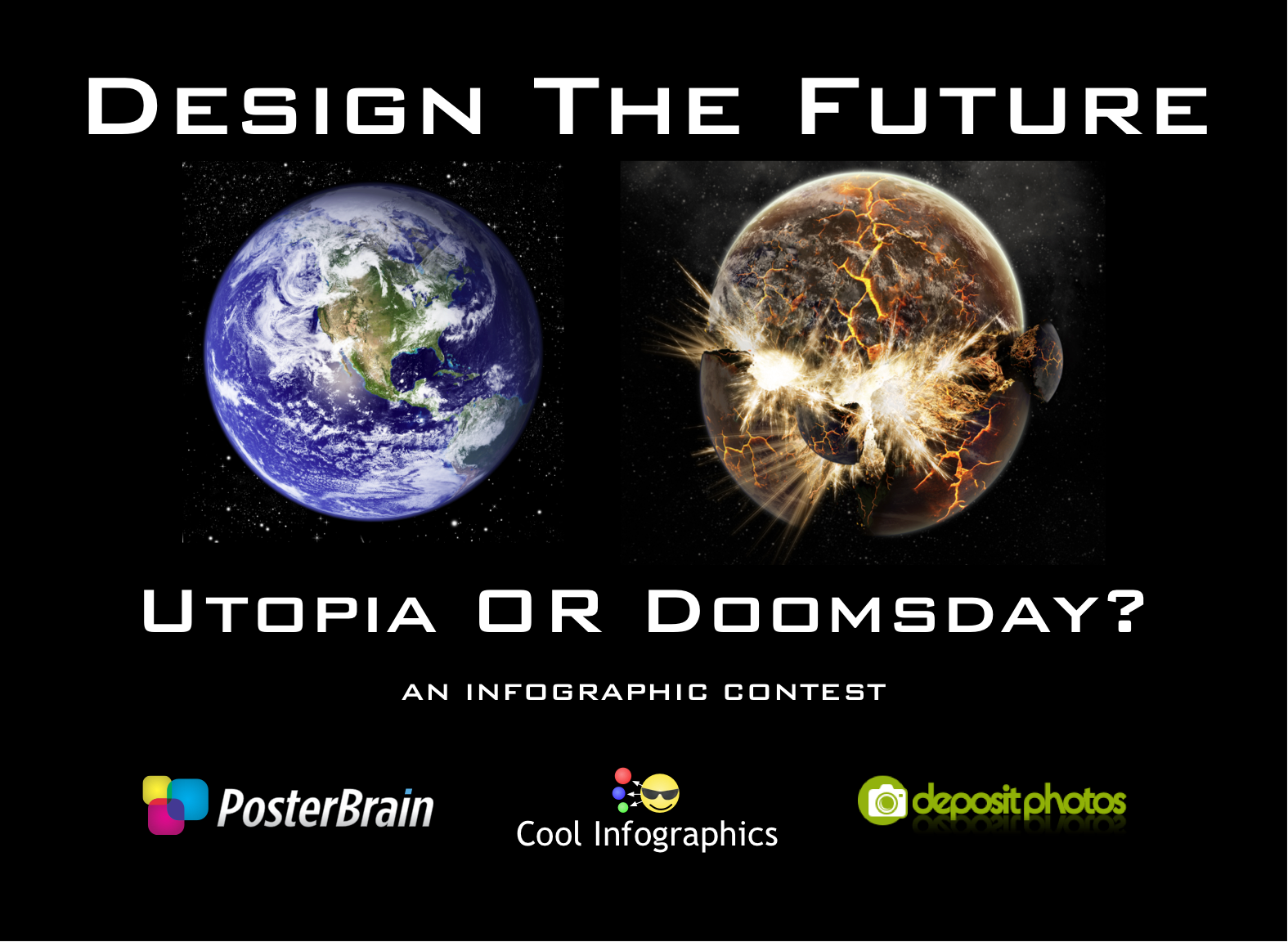
Hosted here on Cool Infographics, PosterBrain.com is sponsoring the Design The Future infographic contest for the best Utopia or Doomsday infographic poster.  The grand prize will be a 16GB iPad2.  Plus random prizes will be awarded throughout, no matter what everyone will get something.  Instead of giving you a subject for the infographic we will provide the data and you will create your own subject.  Data MUST be pulled this data spreadsheet available on Google Docs.  THIS IS THE ONLY SOURCE you can gather data for your infographic from.  Judging will be based on creativity, aesthetics, clarity and the story that your infographic tells.

Contest will end when they receive 50 Entries!  So act fast!


Of course you can create you own illustrations and visualizations, but DepositPhotos.com is offering a free, PROMO CODE to all designer participants.  This promo code gets you FIVE FREE images to use in your design!


Click here for all of the Official Contest Page with of the details.


Once you submit your entry, 33% of the judging criteria will be on how many people “LIKE” your image on our Facebook contest page.  Once you email in your entry, PosterBrain will post them on the Facebook page so you can start gathering LIKEs.

Everyone is encouraged to enter, so even if you have never designed an infographic before, this is your opprtunity.  Plus, PosterBrain will be awarding some random prizes to participants

Tuesday
Sep202011

The Internet of Things


Intel has designed a large infographic, The Internet of Things that explores the growing number of devices connected to the Internet since 1960 through predictions up to 2020.  (NOT to be confused with The Internet of Things infographic released by Cisco earlier this year with the same name)  High-Resolution PDF version, additional information and the data files are available here.

The Internet is evolving, again. Every day, billions of people connect to the Internet through billions of devices – PCs, smartphones and TVs to name just a few. While the PC remains at the centre of this evolution, Internet connectivity is now embedded into cars, fitness equipment, factory robots and vending machines. This smarter, connected world has the potential to change how we live.

We’re entering a new phase of Internet evolution. It is expanding much more rapidly than it has done in the last decade. Increasing numbers of everyday appliances are connecting to the Internet, their environment and to each other. Cars, fitness equipment, factory robots, retail signage and vending machines are becoming ‘smart’ thanks to tiny embedded computer processors and sensors, just like those in your laptop or mobile phone.

I have mixed feelings about this one.  It’s visually attractive, and would make a really nice printed poster.  The data is valuable and interesting, apparently gathered from a large number of disparate sources, but the URL listed at the bottom to view the sources didn’t work for me.

However, all of the colored lines aren’t actually connecting any events or actually combining to create a visualization of the values on the left side of the page.  While it visually implies the growing connections to the Internet and complexity, it doesn’t have any connection to the actual data.

I like the circle diagram at the bottom of the growing millions of PCs sold every day, but the “80% of of all PCs shipped today have Intel Inside” turned a fun, informative infographic into an ad and could turn off some readers.

Thanks to Emma for sending in the link!

Wednesday
Mar092011

The Present and Future State of Music

A State of the Art, The Present and Future State of Music (long title, I know) from 3GM.hu looks at the current statistics behind music streaming and consumption.

Personally, I can’t believe the statistic that 85% of listening is still consumed from the Radio?!?  I haven’t listened to an actual radio station for years!  I listen to everything through my iPhone.

Tuesday
May112010

Frog Design Envisions Your Future in 2020

At the end of 2009, Forbes magazine asked a team from Frog Design to Envision the Future, but only a future a short time ahead of us in 2020.  Augmented reality played a big part in what the team at Frog came up with, but I think infographics played an even bigger part.

At the end of last year, Forbes magazine asked frog to help them envision the future in 2020.  The day-long event led to an extensive online feature: “Your Life in 2020,” a collection of illustrated concepts and videos that envision the future of ubiquitous computing. In that future,  your computer is not only incorporated into every aspect of your life but is a part of you.

I love that they included the Whuffie, a personal score system developed by Cory Doctorow.

The term “whuffie,” by the way, is a word coined by author Cory Doctorow in his book Down And Out In the Magic Kingdom. It refers to the measurement of respect or karma a person gains or looses in their lives. In Doctorow’s future, humans have implants in their brains that visually project their whuffie, which has replaced money as currency.

Found on VizWorld and DesignMind, the Frog Design blog

Thursday
Jan282010

How Will You Manage? [video]

Loaded with labor statistics, How Will You Manage? is a new infographic video put together by XPLANE for Kronos Workforce Management.  Using a mix of statistics, illustrations and some infographics the video does a good job of looking at our changing workforce, and the challenges faced by both companies and employees.

Both teams conducted research for the video’s content, and XPLANE developed a forward-thinking storyline that exuded personality and brought the message to life. XPLANE also leveraged existing Kronos visual style and color palette to ensure brand consistency. Created with Apple’s Keynote software, the five-minute video uses simple visuals, text and music to depict the changing state of today’s workforces and what that means for employers. 

Xplane has posted a brief case study description of the process they went through with Kronos to develop the video under a very tight timeline to prepare for the Kronos User Conference.  I love that they made this with Apple Keynote!


Page 1 2