About
Randy Krum
President of InfoNewt.
Data Visualization and Infographic Design

Infographic Design

Infographics Design | Presentations
Consulting | Data Visualizations

DFW DataViz Meetup

Join the DFW Data Visualization and Infographics Meetup Group if you're in the Dallas/Fort Worth area!

Search the Cool Infographics site

Custom Search

Subscriptions:


Feedburner

The Cool Infographics® Gallery:

How to add the
Cool Infographics button to your:

Cool Infographics iOS icon

- iPhone
- iPad
- iPod Touch


Read on Flipboard for iPad and iPhone

Featured in the Tech & Science category

Flipboard icon

Twitter Feed
From the Bookstore

Caffeine Poster

The Caffeine Poster infographic

Entries in government (22)

Monday
Nov192012

The Difference Between the United Kingdom, Great Britain, and England

The Difference Between the United Kingdom, Great Britain, and England infographic

Do you know the Difference Between the United Kingdom, Great Britain, and England? This infographic from sa-la.jp spells out the differences. It also includes a timeline of major events and some ideas for the future.

The terminology of the UK is quite complicated, so it’s no wonder that people get confused. Are Great Britain, the UK and England the same thing? Is Ireland part of the UK? What’s Wales!? To help explain things, I put together this infographic to define the parts that make up the UK and how it came about. If you still have any questions by the end of it, feel free to ask in the comment section below.

Really good infographic design that uses different visualization methods in the visual explanation.  Maps, icons and a subway map style timeline are easy to understand, and give the reader a basic understanding of the UK.

The sources should be more specific, linking to specific web pages, and there should be a URL to the original infographic landing page in the footer.

Thanks to Tim for sending in the link!

Friday
Oct262012

A Visual History of the US House poster and interview

The Visual History of the United States House of Representatives infographic poster


Timeplots has launched a new infographic poster, The Visual History of the United States House of Representatives.  Available for purchase from the Timeplots site for $34.95.

This large-scale (48″x32”) print is like nothing else available on the history of the U.S. House of Representatives. It depicts the progression in political ideology of every House seat from 1789 to 2010.

Other highlights include a timeline of over 100 major legislative enactments and significant developments in U.S. legislative history, and visual summaries of party control and ideological distribution of the House and Senate in each Congress. A Visual History of the U.S. House of Representatives is packed with information and is not intended to be absorbed at a glance, but rather visited and revisited over time. 

The infographic design visualizes the entire history from 1789-2013.  The main, central visualization is the unique highlight of this design.  Each representative is shown by a colored circle that matches their party affiliation, and placed along a vertical scale based on their ideology.  The circles are filled partially transparent, so you get the cumulative color effect when the circles overlap.  This creates a darker color when many representatives within any particular two-year Congress share a similar ideology, and you can see clear areas of concentration.  Fantastic new visualization method, and creates a beautiful image.

The Visual History of the United States House of Representatives infographic poster ideology

The poster also visualizes the balance of power for each two-year Congress by party, and compares it to the Senate and the President from the same time period.  Major milestones, amendments, governance issues, economy, foreign affairs, civil rights and social policy achievements are also plotted within the time periods they took place.

Nathaniel Pearlman, Founder and President of Timeplots, agreed to answer a few behind-the-scenes questions about designing the poster.

Cool Infographics: What software applications were used to help analyze the data and create the design?

Nathaniel Pearlman: So far we have programmed our information graphic prints in the R language and done the final design pass in Illustrator. I’m interested in hearing about other platforms to use for complex data and layout — especially other software applications that would allow us to create interactive and print versions from the same code base.

Cool Infographics: What’s the most interesting thing you learned from the data?

Nathaniel Pearlman: As with some of our other posters, I like the big picture: for me, the visual history of the U.S. house print shows the sweep of U.S. history — a marked contrast with the more journalistic, and immediate, take on the political and economic state of the nation that we are used to seeing in the news. You can clearly see the ebb and flow over time of ideological overlap between the parties – and how they are at such loggerheads now.

Cool Infographics: What was the hardest part behind designing the House poster?

Nathaniel Pearlman: For the House poster, it took us a while to come up with a compelling central graphic. We were looking for something visually arresting from a distance, but that captured the key patterns in the data.  I think we found that.  

Cool Infographics: What should we expect in the future from Timeplots?

Nathaniel Pearlman:  We have recently launched Graphicacy, a design group that helps other tell their own stories with print or interactive information graphics, especially involving large or complex data sets. For Timeplots, we are currently working on a history of U.S. State boundaries and a visual history of baseball. I am excited about both of them. I would also love to hear from your audience what they would like to see, and we are always looking for collaborators, if someone would like to work with us on a project that they care about. We’re open to new ideas!

Cool Infographics: Who is your primary audience for the posters?  Schools, businesses, political offices, individuals, etc.?

Nathaniel Pearlman: Our primary audience is those with true interest in the subject matter.  Our work is explanatory or educational art for smart people – and just about everyone has areas of intense interest, whether it is sports, entertainment, food, politics or finance.  Timeplots has done a lot with American politics so far, but we intend to move now into other areas as well.


Tuesday
Oct232012

Tracking American Poverty - interactive infographic

Tracking American Poverty - interactive infographic

Tracking American Poverty & Policy is an interactive infographic visualization site that breaks down the data about…you guessed it…poverty in America.

The site provides a sequence of interactive pages that start with the overall poverty numbers, and then break them down in more detail by race, gender, education, age and family type.  In addition to the initial pie charts for the official poverty rate, the visualizations change to show details for Near Poverty, In Poverty and Deep Poverty numbers when you hover your pointer over each chart.


Tracking American Poverty - interactive infographic

You also have the option on each page to change the year to see how the number have changed from 1967 - 2010.

Good visualization design by Two-N 

Thursday
Oct112012

Obamacare: The Price of Socialized Medicine

Obamacare: The Price of Socialized Medicine infographic

The big news in the public health field in the U.S. is Obamacare. In response to its passing, Master of Public Health.org created The Price of Socialized Medicine: Obamacare’s Unconstitutionality by the Numbers infographic to give insight into how it will affect everyone.

The Supreme Court yesterday upheld the constitutionality of the Patient Protection and Affordable Care Act of 2010, in a landmark 5-4 decision. Unfortunately, they got it wrong. The PPACA, known colloquially as Obamacare, should have been struck down by the high court, as it is both unconstitutional and very costly:

  • Individual Mandate: Obamacare requires that all Americans carry health insurance or face an annual penalty. The federal government is effectively compelling individual citizens to enter a market, which is a clear violation of the Commerce Clause of the Constitution. The Supreme Court ruled that this was constitutionally valid as within Congress’ taxing power.
  • Medicaid Expansion: As the original Act is written, the PPACA would require states to expand Medicaid support or risk having their entire Medicaid federal funding cut off. This infringes on states’ rights. Fortunately, the Supreme Court did rule against these sanctions.

In response to the ruling, we have produced an infographic titled, “The Cost of Socialized Medicine: Obamacare’s Unconstitutionality by the Numbers”, which illustrates the folly of the PPACA as well as some of the costs that will be borne as a result.

Obviously, this design is promoting a specific opinion, but we’re here to discuss the infographic design itself.

  • The design outlines a really good step-by-step story top-to-bottom, and summarizes the data behind their point of view clearly
  • Good mix of illustrations and data visualization within each section.
  • In general, there’s WAY too much text in the design.  They want to be thorough in their explanations, but this much text will turn away many readers from reading the infographic at all.  Also, most of the text is too small to read on their landing page.  Less text would have been more effective, and allowed for a larger font.
  • The timeline looks like events along the heartbeat axis, but they aren’t spaced out appropriately to match their dates.
  • I like the icon representation of the justices.  Just enough detail to be recognizable.
  • Clear, easy to understand map of the costs to each state in the country map
  • The sizes of the circles in the Cost of Obamacare section are close, but not quite accurately representing the dollar figures shown.  Some are larger than they should be, and a couple are smaller.  Almost like the sizes were eye-balled instead of calculated mathematically.  Odd.
  • The states that have filed lawsuits would be easier to understand if the colored states were still placed within the map of the U.S.
  • Good list of sources
  • Need a copyright statement and the URL to the original infographic landing page for readers that find the infographic posted on the Internet to be able to find the original.

Thanks to Jimmy for sending in the link!

Tuesday
Apr242012

Gov 2.0 Infographic: Bringing the Tobacco Control Act to Life


In 2011, Enspektos, a health marketing communications innovation consultancy, invited InfoNewt (my company) to be involved in a special project the firm was leading on behalf of the Food and Drug Administration’s (FDA) Center for Tobacco Products (CTP).  As a new federal agency, the CTP is tasked with regulating tobacco products and preventing tobacco use – especially among youth.

During the project, we collaborated with the CTP to help create The Family Smoking Prevention and Tobacco Control Act: Facts, History and Milestones, an infographic timeline that covers the past and future actions related to the Tobacco Control Act passed in 2009.

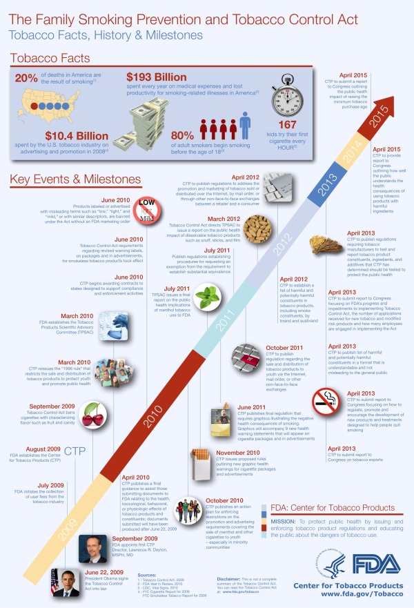
The Family Smoking Prevention and Tobacco Control Act (Tobacco Control Act) is an important piece of legislation with many requirements. This infographic illustrates the history, rationale and major events associated with the Act. The Tobacco Control Act provides all of the events, deadlines and requirements in full and should be used as the final resource for information about the Act.

The infographic is yet another example of Gov 2.0, or the effort to utilize a range of digital technologies to improve government transparency and public understanding of how federal agencies function.  The original Tobacco Control Act is a 68-page document available online, but in actual practice that isn’t easily accessible or understandable by the general public.  The FDA has created several tools to help the public understand the Tobacco Control Act, like a snapshot overview of the Act, an interactive scrolling timeline viewer, a searchable interface and the infographic timeline.

On Wednesday, April 25th, the FDA is holding a LIVE webinar to share the different tools they have created to help everyone access and understand specific information from the 68-page law. 

Attend Our Live Webinar!

As you might expect from an official government publication, the design went through many iterations of review and revisions.  In my opinion, the final infographic is text-heavy, but strikes a balance between optimal design and content that was vetted and approved by many different individuals at the CTP. 

Fard Johnmar, Founder and President of Enspektos agreed to answer some questions about the project.

Cool Infographics: How do you think the infographic and other tools will aid public understanding of the Tobacco Control Act and the CTP? 

Fard Johnmar:  I think the infographic and other tools are an important step for the federal government.  Transforming dense and complicated legislation into simple, visually appealing information products is a very difficult process.  You have to balance the wish to make things clear and concise with a requirement that information be as accurate and complete as possible.  

We had two primary goals: The first was to improve the public’s understanding of the Tobacco Control Act.  The second was to get people within FDA comfortable with using new tools that help visually communicate important regulatory and public health information.  Now that this project is complete, I think FDA will be looking for other ways to communicate about its mission and activities in more visually appealing ways.

Cool Infographics: Do you see other health and medical organizations using visual communications techniques? 

Fard Johnmar: Absolutely.  In fact, since we published the Empowered E-Patient infographic a few years ago, I’ve seen a number of health organizations using infographics to communicate about a range of topics, including GE for its Healthymagination project (click here for a few sample infographics).

Cool Infographics:  How difficult was it to push the infographic through the FDA approval process

Fard Johnmar: As you can imagine, getting final approval for a novel visual project like this can be difficult for large organizations.  However, there was a real passion for the project from Sanjay Koyani, Senior Communications Advisor at the CTP and other members of his team.  They helped to successfully meet all of the legal requirements and answer the numerous questions posed by colleagues at the CTP.  Now there is a higher comfort level at the agency with utilizing these types of visual tools to tell the CTP story.

I truly appreciated being involved in the project, and think this is a really big step towards making the often overly complex information released through official government channels more understandable to more people.

Thanks to Enspektos and the team at the Center for Tobacco Products!

Friday
Sep302011

A Disaster for FEMA

The team at DigitalSurgeons has taken it upon themselves to design the FEMA on Warning Watch infographic that looks at how 2011 (through Spetember 14th) is draining all of the FEMA funds.

We’re obsessed with data and showcasing it in a way that anyone can digest. This was unsolicited by anyone, and we just wanted to raise awareness for how much of a reality FEMA exceeding their expense budget on natural disasters was.

After our office was shaken up by the East Coast Earthquake and pelted with rain by Hurricane Irene, we got to thinking about the freak weather being experienced across the country, and the bigger question of how the damage was being paid for. As it turns out, FEMA is starting to ask itself the same question. We created an infographic that outlines the damage caused in the wake of the natural disasters that have ravaged the country and the amount of money being spent to clean up after them.

They’ve also gone one step farther, and created the SorryMotherNature.com site where anyone can pledge to make a difference.

Please share this post and help spread the word.

Monday
Aug082011

Visualizing the U.S. Debt

The U.S. Debt Visualized is a great visualization of scale, and can be found at usdebt.kleptocracy.us, where you start with a single $100 bill, and start stacking them in orders of magnitude.  Stack them on pallets, start stacking the pallets and show them in comparison to other real-world items.

$114,500,000,000,000. - US unfunded liabilities
To the right you can see the pillar of cold hard $100 bills that dwarfs the
WTC & Empire State Building - both at one point world’s tallest buildings.
If you look carefully you can see the Statue of Liberty.

Numbers this large become too big to truly comprehend to many people, and I love visualizations like this one that put the unbelievable high numbers into context and scale.  Here’s one trillion dollars:

A visualization like this has a natural bias.  Whatever object the designer chooses to show in relation to the stack of bills can make the pile appear large or small in comparison.  In this example, the piles of money are truly staggering, but that’s all the reader can walk away with.  In it’s defense, this visualization isn’t trying to propose a solution, it’s just trying to make the viewer understand how big the number is.

Found on SeeWhatYouMean, VizWorld, Business Insider and Information Aesthetics.

Monday
May092011

The Obama Energy Agenda: The White House attempts an #Infographic


On Friday, the White House (yes, that White House) released this infographic, The Obama Energy Agenda & Gas Prices.  This is one of the very few “official” infographic designs we’ve seen from the U.S. Government, so I think it deserves a little more critique than normal.  There are some things I like about this one, and some things I don’t.

The Good: 

  • The fact that this was released by the White House, is a really big positive.  I generally praise companies that experiment with infographics to get their messages out, and an official one like this from the government says big things about infographics continuing to grow in relevance in today’s society of information overload.  If you want your information to reach a bunch of people online (especially the younger crowd) then using an infographic is your best bet.
  • Nice layout telling a story.  The best infographics tell a story well, and the progression of topics top-to-bottom tell the story Obama’s team wants to share.  One topic leads into the next.
  • Bold colors.  The dark background stands out nicely in most online news and blog formats, even on the white background color of the White House Blog.  The color gradient matches the new, official White House logo with the blue gradient background you see at the top.  Makes the overall infographic feel very official.
  • Good use of illustrations.  Sometimes, visualizing a point is effectively done with an image or illustration so the reader immediately knows what you’re talking about.  The car with a power cord, the bus, the fuel gauge and the oil wells designed into the separator line near the top.
  • I like the color scheme too.  Some infographics go so crazy with clashing colors it’s hard to read, but the consistent light blue, yellow and white is easy on the eyes.
  • They included a social sharing button at the bottom of the blog posts.  They use a combined social button that expands to show many sharing services.  I generally find that less people actually use combined buttons, but they certainly save screen real estate and there’s a way to share online.  There’s no logo or company name included in this button either, so the White House isn’t endorsing a particular company.
  • I like the line chart.  They removed the y-axis labels and put the data right onto the chart, along with additional comments.  This makes the whole chart easier to understand.


The Bad: 

  • NO DATA SOURCES!  Where did the numbers come from?!?  You want readers to engage and debate your story, not challenge your facts.  Citing all of your data sources keeps the conversation on your story.  This design, without sources, almost invites readers to focus on challenging the facts instead of becoming engaged in the conversation about energy.
  • Way too much text!
  • The infographic above is the blog-size version.  The high-resolution version is tough to find because clicking on the image only takes you to the blog-size image.  Separately, in the text of the White House post, you have to click “Download Full Size” to view the higher-resolution version. (Click the image above to view high-resolution)
  • Text too small.  The font is so small in some places, it’s hard to read, and many people won’t find the text link to the high-resolution version.
  • Not many data visualizations.  Big numbers are not visualizations. and there are only three actual data visualizations (line chart, column chart and color filled factory illustrations).  There are so many more numbers included that should have been visualized to give them context!  
    • How does 35.5 mpg from 2012-2016 compare to the last four years?
    • “Over 2 billion barrels of American crude oil produced in 2010.”  Show the last 20 years to provide context.
    • “…would reduce oil consumption of about 750 million barrels through 2010.”  Is that a lot?  Making the text bold makes it feel important, but it doesn’t give the reader any frame of reference.
  • The stacked column chart could be much better.
    • They could have removed the Y-axis labels and the background lines
    • Legends are evil.  In the 2012 column, they could have identified the color-coding of the different sources of renewable energy instead of putting a separate legend under the chart.  Makes the reader work harder to look back-and-forth at a legend.
    • Why isn’t “Solar” the yellow color instead of “Geothermal”?  Yellow…like the sun.
  • The factory visual at the bottom is tough.  For any shape visualizations, it’s the AREA of the shape that conveys meaning, and I think the designer missed it here.  It looks like the green color height matches the data, but not the area of the factory shape.  Readers understand this intuitively, so to most readers the factory showing 2035 data will just look wrong, even if they don’t know why.
  • No designer credit.  Who designed it?
  • No single landing page.  The infographic is actually included in two different blog posts: The President on Jobs & Gas Prices: Read His Remarks, Download the Graphic on May 6th and Weekly Address: Clean Energy to Out-Innovate the Rest of the World on May 7th.
    • This makes tracking more difficult because they would have to look at links and views for both individual blog posts.
    • The infographic is actually the secondary topic to both blog posts, so it’s never truly highlighted as the focus of the blog post.  It’s just included in blog posts about energy topics.


Don’t get me wrong.  I LOVE that the White House staff is experimenting with infographics, and I hope they do many more in the future.  They just need some more practice. 

What do you think?

Friday
Feb182011

The 2011 Massachusetts Budget infographic poster

Jess Bachman, from ByJess.net,  has designed this new government budget poster of the 2011 Massachusetts Budget for The Pioneer Institute.

The most largest and most detailed visualization of a state budget ever, this 864 sq in poster (not for sale) compares hundreds of programs and expenditures from the billions down to the thousands of dollars.  If you really want to see how a state (like Massachusetts) spends it’s tax payers money, this is it.

The above graphic is a massive visual guide to the Massachsettes state budget. It presents hundreds of government departments, agencies, and programs in a visual format, proportionate in size to their funding level. The largest item is $15 billion, the smallest is $65 thousand.

Similar to his Death & Taxes poster of the Federal budget, the Massachusetts Budget poster is highly detailed, showing how spending for every department is broken down.


Although it’s not clear if The Pioneer Institute will make posters available for purchase, you can see the full detail online in this high-definition zoomable image.  (Check it out full-screen too!)


Wednesday
Feb162011

The Visual History of the Political Parties (infographic posters)


Timeplots.com has just released two new posters visualizing the history of the two major American political parties.  Zoomable images of both A Visual History of the Democratic Party and A Visual History of the Republican Party are available so you can see all of the detail online.  

Timeplots is also offering a discount to readers of Cool Infographics!  Enter the Coupon Code “CIG020311” to receive 10% off until 3/31/11!


Just like the other great posters from Timeplots.com, these are highly-detailed posters, loaded with a huge amount of data.  At its heart, they are timelines that show the overall party strength from 1832 (Democrats) or 1856 (Republicans) to the present.  Along the timeline additional information is included like the names of the national party chairs, Congressional leaders, city where the party convention was held, who were the winning and losing party nominees for President (along with campaign material), election highlights, party events, major legislation, as well as pictures of other party notables.

You get the point that there is a lot of history in there!

It places each party event in historical context, visualizing a remarkable range of party events, legislation, election results, and leadership to succinctly tell the story of the party. Narratives are displayed within the larger context of party strength by aggregating and annotating data on presidential elections, Congress, Governorships and State Legislatures. The Timeplot provides a new lens into American political history; it is not intended to be absorbed at a glance, but rather to be visited and revisited over time.

Posters are 36” x 24” and normal price without the discount is $29.95.

Posters should start shipping by 2/28.  Also, check the Timeplots.com site for student discounts on any of their posters.