Tiago Veloso - What Makes an Infographic Cool?
Guest post by Tiago Veloso
The ‘infographic explosion’ in the Internet began, as many of Cool Infographics readers probably know, around 2009. Since then, a whole new industry emerged, one that is dedicated to develop visual representations of information for organizations across pretty much all sectors.
It’s obvious that, as the number of marketing infographics grew, it became more difficult to achieve the link-bait impact we see so many agencies and SEO experts advertise, when defending the reasons why potential clients should include infographics in their marketing efforts.
Of course, a ‘viral infographic’ can have that impact, but the Internet user is getting more mature, I believe, in terms of what’s worth spending time reading. That means your infographic will have a couple of seconds to create an impression and captivate the reader – much like the ‘old’ newspapers headlines.
In fact, you can’t ask for a better reference of ‘what makes an infographic cool’ than the works published by many newspapers and magazines. And, from everything one can learn about infographics just by admiring some of best works in the world - like the ones awarded at Malofiej21, recently -, here are some of my favorite lessons:
Make it relevant to your audience, not to you
To be relevant, no matter in what context, implies to be correct. Nothing can be more destructive to an infographic than lack of accuracy. Dedicate enough time to research and instead of trying to mold the facts to an initial question or point of view, let the stories emerge from the data exploration process. Aim for that unique story everyone else missed. Concentrate on having a strong data-based story, in opposition of creating ‘lists of facts’.
Now, the problem with corporate clients is that usually you don’t have much data to work with in the first place. They just want an infographic, and if you’re an agency trying to make it in this market, you can’t afford to let any client escape, right?
However, poorly sourced and meaningless infographics tend to be less ‘viral’ – if they do go viral, it’s not usually good for the brand behind it. That just means it’s up to you to go after the sources – and I don’t mean just Wikipedia -, verify them, collect and explore the data, find the story before you even start drawing a chart or graphic.
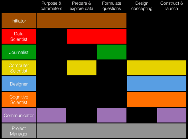
The ‘8 hats of data visualization design’, by Andy Kirk, showing the multiple dimensions of developing a data visualization.
Make it easy to the brain, not the eye
The ‘visual impact’ of an infographic it’s key in the Internet marketing business, a concept that has led to the premise that aesthetics means more to the general audience than the content itself. So, to create ‘awesome infographics’, graphic designers (most of them without any experience in visual journalism) run to vector illustrations, start playing with typography and colors, textures and even photos, adding elements that can fill up the space of those widely adopted ‘tower’ formats that the client demanded.
This strategy helped the “Infographic Industry” to grow quickly, but like I said before, I think the information consumer is adapting, evolving, learning to process visual information more intuitively, and therefore, paying more attention to the content.
And what your brand really wants, ultimately, is a message that sticks to the brain, not only to the eye. Too many colors, fonts and vectors will only take away the reader’s attention from what really matters in an infographic: the layers of information, the multiple insights you’re not only saying (in text and numbers) but showing (with comparative graphics).
There are scientific principles applied to all dimensions of information design, and I must recommend Alberto Cairo’s book The Functional Art as the perfect starting point in that journey towards a deeper understanding of this topic. The important thing to have in mind is that if you focus on providing the best information display possible, and not the easiest or the most ‘eye-grabbing’ one, you’ll be heading in the right direction to get an infographic that will please both the eye and the brain.
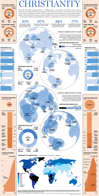
‘Tower infographics’ can be useful, and even newspapers use them. See this recent example from Canada’s National Post, designed by Richard Johnson.
Make it as an investment in branding, not sales
This third point is sort of a consequence of the previous ones. To create a ‘Cool Infographic’ you’ll have to make an investment in research, find the right balance between form and function and still have the proper connections to see it featured in major websites. Most of times, you’ll need to outsource these tasks.
Worst of all, infographics don’t sell. They’re not supposed to. They can generate lots of website traffic, perhaps even some leads, but if you’re thinking about investing in Infographics to rise sales or something like that, than my advice is that you channel those resources on to something else (please remember that we’re talking about a specific type of ‘infographic’, not all the uses for information design inside a company).
If you add to that the general lack of tolerance the internet user has to ads disguised of something else, the only truly good reason for a company to create an infographic is that it has something meaningful to communicate, that is better (not ‘easily’) understood through this specific form of visual representation.
Or, simply putted, instead of looking at infographics as ‘illustrated ads/press-releases”, think of them more as “summarized insightful white papers”.
Simple graphics can be picked up by major websites, if the content is relevant. Here’s one of many examples of charts provided by Statista that ended up in Mashable.

Tiago Veloso is the founder of Visual Loop, a collaborative digital environment for everything related to information design and data visualization. He lives in Brazil, and you can connect with him online on Twitter and LinkedIn.
 Randy
Randy
This post has now also been published on Portuguese on the Visual Loop Brazil site: http://visualoop.com/br/7072/infograficos-virais-comofaz


