About
Randy Krum
President of InfoNewt.
Data Visualization and Infographic Design

Infographic Design

Infographics Design | Presentations
Consulting | Data Visualizations

DFW DataViz Meetup

Join the DFW Data Visualization and Infographics Meetup Group if you're in the Dallas/Fort Worth area!

Search the Cool Infographics site

Custom Search

Subscriptions:


Feedburner

The Cool Infographics® Gallery:

How to add the
Cool Infographics button to your:

Cool Infographics iOS icon

- iPhone
- iPad
- iPod Touch


Read on Flipboard for iPad and iPhone

Featured in the Tech & Science category

Flipboard icon

Twitter Feed
From the Bookstore

Caffeine Poster

The Caffeine Poster infographic

Entries in live (22)

Tuesday
Oct092007

WiFi Detector T-Shirt

Another one for the "real world" infographics. This t-shirt from ThinkGeek will detect WiFi 802.11b or 802.11g wireless networks and display their signal strength on the front of the shirt. A great Christmas present for the geek in your family, for only $30.

It will amuse you, that I caught this one from Guy Kawasaki on Twitter.com, which linked to Truemors.com, which linked to BoingBoing.com, which linked to BoingBoingGadgets which finally linked to the original page on ThinkGeek.com. What a tangled web we weave...

Thursday
Oct042007

Breathing Earth


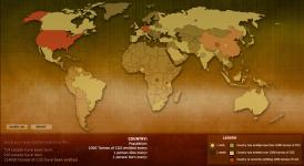
Breathing Earth is a cool website that displays international statistics in real-time, similar in concept to Poodwaddle.com's World Counter. Breathing Earth focuses on carbon dioxide emissions by country and adds population, births and deaths.

Welcome to Breathing Earth. This presentation displays the carbon dioxide emission levels of every country in the world, as well as their birth and death rates - all in real-time. Though considerable effort has been taken to ensure that the presentation uses the most accurate and up-to-date data available, please remember that this is just a simulation.
Breathing Earth was created by David Bleja (aka Stillwater), whose home website is stillwater-microcosm.net

Found on SimpleComplexity.net

Tuesday
Sep182007

Speedtest.net


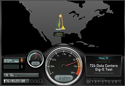
Speedtest.net does a great job showing you the data while testing your own internet connection speed. From locating a test server on the map, to animating the speedometer as the test runs. Without much text at all explaining what's going on, you understand the test, and the results.

Then you get the code to embed your results (see below) into a blog post, email or website. How fast is your connection?

Monday
Sep102007

The Bloomberg Makeover

Three design firms took on the challenge of re-designing the Bloomberg terminal interface, and the results were fantastic. The challenge came from Portfolio.com. The original article is here, but the fantasy terminals are here with an interactive interface that lets you highlight and zoom in on particular features. The design above is from thehappycorp.com and is my personal favorite.

Bloomberg claims to be constantly improving their interface design, but it still looks like runs on DOS and is straight out of the 80's.


Here is the desing from IDEO.com:


And one from Ziba.com:

Wednesday
Sep052007

Marumushi News Map


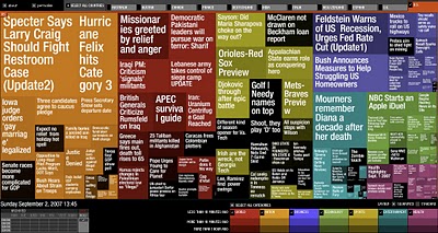
Marumushi.com has a fantastic News Map using the treemap visualization style. This is one of the best implementations of a treemap that I have found. Updated every 6 hours, it groups news stories (from the Google news aggregator) by overall category (technology, world, sports, etc.). You can choose to show the news map from 11 different countries, and the color shading of each block represents how old that particular news story is. Hovering your mouse over any square shows the whole title, and clicking takes you directly to the story.

Tuesday
Sep042007

Microsoft Car HUD


Found on arstechnica.com, this one has me really excited. I have been disappointed for at least two decades that real HUDs (Heads-Up Displays) have not become standard, or even available as a third party product for our cars. Now a US patent application from Microsoft has been published showing a possible future HUD for your car.

More than just your speed, with today's technology we should have things like incoming caller-id, compass direction, outside temperature, current playing music title, live GPS map and distance to the car in front of us showing around the edges of our windshields.

We can only cross our fingers and hope that this would some day become a reality.

Monday
Sep032007

VizThink Conference 2008


Early registration to the VizThink 2008 conference will end on September 15th. The conference is in San Francisco Jan 27-29. I won't be able to attend, but I hear that this is a great conference for people who make a living creating visual presentations, infographics, brainstorming sketches, etc.

Out friend David Gray from XPLANE is one of the conference facilitators (speakers).

A big THANKS to the folks at VizThink for adding a link to Cool Infographics on their VizThink Blog!

Sunday
Sep022007

World Clock Counter


You've seen these counters on highway billboards and other websites before. The World Clock from poodwaddle.com combines many of these counters together into one dashboard.

I've added a smaller version to the bottom of the right pane here on on the blog.

Sunday
Sep022007

Visual Tire Pressure


Infographics don't have to be complicated. This is a very simple, real-world example of an infographic system to monitor the tire pressure on your car called Accu-Pressure Caps. A set of four gauges screw onto your tire's valve stems, and the air pressure pushes the green indicator completely out. As tire pressure begins to drop, so does the green indicator revealing a yellow indicator, and ultimately the red indicator. The key here is to buy the set of caps to match the tire pressure you want to maintain on your car.

An alternative is from aviationupgrade.com, which is a battery operated version. These always start with the tire pressure when you screw them on, and when the pressure drops by 4psi the LED light on the end starts blinking to get your attention.

Wednesday
Aug082007

2008 Presidential Campaign Finances


This interactive infographic from the New York Times website is really impressive. Using weekly data reported by the Federal Election Commission, it plots the contributions on a map of the U.S. and sizes the bubbles based on contributions from that city. It has data from every week since January 1st, so it will also "play" and animated version showing the contribution as time progresses (similar to the Trendalyzer that Google purchased from GapMinder).

You can also search for specific contributors to see which candidate campaigns they have contributed to, and how much they gave.