About
Randy Krum
President of InfoNewt.
Data Visualization and Infographic Design

Infographic Design

Infographics Design | Presentations
Consulting | Data Visualizations

DFW DataViz Meetup

Join the DFW Data Visualization and Infographics Meetup Group if you're in the Dallas/Fort Worth area!

Search the Cool Infographics site

Custom Search

Subscriptions:


Feedburner

The Cool Infographics® Gallery:

How to add the
Cool Infographics button to your:

Cool Infographics iOS icon

- iPhone
- iPad
- iPod Touch


Read on Flipboard for iPad and iPhone

Featured in the Tech & Science category

Flipboard icon

Twitter Feed
From the Bookstore

Caffeine Poster

The Caffeine Poster infographic

Entries in movies (48)

Friday
Oct282011

An Ode to Horror Cult Classics (1933-2006)

Yep, Halloween is a great time of year, and CheapSally.com brings us a new timeline history of horror movies with OH, The Horror! An Ode to Horror Cult Classics.

We all love to be a little scared sometimes, and Halloween is the perfect day for that. We get to enjoy all of the frightening festivities:  creepy carnivals, haunted houses, trick or treating and of course, horror film marathons. The Halloween Horror Films infographic takes us back to some of our most feared nightmares. Look at 35 of the most popular cult classics, their rotten tomatoes ratings, the original movie budget and their gross domestic box office revenue. See which movies made the cut to become the Top 15 Highest Ranked Horror Films of All Time.

Thanks to Cameron for sending in the link!

Friday
Sep162011

HBO Recycling Program

The HBO Recycling Program is a visualization by Craig Robinson that shows many of the actors and actresses that HBO has used in multiple series.  This was posted as part of an article on Grantland.com.

Actors who have appeared in three or more episodes of multiple scripted, live-action, original, HBO series since OZ (excluding miniseries).

Inspired by the original visualization, an interactive version was created by Zack Grossbart that allows you to highlight either the show, or the actor, and it will display the connections.


Click on two shows, and the interactive version will highlight only those actors in both shows.


Zack’s interactive infographic is made with PaperJS, underscore.js, and a little JQuery.  He has made the code open source, and it can be used to display the connections between other groups as well, if anyone has the motivation to map their own connections. 

Tuesday
Aug302011

18 Things You Didn't Know About Firefly


You can’t stop the signal…

As a Browncoat, I had to post this new infographic: 18 Things You Didn’t Know About Firefly from CarSort.com.

Firefly has quickly become a cult classic, after it was cancelled by Fox in 2002, after airing only 11 episodes (out of order). Firefly was created by Joss Whedon who is best known for creating Buffy the Vampire Slayer and is set to direct and write The Avengers movie set for release in the summer of 2012. Firefly is a space western set in the 25th century where the renegade crew of the Serenity try to stay one step ahead of the long arm of the Alliance.

CarSort.com has put together a fun infographic with little known facts about Firefly and Serenity.

  • Did you know that Neil Patrick Harris was turned down for the role of Simon
  • Some people believe that Firefly was a rip off of an amine series called Outlaw Star
  • Some of the sets were recycled from Power Rangers
  • Zac Efron made his TV debut on Firefly…

Certainly not the best infographic design I’ve ever seen

  • WAY too much text!  This is really a text list with some images.
  • No data visulizations for the body counts
  • Should have included a visual size comparison of Serenity to the ISS or the Battlestar Galactica when either of them was mentioned
  • No data sources listed.  Where did these facts come from?  Are they really true?
  • No license listed on the infographic (Copyright or Creative Commons)?

But the infomation is cool, and I learned a few things I didn’t know.  Joss, you can hit that red button any day now…

Thanks to Brenden for sending in the link!

Monday
Mar142011

Moviebarcodes: Whole Movies at a Single Glance

Moviebarcodes is a tumblr blog from an unknown author that posts these images generated from different movies.  Each frame of the movie is stretched tall and thin to create this single image from an entire movie.  The one above is from The Matrix, and you can see the green tint they used every time they were “in the Matrix”.

From Wired:

The person behind MovieBarcode, who wouldn’t reveal their identity or what they do for a living, told Wired.co.uk that the creative process can take a few hours on the slightly aged machine they are being processed on, “depending on the length of the movie and the quality of the outcome”.

Movies on the blog are chosen “due to the expected result, not for the movies themselves”. Besides colourful movies, the blog author prefers “movies with long shots such as Kubrick, Hitchcock and Weerasethakul, which can result in unique and interesting moviebarcodes”.

Although, some of them don’t seem to reveal anything interesting, a few of these did give some insights into the movie visuals.

They spent a lot of time at sea in Jaws:


The Dark Knight was a very dark, almost colorless movie:


Kung Fu Panda was very colorful:


You can see the time spent in the digital, neon-blue world of TRON (1982):


Found on Wired.co.uk, VisualJournalism, FlowingData and Chart Porn.

Monday
Jan172011

The Sequel Map - Is Part II Ever Better than the Original?


The Sequel Map, from BoxOfficeQuant.com is a cool chart of movie sequels showing how they compared to the original.  The location is based on the RottenTomatoes.com scores of the original and the sequel being plotted.  If the scores are the same, the movie would be exactly on the line, and any sequel with a score higher than the original is above the line.  The sizes of the bubbles represent the total box office receipts.

As evidence, all sequels with Rotten Tomatoes scores have been categorized below, with the originals’ scores on the X-axis, and the sequels’ scores on the Y. Films at the center line are sequels with the exact rating as the original; films above are sequels that have surpassed the original; films below, ones that fared worse.

Notes: Categorization of sequels is sometimes more art than science, so I’ve had to follow a few rules: I’ve only included the second film in any series, never third or following films. I haven’t included remakes or “reboots,” and I’m only presenting films which opened (at some time) in the US and have Rotten Tomatoes ratings.

And finally, it’s worth noting that the only two film/sequel combos to both score 100%, are the first two Toy Storys and the French films Jean de Florette / Manon des Sources.

Rotten Tomatoes ratings from RottenTomatoes.com. US Gross from www.the-numbers.com

I especially like turning the chart 45°, which puts the best score possible for a sequel to improve on the original at the top center of the chart.  If both the original and the sequel scored high, the bubbles are located towards the right instead of the top.  I’ve done this with a number of 2x2 quadrant charts for clients.

So, according to the chart, Star Trek II: The Wrath of Khan was the best sequel improvement over the original, and I would have to agree.

I’d love to see a version that plots the box office receipts on the X and Y axes so that it would show the instances where the sequel made more money than the original.  You could see more of the financial incentive behind making sequels, even if they’re generally rated lower than the original.

Found on VizWorld.com

Monday
Jan032011

2010 Box Office Movies Infographic

As the year ends, the 2010 Box Office Movie Chart is complete.  A cool, interactive view of the box office receipts by week.  It’s pretty large, so you have do some scrolling through they year.  If you hover over any movie in the chart, it displays the actual receipt dollars for that week so you can see the numbers behind the chart.

Zach Beane has created a number steam graphs showing movie box office receipts for the last five years and more.

I had an idea for displaying box office data graphically and here are the results. It’s inspired by stream graphs and the works of Edward Tufte.

Each page displays trends in the top 25 movies at the box office for each weekend in a year. The color is based on the movie’s debut week. Because of that, long-running movies will gradually start to stand out from newer movies with different colors.

Nice work Zach!

Found on VizWorld

Monday
Dec132010

The TRON Video Game Timeline


This is partially for fun because I’m excited about the upcoming TRON movie, and partially because this is something you would expect a fan to create and publish.  Instead, Disney created this simple TRON: Evolution timeline that explains where most of the TRON video games fit in history (TRON 2.0 is noticeably absent).  This is part of the product description page on Amazon.com.

It didn’t have to be complicated, but this timeline quickly and clearly communicates when each of the games takes place in reference to the movies.  It also nicely incorporates the design style of the new movie and uses the light cycle trail.

TRON Story Timeline

  • The TRON: Evolution video games are the key to unlocking the TRON mythology in between the original 1982 film and the 2010 blockbuster film TRON: Legacy.
  • Every game tells a different story of the digital grid and offers a completely unique gameplay experience designed specifically for each platform.

Nicely done Disney.  See you on the Grid! 

Wednesday
Oct272010

Client Infographic: The Visual History of Halloween

The Visual History of Halloween infographic poster


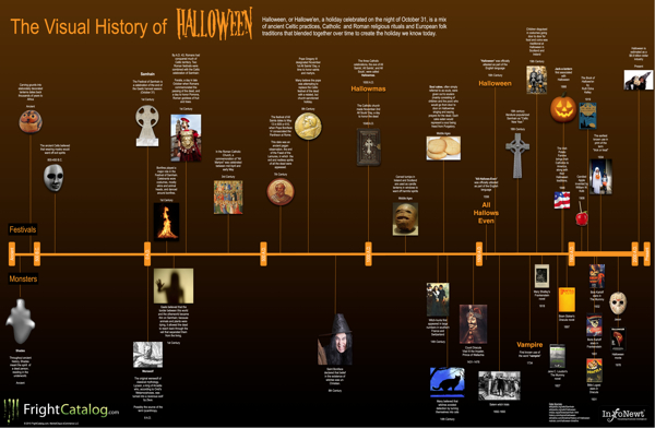
Parties, Costumes, Food, Ghosts, Vampires, Witches, Jack-O-Lanterns…oh my!  Halloween is one of the world’s favorite holidays, and The Visual History of Halloween brings all of the diverse history and influences together at last.  Estimated as a $6.9 Billion industry today, Halloween is actually the combination of at least six different festivals and celebrations from hundreds (even thousands) of years ago.  Click HERE to see the high-resolution version.

InfoNewt (my company) designed this one mainly focused on the historical foundation of Halloween.  I’m sure a completely separate timeline could be made just covering the last 100 years of commercializing Halloween, but I tried to stay away from most of that with this one.

This was actually a very fun project, and a perfect topic for an infographic because the information available is so diverse and scattered.  Of course, when you talk about history going back this far, there is also disagreement on what really happened.  So, I plotted the most commonly accepted events and dates I could find.  I had to pull from a handful of different sites to get all of the pieces to fit together.


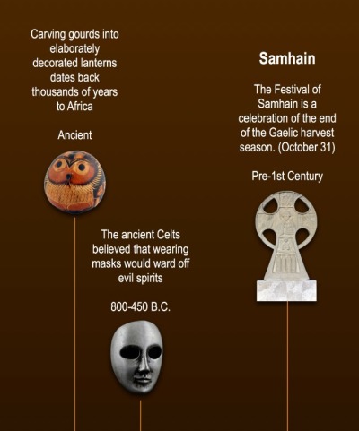
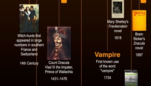
Ghosts, werewolves and witches have a long history.  It’s not until much more recent times that many of the other monsters we relate to Halloween appear.  Count Dracula, vampires, Dr. Frankenstein’s monster, The Mummy, Jason and all of the horror movie villains appear in the last 300 years.


My time to complete this project was short, but I believe I captured the most critical events in history.  Wouldn’t this make a great poster?

A big thanks to Erick and the team at FrightCatalog.com

Monday
Oct252010

Waiting For Superman - Infographic Video Trailer

Participant Media - Pledge To See This Film from CypherAudio on Vimeo.


Cool infographic trailer for the upcoming movie Waiting For Superman, a film about the declining state of education in America.

Produced by directing team Buck, this animated ‘pledge’ trailer is for the forthcoming Davis Guggenheim film, Waiting For Superman, that investigates the crisis in the US education system…

A collaboration with Buck and takepart.com for Participant Media and Director Davis Guggenheim (An Inconvenient Truth). For the film ‘Waiting For Superman’.

music and mix by CypherAudio.

BUCK

–––––––

Creative Director: Ryan Honey

Executive Producer: Maurie Enochson

Producer: Eric Badros

Art Director: Joe Mullen

Animation: Jorge R. Canedo Estrada

Original Music: John Black


TAKEPART

–––––––

Carolyn Sams: Co-Producer

Wendy Cohen: Co-Producer


Found on Creative Review

Wednesday
Aug112010

Time Travel in Popular Movies and TV infographic

I couldn’t believe that I hadn’t posted this one by David McCandless from InformationIsBeautiful.net.  Timelines: Time Travel in Popular Film and TV is one of my favorites, and you can tell how much effort went into the design and getting the details right.

Here’s a visualisation of time travel plots in various films and TV programs. I had a lot of fun doing this!

This is a straight data visualisation, rather than information design. That is, it’s not particularly useful, nor useable, nor meaningful. The inspiration was the coolness of the idea, really. I was excited to see what shape all the plots would make, and whether it could be shaped into something beautiful.

What I really love about this image, though, is the idea that this information has never been seen before. Despite the fact that it exists, in some way,somewhere, wrapped in various plots, it’s never been given form. I have to say, it was a joy to untangle it all :)

David, I would love to help design one for Dr. Who!