About
Randy Krum
President of InfoNewt.
Data Visualization and Infographic Design

Infographic Design

Infographics Design | Presentations
Consulting | Data Visualizations

DFW DataViz Meetup

Join the DFW Data Visualization and Infographics Meetup Group if you're in the Dallas/Fort Worth area!

Search the Cool Infographics site

Custom Search

Subscriptions:


Feedburner

The Cool Infographics® Gallery:

How to add the
Cool Infographics button to your:

Cool Infographics iOS icon

- iPhone
- iPad
- iPod Touch


Read on Flipboard for iPad and iPhone

Featured in the Tech & Science category

Flipboard icon

Twitter Feed
From the Bookstore

Caffeine Poster

The Caffeine Poster infographic

Entries in music (24)

Friday
Oct032008

The Age of Pop

From verysmallarray.com, the Age of Pop visualizes the #1 songs every week from 1960-1969.  You can see that Pop ruled the decade.  Check out their home page to see how other decades sounded.

Wednesday
Sep242008

Mashup DJ Girl Talk


From Wired.com, how do you visualize a music mashup of 300 different songs?
In the modern laptop era, any monkey with Pro Tools can make a mashup. But Pittsburgh-based computer maestro Girl Talk (known to the IRS as Gregg Gillis) has turned the cut-and-paste process into a jams-packed jigsaw puzzle. His latest album, Feed the Animals (released digitally in June with hard copies out September 23), brims with 300 song snippets in just over 50 minutes (compared to around 250 in his previous effort). "People want to see the bar raised," Gillis says. Below, a beat-by-beat breakdown of a single track.
Thanks Daniel for the link!

Friday
Aug292008

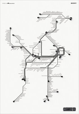
Sony Walkman advertising


This may cross the lines between infographics, advertising and art, but I really liked these advertising posters.  They're real subway maps of New York, London and Sydney, with a little artistic twist to add the ear buds.


I found these on Ad Goodness, and they were created by Saatchi & Saatchi.

Tuesday
Jul292008

Radiohead: House of Cards visualization video

Really cool use of visualization tools to create this music video for Radiohead's "House of Cards".

Check out this link to a different version on Google that lets you move the video image around while its playing. and the "making of" video that shows the laser scanners they used.

Radiohead just released a new video for its song "House of Cards" from the album "In Rainbows".

No cameras or lights were used. Instead two technologies were used to capture 3D images: Geometric Informatics and Velodyne LIDAR. Geometric Informatics scanning systems produce structured light to capture 3D images at close proximity, while a Velodyne Lidar system that uses multiple lasers is used to capture large environments such as landscapes. In this video, 64 lasers rotating and shooting in a 360 degree radius 900 times per minute produced all the exterior scenes.

Watch the making-of video to learn about how the video was made and the various technologies that were used to capture and render 3D data

Page 1 2 3