


The Map of the Internet
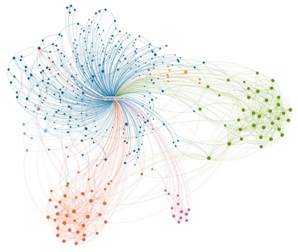
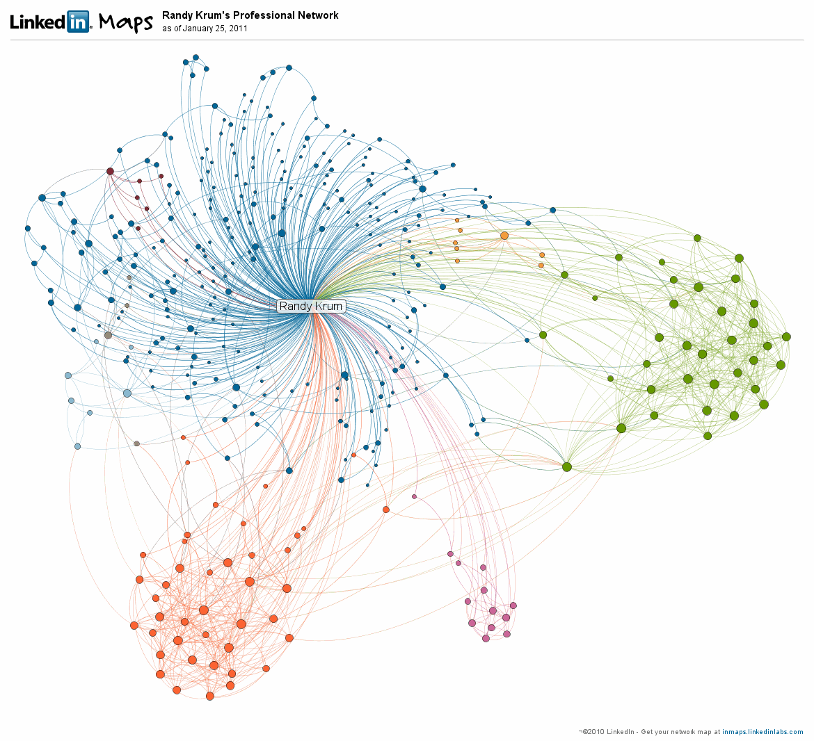
 Randy
Randy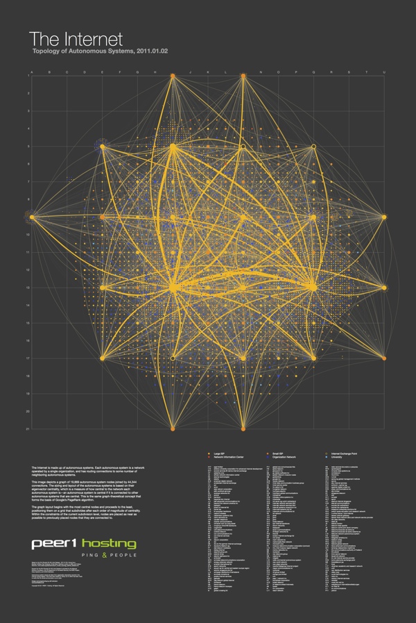
The Map of the Internet is an ambitious project from Peer 1 Hosting that maps the network of hosts and routing connections that are the foundation of the Internet. Clicking on the image above takes you to the poster in an interactive zooming viewer so you can see the details. You can also read about the making of the poster in this post on the Peer 1 Hosting blog.
It’s a layout of all the networks that are interconnected to form the internet. Some are run by small and large ISPs, university networks, and customer networks - such as Facebook and Google. It’s visual representation of all those networks interconnecting with one another, forming the internet as we know it. Based on the size of the nodes and the thickness of the lines, it speaks to the size of those particular providers and the connections.
In technical speak, you’re looking at all the autonomous systems that make up the internet. Each autonomous system is a network operated by a single organization, and has routing connections to some number of neighbouring autonomous systems. The image depicts a graph of 19,869 autonomous system nodes, joined by 44,344 connections. The sizing and layout of the autonomous systems is based on their eigenvector centrality, which is a measure of how central to the network each autonomous system is: an autonomous system is central if it is connected to other autonomous systems that are central.

My apologies for being late posting this one here on the blog. They were giving out free printed 24”x36” posters at SxSW in Austin, TX a couple weeks ago, but the high-resolution PDF is available from the Peer 1 Hosting site.
Thanks to Shobhita for sending me the information and the link!
