About
Randy Krum
President of InfoNewt.
Data Visualization and Infographic Design

Infographic Design

Infographics Design | Presentations
Consulting | Data Visualizations

DFW DataViz Meetup

Join the DFW Data Visualization and Infographics Meetup Group if you're in the Dallas/Fort Worth area!

Search the Cool Infographics site

Custom Search

Subscriptions:


Feedburner

The Cool Infographics® Gallery:

How to add the
Cool Infographics button to your:

Cool Infographics iOS icon

- iPhone
- iPad
- iPod Touch


Read on Flipboard for iPad and iPhone

Featured in the Tech & Science category

Flipboard icon

Twitter Feed
From the Bookstore

Caffeine Poster

The Caffeine Poster infographic

Entries in Phone (13)

Friday
Apr012011

Microsoft's Growth of Mobile Marketing

I love to see the big companies experimenting with new media like infographics!  The Growth of Mobile Marketing and Tagging was published by Microsoft Tag last week, and explores the data behind mobile devices.

Sure, it seems like everyone’s got a cell phone – but what are the hard numbers? How many people have smart phones, and what demographic is the most active group in mobile socialization? (Surprise — it’s actually not teenagers!) Find out the statistics on the present (and future!) of mobile marketing in our new infographic

They also broke the graphics down into individual pieces (roughly) and created a presentation version for anyone that wants to use it on SlideShare:


Thanks Elliott for send me a link!

Tuesday
Dec072010

Do You Answer the Cell Phone During Sex?


The Shocking Demographics of Cell Phone Use from Wilson Electronics provides this answer (15% say “YES!” apparently hoping someone more interesting is calling…) and more surprising statistics about how cell phone use has grown in the last 10 years.  

The infographic was sent in to Mashable.com, and I can’t find any trace of it on the Wilson Electronics site.

Wilson Electronics, Inc. sent us this interesting (rather large) infographic outlining the demographics of cellphone use (click for full version).

The infographic illustrates, among other things, the number of cellphones per capita in various countries, the rate of cellphone adoption in the U.S. during the past decade and the acceptability of certain behaviors regarding cellphone use.

Sadly, there is no credit for the designer, but I found it on Twitter, tweeted by @invoke

Wednesday
Oct062010

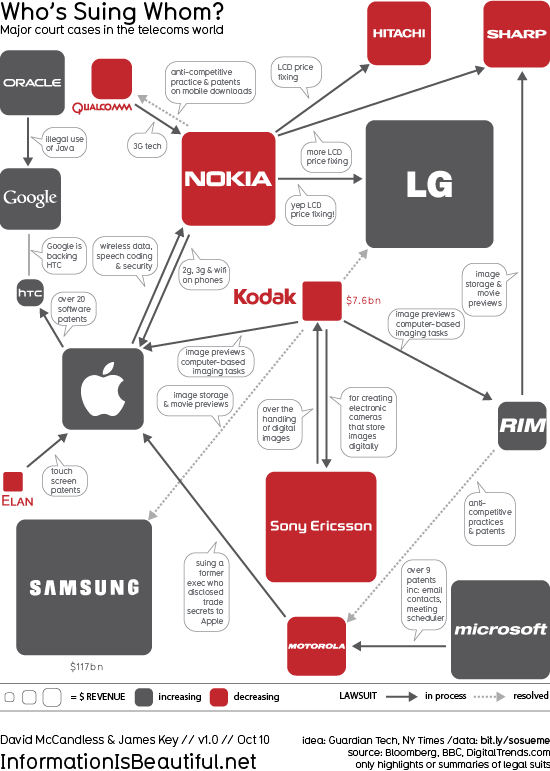
Who’s Suing Whom: Lawsuits In The Telecoms Trade infographic


Who’s Suing Whom is a great infographic design improvement by David McCandless from InformationIsBeautiful.net.  David took existing diagrams (which were pretty poor) from The Guardian and the NY Times, and created a much more compelling and information-rich infographic.  My feeling from the news is that there are many more lawsuits that these, but I don’t know the data.

Based on these diagrams from Guardian Tech and the NY Times.

I thought those charts generated more questions than they answered. So, as ever, I tried to answer the obvious questions and convey various contexts simultaneously.

I wondered, too, if I could design the connections so the lines didn’t cross. Almost managed it!

And see if there was a relationship between dropping revenues and litigiousness. What do you think? Is there?

Data: http://bit.ly/sosueme


Great job David!

Page 1 2