About
Randy Krum
President of InfoNewt.
Data Visualization and Infographic Design

Infographic Design

Infographics Design | Presentations
Consulting | Data Visualizations

DFW DataViz Meetup

Join the DFW Data Visualization and Infographics Meetup Group if you're in the Dallas/Fort Worth area!

Search the Cool Infographics site

Custom Search

Subscriptions:


Feedburner

The Cool Infographics® Gallery:

How to add the
Cool Infographics button to your:

Cool Infographics iOS icon

- iPhone
- iPad
- iPod Touch


Read on Flipboard for iPad and iPhone

Featured in the Tech & Science category

Flipboard icon

Twitter Feed
From the Bookstore

Caffeine Poster

The Caffeine Poster infographic

Entries in real time (31)

Tuesday
Mar182008

New York Talk Exchange


Currently on exhibition at MOMA, The Museum of Modern Art, from Feb 24th - May 12th is an exhibit called "Design and Elastic Mind". New York Talk Exchange is included as part of the exhibition.

New York Talk Exchange illustrates the global exchange of information in real time by visualizing volumes of long distance telephone and IP (Internet Protocol) data flowing between New York and cities around the world.
Thanks Oliver!

Wednesday
Mar122008

Ocean's Thirteen infographics


I can't upload the video (for obvious copyright reasons), but the movie Ocean's Thirteen uses some cool infographics to show the real-time winnings at each table in the casino.

Sunday
Mar022008

What if...


Craig Robinson, from flipflopflyin.com, has created a graphic showing many of the different paths/branches his life could have taken. Clicking on each character icon reveals text describing the event or deviation from actual events.

Who hasn't at one time or another wondered how their life could've gone in other directions if different events had occurred or different choices been made? These are the ways my life could've deviated from its actual path (the top row).
" Craig dies at the age of 34, killed by an angry swan" I found incredibly funny.

Found on NiXLOG.

Thursday
Jan102008

Digg These Pics


Really cool new feature over on Digg.com. Back in late 2007, they added an Images category so users could digg their favorite pictures. Now they've added an interactive image viewer in the Digg Labs that lets you see new images and pictures being dugg in real-time.

The only thing I don't like is that it doesn't let you add any search terms. You have to see all of the activity, and can't narrow it down it all.

Sunday
Jan062008

Cool Color Fading Calendar


I don't think this is an actual product, but a concept from the mind of designer Shi Yuan
from his website. The ink is light sensitive, so it fades slowly over the course of a day, eventually disappearing by the end of the day.

Found on Sawse

Sunday
Dec022007

Disneyland Wait Time


Traveling in California this last week kept me from being able to post. But here's a real-life infographic from Disneyland in Anaheim, CA. At the entrance to each separate attraction, is a posted wait time estimate, but they are all combined on this information board in the center of the park.

Not willing to wait an hour for the new Finding Nemo Submarine Voyage? Pick a handful of other rides that you can get through in the same amount of time and maximize the money you spent getting into the park.

Thursday
Nov082007

Flight Explorer Snapshot


Reader submission (thanks Karen).

On the NATCA (National Air Traffic Controllers Association) website is this U.S. map showing every airline flight currently in the air. The information is delayed by 5 minutes. Also, the graphic isn't interactive, so you can see any information about the dots (like which flight it is).


You can also zoom into nine select cities to see the flights in the air and the flight numbers. So the next time you're lying in the grass with your kids (in one of the major cities) looking up at the sky, you could (if you wanted to) figure out where that airplane is going.

See also: Flight Patterns

Wednesday
Oct312007

Stranger Than Fiction

This video is the introduction to the movie Stranger Than Fiction, full of infographics. It's been around for a while, but I thought I would share it too.

Tuesday
Oct092007

WiFi Detector T-Shirt

Another one for the "real world" infographics. This t-shirt from ThinkGeek will detect WiFi 802.11b or 802.11g wireless networks and display their signal strength on the front of the shirt. A great Christmas present for the geek in your family, for only $30.

It will amuse you, that I caught this one from Guy Kawasaki on Twitter.com, which linked to Truemors.com, which linked to BoingBoing.com, which linked to BoingBoingGadgets which finally linked to the original page on ThinkGeek.com. What a tangled web we weave...

Thursday
Oct042007

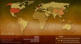
Breathing Earth


Breathing Earth is a cool website that displays international statistics in real-time, similar in concept to Poodwaddle.com's World Counter. Breathing Earth focuses on carbon dioxide emissions by country and adds population, births and deaths.

Welcome to Breathing Earth. This presentation displays the carbon dioxide emission levels of every country in the world, as well as their birth and death rates - all in real-time. Though considerable effort has been taken to ensure that the presentation uses the most accurate and up-to-date data available, please remember that this is just a simulation.
Breathing Earth was created by David Bleja (aka Stillwater), whose home website is stillwater-microcosm.net

Found on SimpleComplexity.net