About
Randy Krum
President of InfoNewt.
Data Visualization and Infographic Design

Infographic Design

Infographics Design | Presentations
Consulting | Data Visualizations

DFW DataViz Meetup

Join the DFW Data Visualization and Infographics Meetup Group if you're in the Dallas/Fort Worth area!

Search the Cool Infographics site

Custom Search

Subscriptions:


Feedburner

The Cool Infographics® Gallery:

How to add the
Cool Infographics button to your:

Cool Infographics iOS icon

- iPhone
- iPad
- iPod Touch


Read on Flipboard for iPad and iPhone

Featured in the Tech & Science category

Flipboard icon

Twitter Feed
From the Bookstore

Caffeine Poster

The Caffeine Poster infographic

Entries in timeline (240)

Friday
Sep212007

AT&T: A History


In 1984, the government broke up "Ma Bell" as a monopoly. Since then it has slowly be pulling back together. This infographic really puts all the pieces back together in a simple way that you understand immediately. Kind of like a free-form timeline, instead of the traditional, left-to-right timeline visual. The AT&T brand name is still so strong, Cingular chose to rename all of their stores AT&T after their recent merger.

Found on FreePress.net

Friday
Sep072007

The Cosmic Calendar


This last December was the 10th anniversary of Carl Sagan's death. One of his most popular episodes of Cosmos was titled The Dragons of Eden where he first described his Cosmic Calendar. This website from discovery.com has a simple image showing the Cosmic Calendar as Carl described it. A few websites are selling posters of the Cosmic Calendar, like AllPosters.com.

The premise is that if you compress the entire history of the universe into a calendar year, homo sapiens only exist in the last 6 minutes, and the last second represents the last 400+ years of human history.

You can see Cosmos, and hear Carl describe it on YouTube here:

Sunday
Sep022007

World Clock Counter


You've seen these counters on highway billboards and other websites before. The World Clock from poodwaddle.com combines many of these counters together into one dashboard.

I've added a smaller version to the bottom of the right pane here on on the blog.

Tuesday
Aug282007

A Day of Diggs


This one is really interesting. Stamen Design took one day of digg.com and visualized the user activity. The explanation is really cool, and can be found here on content.stamen.com. Stamen works with Digg on a number of the tools available in Digg Labs.

Red dots represent people that have been on Digg for a while, yellow is a good mix, and blue is new users. So when a story is predominantly blue, it represents a story that is attracting a bunch of new users to Digg.

Wednesday
Aug082007

2008 Presidential Campaign Finances


This interactive infographic from the New York Times website is really impressive. Using weekly data reported by the Federal Election Commission, it plots the contributions on a map of the U.S. and sizes the bubbles based on contributions from that city. It has data from every week since January 1st, so it will also "play" and animated version showing the contribution as time progresses (similar to the Trendalyzer that Google purchased from GapMinder).

You can also search for specific contributors to see which candidate campaigns they have contributed to, and how much they gave.

Thursday
Aug022007

Imagining the Tenth Dimension


Ten dimensions are really hard for most people to understand. Especially since our lives are constrained to only four dimensions. This video from tenthdimension.com does an EXCELLENT job of using pretty simple animation and illustrations to explain the 10 dimensions of our universe.

This video is really good, even if you're not a physicist.

Tuesday
Jul242007

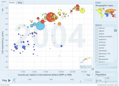
Gapminder on Google!


Here it is! Live on Google. Gapminder is the Trendalyzer software used by Hans Rosling and acquired by Google. It's now online at Google, but it looks like an early test. I'm not sure if you can use your own data yet or not, but that is one of the goals.

Check out all of the Gapminder tools, and see more presentations using the Gapminder software at www.gapminder.org

Tuesday
Jul242007

Hans Rosling @ TED 2007

Here's part two, when Hans Rosling followed-up his 2006 presentation with updated software in 2007. It looks like he's been able to get more data from the UN also.

He gets really excited while describes what's happening as the software animates the data about world health.

Tuesday
Jul242007

Hans Rosling @ TED 2006

Hans Rosling is a professor from Sweden who is an expert in world health, but has pioneered some amazing ways to look at massive amounts of data. I mean truly AMAZING. I can think of at least a dozen uses for this software to help visualize changes over time. Don't let the topic scare you, this is incredible to watch.

The Trendalyzer software (recently acquired by Google) turns complex global trends into lively animations, making decades of data pop.
This video is one of the TED Talks videos from the 2006 TED Conference.

http://www.ted.com/talks/view/id/92

Sunday
Jul222007

Stop Smoking Infographic


Healthbolt.net has a great infographic about how your body reacts to stopping smoking and when it actually starts to recover. It a great combination of a timeline with a description of the symptoms that smoking quitters experience over the period of time.

Information is power, and the understanding of what to expect gives quitters to power to overcome those symptoms. Too many go back to smoking because they didn't understand what they were experiencing was normal.

They had started by selling this as a high-quality poster, but now its available free as an 18MB PDF for anyone to print. Kudos to them to making this availble free to smokers trying to quit everywhere.

Page 1 ... 20 21 22 23 24