


Wednesday
Mar162011
A (Future) Day of Glass
A Day of Glass video of the future from Corning Glass. A lot of augmented reality and infographics in our daily lives of the future…
tagged  Augmented Reality, ad, design, video

![]()

Join the DFW Data Visualization and Infographics Meetup Group if you're in the Dallas/Fort Worth area!

The Cool Infographics® Gallery:
How to add the
Cool Infographics button to your:

- iPhone
- iPad
- iPod Touch
Read on Flipboard for iPad and iPhone
Featured in the Tech & Science category


A Day of Glass video of the future from Corning Glass. A lot of augmented reality and infographics in our daily lives of the future…
Hans Rosling, known for some of his famous TED Talks, here tries a little augmented reality with his animated charts showing life expectancy and wealth all over the world for the last 200 years. 120,000 data visualized in this 4 minute video clip from his The Joy of Stats documentary for the BBC.
Hans Rosling’s famous lectures combine enormous quantities of public data with a sport’s commentator’s style to reveal the story of the world’s past, present and future development. Now he explores stats in a way he has never done before - using augmented reality animation. In this spectacular section of ‘The Joy of Stats’ he tells the story of the world in 200 countries over 200 years using 120,000 numbers - in just four minutes. Plotting life expectancy against income for every country since 1810, Hans shows how the world we live in is radically different from the world most of us imagine.
Thanks Udi for sending in the link!
“I Love Charts” is a fun little video about charts and visualizing data for children from PBS Kids.
Found on Chart Porn
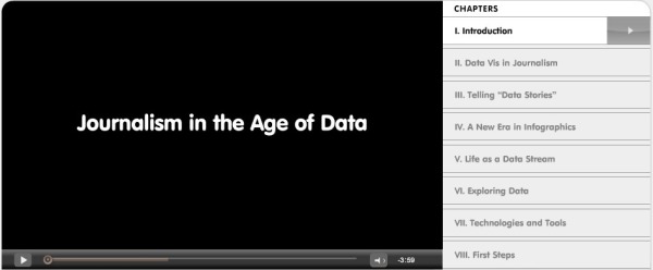
Wow! Journalism in the Age of Data, by Geoff McGhee at Stanford, is a fantastic video documentary looking at the Age of Infographics, and how we got here.
Journalists are coping with the rising information flood by borrowing data visualization techniques from computer scientists, researchers and artists. Some newsrooms are already beginning to retool their staffs and systems to prepare for a future in which data becomes a medium. But how do we communicate with data, how can traditional narratives be fused with sophisticated, interactive information displays?
A video report on data visualization as a storytelling medium. Produced during a 2009-2010 Knight Journalism Fellowship. Total running time: 54 minutes with related information and links.
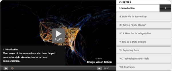
It is 54 minutes long, but nicely broken out into 8 chapters. Geoff was able to interview some of the true superstars in the Infographics field.
Found on Visual Journalism
Participant Media - Pledge To See This Film from CypherAudio on Vimeo.
Cool infographic trailer for the upcoming movie Waiting For Superman, a film about the declining state of education in America.
Produced by directing team Buck, this animated ‘pledge’ trailer is for the forthcoming Davis Guggenheim film, Waiting For Superman, that investigates the crisis in the US education system…
A collaboration with Buck and takepart.com for Participant Media and Director Davis Guggenheim (An Inconvenient Truth). For the film ‘Waiting For Superman’.
music and mix by CypherAudio.
BUCK
–––––––
Creative Director: Ryan Honey
Executive Producer: Maurie Enochson
Producer: Eric Badros
Art Director: Joe Mullen
Animation: Jorge R. Canedo Estrada
Original Music: John Black
TAKEPART
–––––––
Carolyn Sams: Co-Producer
Wendy Cohen: Co-Producer
Found on Creative Review
Randy
Also available on YouTube:
I love the Hans Rosling videos from TED. This new video “The Good News of the Decade?” comes from TEDxCHANGE in Sep 2010.
Hans Rosling reframes 10 years of UN data with his spectacular visuals, lighting up an astonishing — mostly unreported — piece of front-page-worthy good news: We’re winning the war against child mortality. Along the way, he debunks one flawed approach to stats that blots out such vital stories.
I love how passionate and excited he gets about statistics!
Randy
Also available on YouTube:
This is a very cool video animation, Asteroid Discovery From 1980 - 2010, of asteroid discoveries over the last 30 years. Not only does it show the orbits of the asteroids in relation to the inner planets, it highlights them over time as they were identified and colors them according to how close to Earth their orbits will come.
The only visual inaccuracy is the size of the asteroids. Since the asteroids have to be at least one pixel wide to appear in the animation, they are represented much larger compared to the planets than they really are.
View of the solar system showing the locations of all the asteroids starting in 1980, as asteroids are discovered they are added to the map and highlighted white so you can pick out the new ones.
The final colour of an asteroids indicates how closely it comes to the inner solar system.
Earth Crossers are Red
Earth Approachers (Perihelion less than 1.3AU) are Yellow
All Others are Green
Notice now the pattern of discovery follows the Earth around its orbit, most discoveries are made in the region directly opposite the Sun. You’ll also notice some clusters of discoveries on the line between Earth and Jupiter, these are the result of surveys looking for Jovian moons. Similar clusters of discoveries can be tied to the other outer planets, but those are not visible in this video.
As the video moves into the mid 1990’s we see much higher discovery rates as automated sky scanning systems come online. Most of the surveys are imaging the sky directly opposite the sun and you’ll see a region of high discovery rates aligned in this manner.
At the beginning of 2010 a new discovery pattern becomes evident, with discovery zones in a line perpendicular to the Sun-Earth vector. These new observations are the result of the WISE (Widefield Infrared Survey Explorer) which is a space mission that’s tasked with imaging the entire sky in infrared wavelengths.
Currently we have observed over half a million minor planets, and the discovery rates show no sign that we’re running out of undiscovered objects.
Orbital elements were taken from the ‘astorb.dat’ data created by Ted Bowell and associates at http://www.naic.edu/~nolan/astorb.html
Music is ‘Transgenic’ by Trifonic: http://www.amazon.com/Emergence-Trifo…
Quite a few journalists, bloggers and tweeters are attributing this to NASA or Arecibo Observatory - while they do fine work they had nothing to do with this. If you write a story you can credit it to Scott Manley.
Found on FlowingData and VizWorld
Our friend David McCandless, from InformationIsBeautiful.net, gave a great presentation at TEDGlobal in July 2010 on The Beauty of Data Visualization.
David McCandless turns complex data sets (like worldwide military spending, media buzz, Facebook status updates) into beautiful, simple diagrams that tease out unseen patterns and connections. Good design, he suggests, is the best way to navigate information glut — and it may just change the way we see the world.
Thanks to John and Susan for sending me the link! Also found on VizWorld and the VizThink Blog.
The video is also available on YouTube:
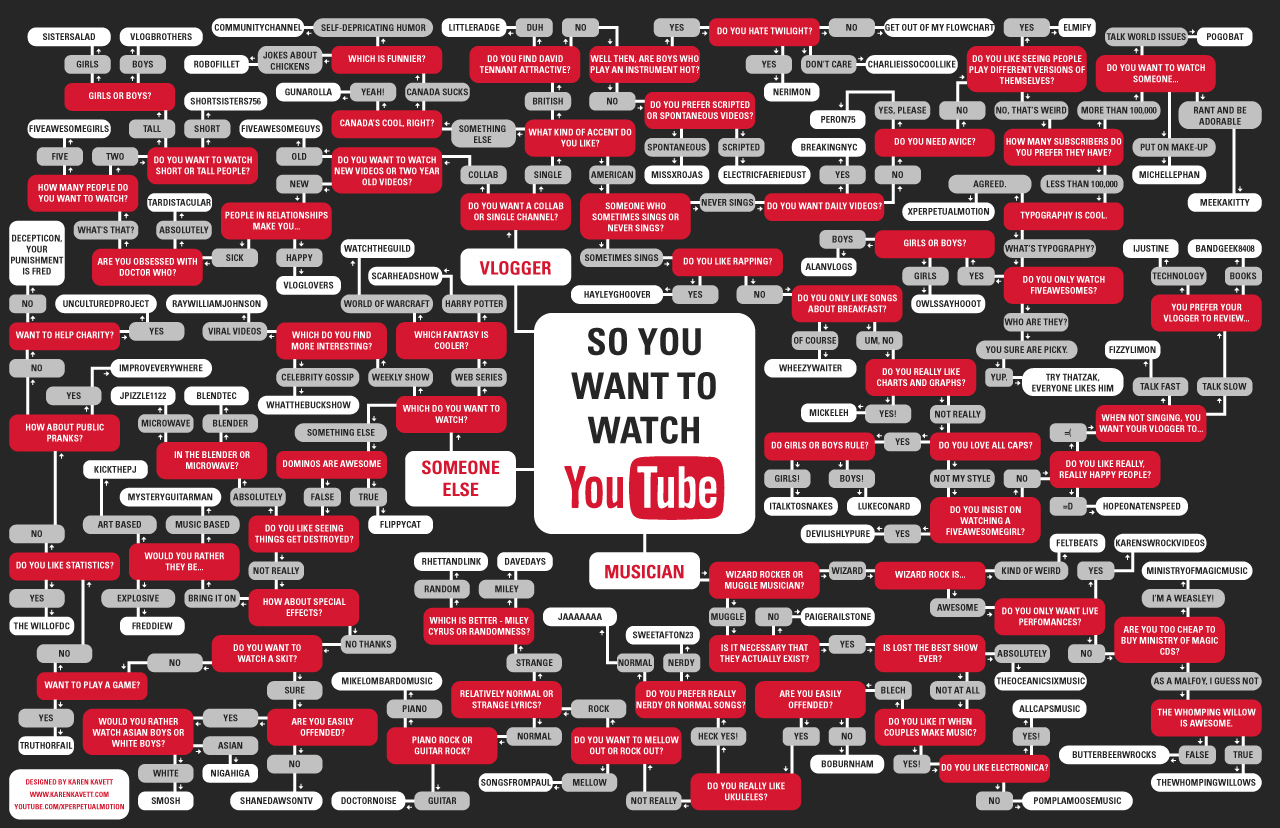
Karen Kavett is a graphic design student at the Rhode Island School of Design and she was inspired to create the So You Want To Watch YouTube flowchart after seeing the So You Need A Typeface flowchart by Julian Hansen.
I was really inspired by the So You Need a Typeface poster and figured, why not make one for which YouTube channel to watch? It was a bit of a bigger undertaking than I originally anticipated, taking about 3 days from start to finish. I began by making a list of everyone I’m subscribed to and other popular YouTubers I thought should be on it. Then I divided them into Vloggers, Musicians, and Everyone Else, and just went at making a really ugly graph showing all the different routes. I had to cut some people out since their channels were just too similar to others I had already used, so if you’re not on here please don’t feel offended. If I included everyone I wanted to it would probably be about twice as big! Finally, I designed this final piece, which luckily, everything fit perfectly into.
Nice job Karen! I especially like the “Get out of my flowchart” endpoint!
The Apple iPhone Statistics 2010 infographic video by Creative Licence Digital (an iPhone app development firm) takes a look at the numbers behind the iPhone phenomenon.
I pose this question to my readers: Is this infographics? I think it walks a fine line between being artistic and infographic. While a lot of numbers are shown and communicated to the viewers, they aren’t represented in any graphic form, just text. What do you think?
Thanks to Darren for sending in the link.
