About
Randy Krum
President of InfoNewt.
Data Visualization and Infographic Design

Infographic Design

Infographics Design | Presentations
Consulting | Data Visualizations

DFW DataViz Meetup

Join the DFW Data Visualization and Infographics Meetup Group if you're in the Dallas/Fort Worth area!

Search the Cool Infographics site

Custom Search

Subscriptions:


Feedburner

The Cool Infographics® Gallery:

How to add the
Cool Infographics button to your:

Cool Infographics iOS icon

- iPhone
- iPad
- iPod Touch


Read on Flipboard for iPad and iPhone

Featured in the Tech & Science category

Flipboard icon

Twitter Feed
From the Bookstore

Caffeine Poster

The Caffeine Poster infographic

« A Graphic History of Newspaper Circulation | Main | Procrastination: The Infographic Video »
Tuesday
Oct272009

Eye Tracking Infographic Plots


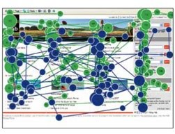
Eye tracking is used is a number of different fields of study; consumer interaction design, advertisements, product packaging, website/software usability, store shelf merchandising design and many more.  The results are plotted visually as an infographic, because it instantly makes the data understandable to the researchers.

In the fixation map image above, a participant's focal points on a website are tracked and the points are numbered in sequential order (like connect-the-dots).  The dots are also each sized based on "Gaze Duration", the amount of time the participant spent looking at that particular point.  In the example above, it took the participant 90 fixations to find the information they were looking for...not a good site design.


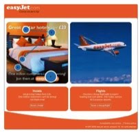
Of course, you can narrow down the fixation points and only see the first few points that attracted the participant's attention.  Answering the question "What does the user see first?"  In this example, the participant looking at the flight website saw the hotel ad first.


It's not just for websites.  When you use this method for product packaging, you can tell what the consumer sees in the store during the first few seconds, and the popular understanding is that you only have 3 seconds of the consumer's attention in the store.  The use of the infographic fixation map instantly conveys to the packaging designers what the consumer sees, and what parts of the design are ignored.


The fixation maps are converted into heat maps to aggregate many participant results together.  You can see here that participants aren't seeing the "Diesel for Successful Living" message.

Thanks to Colin from IDG Consulting for providing the images!  I have used IDG for consumer research projects in the past, and I highly recommend them.

PrintView Printer Friendly Version

EmailEmail Article to Friend

Reader Comments (4)

I saw the Diesel, but the red n yellow are definately the attention grabbers-

Interesting blog!

October 27, 2009 | Unregistered CommenterSnaggle Tooth

The red and yellow weren't on the original ad. The colors represent what caught the avg. viewer's attention first, and where their eyes moved afterwards.

November 19, 2009 | Unregistered CommenterAnonymous

I like these Tobii Eye Tracking visualizations! And there is so much more you can do with it!

April 30, 2010 | Unregistered CommenterPeter
I had a hard time eye tracking the dots in this infographic plot image/photo shown above. However, I am very curious on the study made. It seemed they get you the best of what an eye can do. I only need to focus though.
October 7, 2012 | Unregistered CommenterCarissa at Treehouse
Editor Permission Required
While we are migrating to a new site design, you must have editing permission for this entry in order to post comments.