


Thursday
Mar052009
Chart Chooser
 Randy
Randy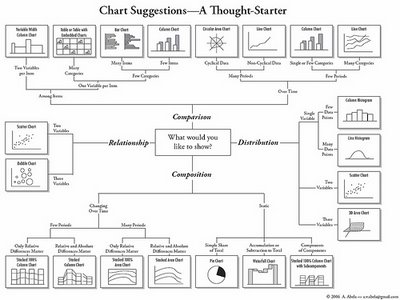
A quick reference guide (in the form of a mind map) by Andrew Abela on choosing the right type of chart for the type of message you are trying to communicate with your data.
Found on Digital Inspiration

![]()

Join the DFW Data Visualization and Infographics Meetup Group if you're in the Dallas/Fort Worth area!

The Cool Infographics® Gallery:
How to add the
Cool Infographics button to your:

- iPhone
- iPad
- iPod Touch
Read on Flipboard for iPad and iPhone
Featured in the Tech & Science category


Found on Digital Inspiration

Reader Comments (1)
The guys at Juice Analytics created an online app that was based on this presentation/flow. Check it out.