About
Randy Krum
President of InfoNewt.
Data Visualization and Infographic Design

Infographic Design

Infographics Design | Presentations
Consulting | Data Visualizations

DFW DataViz Meetup

Join the DFW Data Visualization and Infographics Meetup Group if you're in the Dallas/Fort Worth area!

Search the Cool Infographics site

Custom Search

Subscriptions:


Feedburner

The Cool Infographics® Gallery:

How to add the
Cool Infographics button to your:

Cool Infographics iOS icon

- iPhone
- iPad
- iPod Touch


Read on Flipboard for iPad and iPhone

Featured in the Tech & Science category

Flipboard icon

Twitter Feed
From the Bookstore

Caffeine Poster

The Caffeine Poster infographic

« Win Rock Paper Scissors Every Time [infographic] | Main | GE open position: Leader, Data Visualization »
Wednesday
Jul212010

What BP Could Have Bought With All the Money They Lost [infographic]

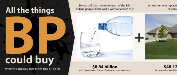
From VisualEconomics.com “What BP Could Have Bought With All the Money They Lost” is a long, side-scrolling visual of some examples of what BP could have done with $100,000,000,000.  I like the use of photos to help tell the story, and it stands out from the crowd by scrolling to the side instead of down.

Two things I think are wrong about this one though.  Although all of the possible expenditures add up, the number values aren’t visualized in any way.  Also the $100,000,000,000 is the loss in stock market capitalization, not $3.5B in cash that BP has spent on recovery efforts.  It’s not actually money that BP has spent.


PrintView Printer Friendly Version

EmailEmail Article to Friend

Reader Comments (4)

Alternative title...

"What BP could have bought (and easily still could buy) at literally any time"

July 21, 2010 | Unregistered CommenterMichael

As you mention, assuming most of the stock is held by the public, then it's really what the stock holders could have bought if they'd sold all of their stock before the spill, and then spent the difference on....

And, as Michael indicates, they could have spent $x billion on water, poverty,... but it's not as if they actually were going to.

July 21, 2010 | Unregistered CommenterAlex Kerin
Clearly they were never actually going to buy any of these things. The idea behind the chart is try to put this massive number into some sort of tangible form.
August 12, 2010 | Unregistered CommenterKyyle
I noticed that this infographic was extremely successful on social media. It went viral and from time to time it's re-appearing. People don't care about accuracy of numers. :)
August 18, 2010 | Unregistered Commenterinfographics-inspiration
Comments for this entry have been disabled. Additional comments may not be added to this entry at this time.