


GE Ecomagination Challenge “Powering the Grid” Visualized
 Randy
Randy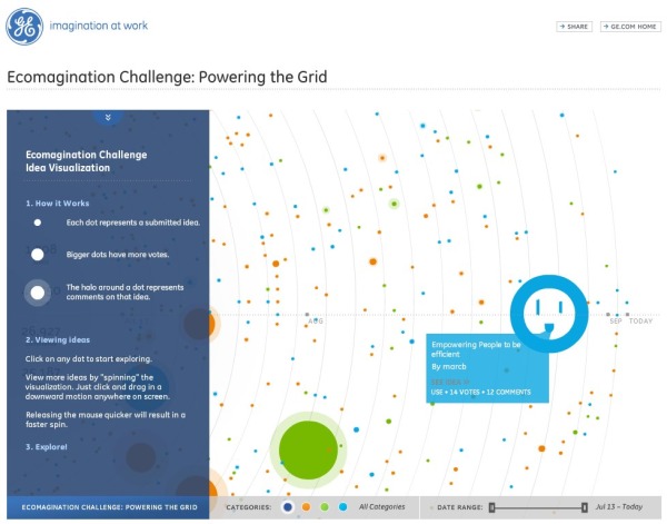
From GE, this is a visual interface/tracking system of the Ecomagination Challenge: Powering The Grid.
This is a data-heavy visualization. Each submitted idea is a dot, and the concentric rings are a timeline expanding outward from July 2010 to today. The dot colors represent the idea categories (Create Power, Connect Power and Use Power). The size of the dot represents how many votes each idea has received and the additional halo around a dot represents the number of comments left by others on that idea. I can’t tell, but I hope they use the values to calculate the “area” of each dot and not it’s “diameter”!
“…our data visualization teams have put their design skills to work on GE’s new “ecomagination Challenge: Powering the Grid.” Backed by $200 million in venture capital funds from GE and its partners, the goal is to find the best ideas from researchers and entrepreneurs that will help accelerate the adoption of smart grid technologies. But it can be a daunting task plowing through the more than 1,400 submissions to-date (and growing). So, as you can see in the data visualization, the entries have been represented graphically, with the circles representing clickable ideas.”
I really like the Solar Roadways idea!
Thanks to Megan for sending the link!

Reader Comments (2)