


The Rise in Mobile Video
 Randy
Randy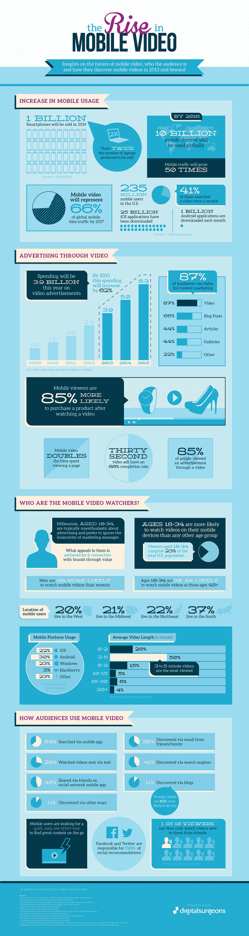
The Rise in Mobile Video from Digital Surgeons takes a look at the confluence of data behind the growth of mobile devices and the growth of video content made for those mobile devices.
Mobile video offers brands a new and interesting way to interact with it’s customers. It’s not about the platform, it’s about telling engaging stories and connecting with audiences.
We took all of that pesky research around the current state of mobile video and condensed it into a beautiful infographic. It’s our pleasure to present the Rise of Mobile Video Infographic.
They have gathered some fantastic data together in this infographic, and the data tells a great story. The simple color scheme is easy on the eyes, and the use of icons and logos for the different device brands helps to reduce the text.
However, the design is visually noisy, and hard for the readers to follow. Here are a few tips that could make this infographic great:
- Big fonts are not data visualizations. If you want your audience to understand the data, the design needs to visualize it to put the value into context for the reader.
- Values not visualized are perceived as being less important. Readers are skimming the infographic because they expect an infographic to make the data fast and easy to understand. Usually they will skip the text and look at the visuals first. This means that any values not visualized are skipped when the readers are skimming.
- Streamline the path of information. An infographic should walk the audience sequentially through the data, building up the conclusions. In this design, the major sections move top-to-bottom, but within each section is a random placement of statistics. Some are side-by-side and some are top-to-bottom. It’s hard for the reader to understand where to move next after each statistic. A clean, linear flow would be easier to read.
Thanks to Alex and Peter for sending in the link!

Reader Comments (1)