About
Randy Krum
President of InfoNewt.
Data Visualization and Infographic Design

Infographic Design

Infographics Design | Presentations
Consulting | Data Visualizations

DFW DataViz Meetup

Join the DFW Data Visualization and Infographics Meetup Group if you're in the Dallas/Fort Worth area!

Search the Cool Infographics site

Custom Search

Subscriptions:


Feedburner

The Cool Infographics® Gallery:

How to add the
Cool Infographics button to your:

Cool Infographics iOS icon

- iPhone
- iPad
- iPod Touch


Read on Flipboard for iPad and iPhone

Featured in the Tech & Science category

Flipboard icon

Twitter Feed
From the Bookstore

Caffeine Poster

The Caffeine Poster infographic

« Find The Best Group Exercise Class for You | Main | How Many Jelly Beans Do You Have Left? »
Thursday
Oct312013

Highest Grossing Movie Franchises

Highest Grossing Movie Franchises infographic

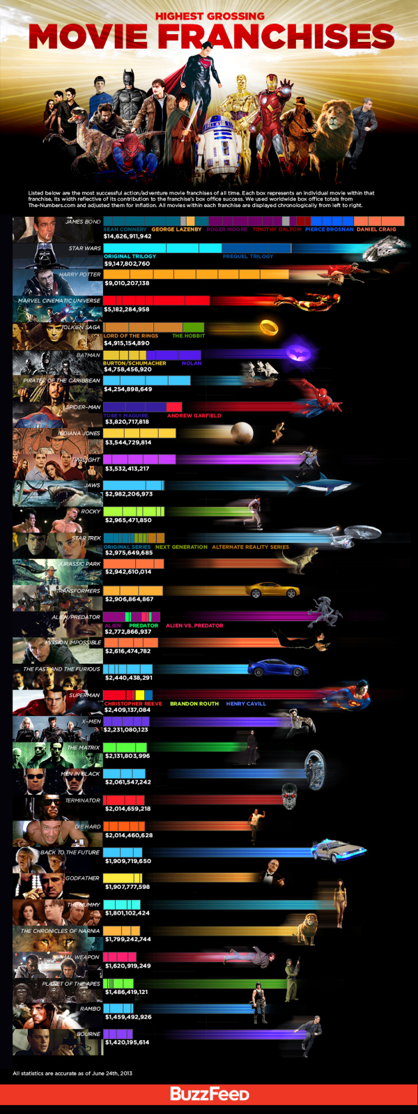
The Highest Grossing Movie Franchises infographic from Buzzfeed makes good use of a stacked bar chart to put the various movie series into perspective. Design by John Gara.

Listed below are the most successful action/adventure movie franchises of all time. Each box represents an individual movie within that franchise, its width reflective of its contribution to the franchise’s box office success. We used worldwide box office totals from The-Numbers. com and adjusted them for inflation. All movies within each franchise are displayed chronologically from left to right.

Great design that really does a fantastic job of comparing the franchises.  I’m especially impressed that they took the time to adjust the data for inflation, a step that designers normally forget.  The color coding within each franchise is also easily explained with colored text under the stacked bars.  No need for a chart legend!

The franchises are sorted in descending order as shown by the bars, but the extra graphic design to the right of each bar is visually misleading.  To some, this will look like an extension of the data, but it’s just artistic, with the images spaced out so they don’t overlap.

The footer should have included both a copyright statement, and the URL link back to the original landing page so readers can find the original full-size version.

Found on GeekTyrant

PrintView Printer Friendly Version

EmailEmail Article to Friend

Reader Comments (6)

Great infographic. You mention copyright. Where was the information sourced?
November 1, 2013 | Unregistered CommenterCharles S
In the infographic description they claim that they "...used worldwide box office totals from The-Numbers.com and adjusted them for inflation."
November 2, 2013 | Registered CommenterRandy
Hello! My name's Marcelo, I'm from Brazil and I have to say that this infographic is preatty cool! Awesome!
November 5, 2013 | Unregistered CommenterMarcelo
Really nice use of depth on this one with the heavy layering - quite eye-catching.
November 5, 2013 | Unregistered CommenterToby
So Twilight sold almost 2x more than The Godfather... Oh, humanity...
December 18, 2013 | Unregistered CommenterDavi T.
There's a reason most designers 'forget' to adjust these films for inflation. It's because it's really not accurate to simply do that and not take into account all the dozens of other variables when comparing grosses from widely different time periods. There is no way to make it all work in such a way that doesn't unfairly penalize competing films. Which is why the simply unadjusted numbers are what are used most of the time. Simply adjusting for inflation doesn't give an accurate portrayal of what a film actually made. Not even close.
December 25, 2014 | Unregistered CommenterX
Editor Permission Required
While we are migrating to a new site design, you must have editing permission for this entry in order to post comments.