


Drones Kill - Animated, Interactive Visualization
 Randy
Randy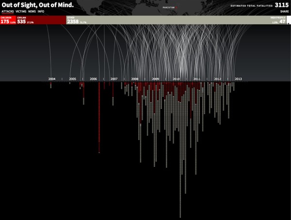
Great data visualization design from Pitch Interactive. Out of Site, Out of Mind is an animated data visualization of every U.S. drone strike in Pakistan since 2004 and the associated kills reported in the news. There is also an interactive element is that the readers can hover their pointer over the visualization an more details appear in a popup window. Visit the original site to see the animation.
Since 2004, the US has been practicing in a new kind of clandestine military operation. The justification for using drones to take out enemy targets is appealing because it removes the risk of losing American military, it’s much cheaper than deploying soldiers, it’s politically much easier to maneuver (i.e. flying a drone within Pakistan vs. sending troops) and it keeps the world in the dark about what is actually happening. It takes the conflict out of sight, out of mind. The success rate is extremely low and the cost on civilian lives and the general well-being of the population is very high. This project helps to bring light on the topic of drones. Not to speak for or against, but to inform and to allow you to see for yourself whether you can support drone usage or not.
The visualization is created in HTML5 and JavaScript. We recommend Chrome for the best viewing experience.
The challenge with gathering the data and how drone attacks are represented in the news is shown by the large OTHER category of victims. Also, it’s the largest category of victims. A data visualization like this is a tremendously effective way to bring this issue to light.
The category of victims we call “OTHER” is classified differently depending on the source. The Obama administration classifies any able-bodied male a military combatant unless evidence is brought forward to prove otherwise. This is a very grey area for us. These could be neighbors of a target killed. They may all be militants and a threat. What we do know for sure is that they are targeted without being given any representation or voice to defend themselves.
The visualization was created by Wesley Grubbs, and there is a video interview of him about the data visualziation process by The Huffington Post.
Thanks to Ray for sending in the link!

Reader Comments (1)