About
Randy Krum
President of InfoNewt.
Data Visualization and Infographic Design

Infographic Design

Infographics Design | Presentations
Consulting | Data Visualizations

DFW DataViz Meetup

Join the DFW Data Visualization and Infographics Meetup Group if you're in the Dallas/Fort Worth area!

Search the Cool Infographics site

Custom Search

Subscriptions:


Feedburner

The Cool Infographics® Gallery:

How to add the
Cool Infographics button to your:

Cool Infographics iOS icon

- iPhone
- iPad
- iPod Touch


Read on Flipboard for iPad and iPhone

Featured in the Tech & Science category

Flipboard icon

Twitter Feed
From the Bookstore

Caffeine Poster

The Caffeine Poster infographic

« Choosing a CMS for Your Business | Main | A #Sworcery Infographic »
Tuesday
Jul302013

What Do 7 Billion People Do?

What Do 7 Billion People Do? infographic

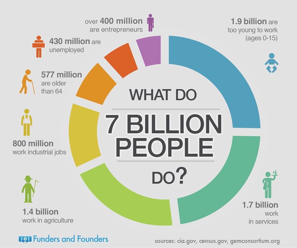
This is a page out of Funders and Founders future book. It is a circle graph of the population of the world. The What Do 7 Billion People Do? infographic simplifies the worlds jobs into broad groups. Entrepreneurs are still the smallest group!

We explain entrepreneurship and startups visually through infographics. Here you can see draft notes from our future book.

Found on Funders and Founders!

PrintView Printer Friendly Version

EmailEmail Article to Friend

Reader Comments (5)

I'm not a fan of this info graphic. (No offense to its creator intended.) In my opinion, a good infographic is marked by its ability to take the complex data or concept and explain or communicate it clearly and simply. This graphic is simply a massive over simplification of data. I think this is a pitfall in designing infographics and an easy one to fall into. There is often a temptation, instead of designing something fresh, clever and imaginative, to fall back on using images to vastly over simplify the subject.

Graphics that so overreach for simplicity, such as this, serve only to discredit the intended communication.
July 31, 2013 | Unregistered CommenterJonathan Echols
Howdy Randy! Great one!! :)

The most surprising thing was that 400 million entrepreneurs. Where did they find this data from? LOL

Anyway, I see that you publish many infographics from Funders and Founders. Is there any special reason?
MB @ Infographics Village,
The data about 400 million entrepreneurs is from International Labor Organization and few experts, please see another graphic for details and sources:
http://fundersandfounders.com/the-next-billion-women-entrepreneurs/

Vlad,
Funders and Founders
August 2, 2013 | Unregistered CommenterVlad
I find that there is a rocketing growth in data and to see "What 7 billion people do" in graphical mode is great.
I always find a graphic speaks louder than words, it is much easier to understand.

Full marks.

http://www.flatroof-systems.com
August 14, 2013 | Unregistered CommenterGordon Youd
Now more than 7.6 billion people live on Earth, and every second 2.5 more are added. This is insane, isn't it?
http://live-counter.com/world-population/
October 21, 2018 | Unregistered CommenterLars
Editor Permission Required
While we are migrating to a new site design, you must have editing permission for this entry in order to post comments.