Born in 2010: How much is left for me?
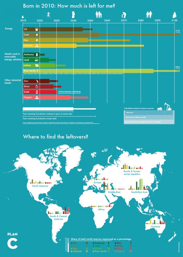
Resources are running low. The Born in 2010: How much is left for me? infographic puts the amount of each energy resource, metals used in renewable energy solutions, and other industrial metals left in perspective and which country to find them in. The infographic was created by Plan C.
I like the timeline design at the top. Graphing the remaining resources is much more effective than telling someone in text that there are only 35 years of oil left. However, I find the map visualization at the bottom confusing. The color-coding and odd range of filled circles is difficult for readers to comprehend.
Found on Visual.ly


 Randy
Randy

Reader Comments (2)
Do you have any suggestions on improving the visualization of the geolocation of the remaining resources?
Peter
Yes, the map visualization is difficult. You are trying to show both the location of each resource and a percentage of each resource in that location. With the stack of circles, you are showing one filled circle to represent 10%, but the filled circles, open circles and partial circles appear to be bars. For the circles to work you would want to show a filled portion of all 10 circles for each resource, and the height of the circle segments for the partial circles would need to be calculated based on the area you are trying to represent.
For percentages, you usually want to visualize the value in comparison to 100%. A stacked bar totaling 100% for each resource might be the easiest, but stay away from showing pie charts for all of the resources in each location (that would be overly complicated). I would try a polar area chart (rose diagram) for each location with arcs for each resource that would clearly show the dominant resources. It would make a MUCH longer design, but I also think a separate map for each resource would be much easier for the audience to understand which locations have most of the supply.
A completely different approach would be to color code the locations instead of the resources, and show a colored map once above a horizontal stacked bar for each resource. This would show all of the locations added together adding to 100%, and would prompt the audience to consider each resource separately. Where is all the Oil? would be a separate visualization from Where is all the Gold?